Benvenuto nelle Font Più Popolari — dove popolarità e qualità si incontrano. Qui trovi i font più scaricati e usati dell'anno. Se cerchi scelte sicure per logo, web o social, inizia da qui.
Ogni font top si distingue per equilibrio, leggibilità e versatilità. Troverai sans serif moderne, script eleganti, serif vintage e display minimalisti.
-
 Scaricare 117 Downloads@WebFont
 -
( Fonts by Manfred Klein. Free for private and charity use. Free for commercial with donation to organizations )
The image contains cartoon faces, not a font.
![JulySketches font caratteri gratis]() Scaricare 117 Downloads@WebFont
Scaricare 117 Downloads@WebFont -
( Fonts by Java Pep - Personal-use only. For commercial use please contact owner. )
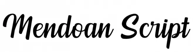
A lively and elegant script font with fluid, connected letterforms.
![Mendoan Script font caratteri gratis]() Scaricare 117 Downloads@WebFont
Scaricare 117 Downloads@WebFont -
( Fonts by Edric Studio www.creativefabrica.com/designer/edricstudio/ - Personal-use only. For commercial use please contact owner. )
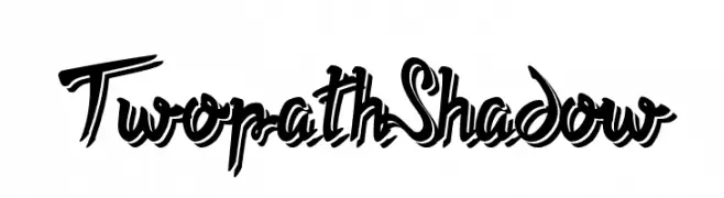
A bold, dynamic script font with a shadow effect for added depth.
![Twopath Shadow font caratteri gratis]() Scaricare 117 Downloads@WebFont
Scaricare 117 Downloads@WebFont -
( Fonts by a Zaffar Ansari - Zansari . Personal-use only. For commercial use please contact owner. )
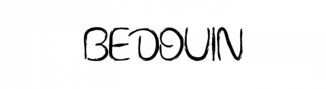
A brush-stroke font with a rustic, hand-painted appearance.
![BEDOUIN font caratteri gratis]() Scaricare 117 Downloads@WebFont
Scaricare 117 Downloads@WebFont -
-
( Fonts by alphArtype - Agung Rohmat - Personal-use only. For commercial use please contact owner. )
A playful and expressive handwritten font with fluid and dynamic strokes.
![Relation Regular font caratteri gratis]() Scaricare 117 Downloads@WebFont
Scaricare 117 Downloads@WebFont -
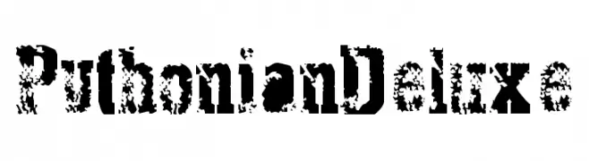
![PythonianDeluxe font caratteri gratis]() Scaricare 117 Downloads@WebFont
Scaricare 117 Downloads@WebFont -
( Fonts by Scratchones )
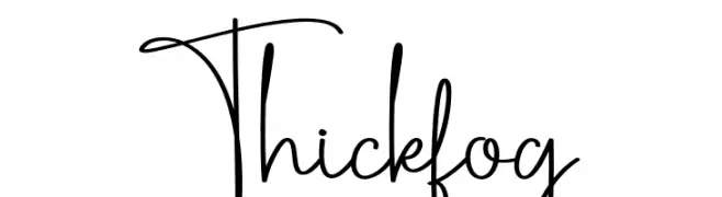
A playful, handwritten font with flowing, interconnected letterforms.
![Thickfog font caratteri gratis]() Scaricare 117 Downloads@WebFont
Scaricare 117 Downloads@WebFont -
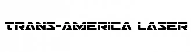
( Fonts by Daniel Zadorozny - www.iconian.com )
A bold, futuristic font with geometric shapes and a stencil-like design.
![Trans-America Laser font caratteri gratis]() Scaricare 117 Downloads@WebFont
Scaricare 117 Downloads@WebFont -
( Fonts by patch po )
A raw, hand-drawn font with jagged strokes and an energetic style.
![Stobau font caratteri gratis]() Scaricare 117 Downloads@WebFont
Scaricare 117 Downloads@WebFont


Quali sono i font più popolari adesso?
Poppins, Roboto, Montserrat, Open Sans e Lato sono molto usati per le forme pulite e l'ampia applicabilità — dall'identità di marca alle landing page e ai poster.
Quali font si usano spesso nei loghi?
Le sans serif geometriche (es. Poppins, famiglie in stile Gotham) sono scelte comuni per un branding pulito e scalabile. Per un tocco personale restano valide script e stili manoscritti. Abbina un display deciso per i titoli a un corpo testo neutro per riconoscibilità ed equilibrio.
Ogni quanto si aggiorna la lista?
Con regolarità, in base ai download e all'attività reale. Torna spesso per scoprire in anticipo le nuove preferite.
💡 Consiglio: aggiungi ai preferiti — le tendenze cambiano in fretta e i font top di oggi possono ispirare il rebranding di domani.