Benvenuto nelle Font Più Popolari — dove popolarità e qualità si incontrano. Qui trovi i font più scaricati e usati dell'anno. Se cerchi scelte sicure per logo, web o social, inizia da qui.
Ogni font top si distingue per equilibrio, leggibilità e versatilità. Troverai sans serif moderne, script eleganti, serif vintage e display minimalisti.
-
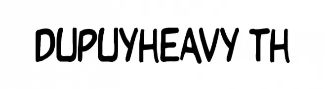
( Fonts by David Rakowski )
A bold, playful font with a hand-drawn, whimsical style.
 Scaricare 557 Downloads@WebFont
 -
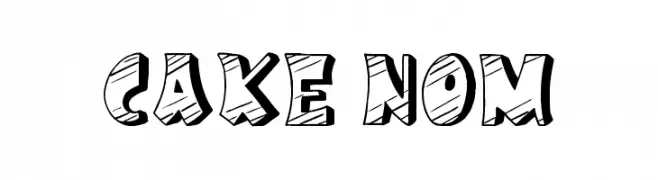
( Font by Jonathan Harris - www.tattoowoo.com )
A playful, bold font with a hand-drawn, three-dimensional style.
![Cake Nom font caratteri gratis]() Scaricare 557 Downloads@WebFont
Scaricare 557 Downloads@WebFont -
![AntPoltSemiExpd-Regular font caratteri gratis]() Scaricare 557 Downloads@WebFont
Scaricare 557 Downloads@WebFont -
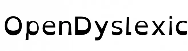
( Abelardo Gonzalez - abbiecod.es )
A readability-focused font with distinct shapes and heavier bottoms, aiding dyslexic readers.
![OpenDyslexic font caratteri gratis]() Scaricare 557 Downloads@WebFont
Scaricare 557 Downloads@WebFont -
![code xero font caratteri gratis]() Scaricare 557 Downloads@WebFont
Scaricare 557 Downloads@WebFont -
-
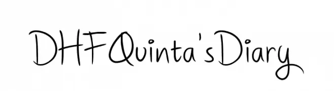
![DHFQuinta'sDiary font caratteri gratis]() Scaricare 557 Downloads@WebFont
Scaricare 557 Downloads@WebFont -
( Fonts by omnibus-type.com. Personal-use only. For commercial use please contact owner. )
A classic serif font with elegant and refined letterforms.
![Unna-Regular font caratteri gratis]() Scaricare 557 Downloads@WebFont
Scaricare 557 Downloads@WebFont -
( Fonts by a Claude Pelletier . Personal-use only. For commercial use please contact owner. )
A bold, slightly italicized font with a playful and dynamic style.
![Postface font caratteri gratis]() Scaricare 556 Downloads@WebFont
Scaricare 556 Downloads@WebFont -
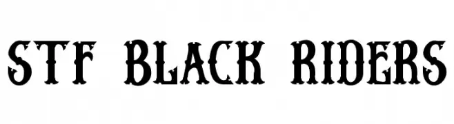
( Gilang Senzana - www.facebook.com/gilang.senzana?ref=tn_tnmn )
A bold, decorative font with a vintage, rugged style.
![Stf BLACK RIDERS font caratteri gratis]() Scaricare 556 Downloads@WebFont
Scaricare 556 Downloads@WebFont -
![Business/Industrial Regular font caratteri gratis]() Scaricare 556 Downloads@WebFont
Scaricare 556 Downloads@WebFont -
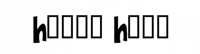
( Fonts by Spork Thug Typography - Josh Wilhelm - www.lifewithouttaffy.com/taffy/blog )
A bold, playful font with a whimsical, hand-drawn style.
![Happy Hero font caratteri gratis]() Scaricare 556 Downloads@WebFont
Scaricare 556 Downloads@WebFont -
![aaronfaces font caratteri gratis]() Scaricare 556 Downloads@WebFont
Scaricare 556 Downloads@WebFont -
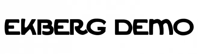
![Ekberg Demo font caratteri gratis]() Scaricare 556 Downloads@WebFont
Scaricare 556 Downloads@WebFont -
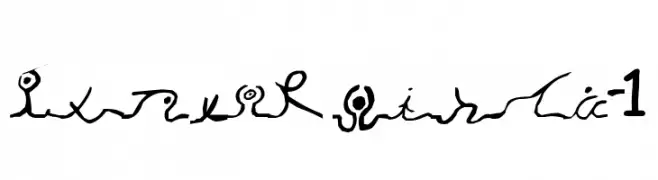
![Wizard Runes-1 font caratteri gratis]() Scaricare 556 Downloads@WebFont
Scaricare 556 Downloads@WebFont -
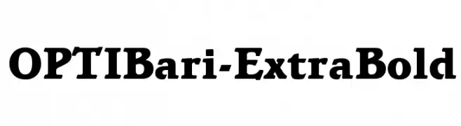
( Fonts by Castcraft Software - opti.netii.net - check the website before use )
A bold, modern serif typeface with strong, thick strokes and pronounced serifs.
![OPTIBari-ExtraBold font caratteri gratis]() Scaricare 556 Downloads@WebFont
Scaricare 556 Downloads@WebFont -
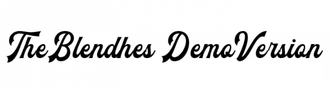
( Ydhra Studio - creativemarket.com/ydhra )
A dynamic and elegant script font with flowing, cursive letterforms.
![TheBlendhes-DemoVersion font caratteri gratis]() Scaricare 556 Downloads@WebFont
Scaricare 556 Downloads@WebFont -
![Snake font caratteri gratis]() Scaricare 556 Downloads@WebFont
Scaricare 556 Downloads@WebFont -
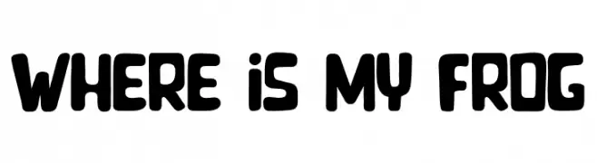
( Fonts by Octotype | Thomas Boucherie )
A playful, bold font with rounded edges and a whimsical style.
![Where is my Frog font caratteri gratis]() Scaricare 556 Downloads@WebFont
Scaricare 556 Downloads@WebFont -
![Moon-Phases font caratteri gratis]() Scaricare 556 Downloads@WebFont
Scaricare 556 Downloads@WebFont -
( Fonts by Graham Meade - GemFonts )
A bold serif font with sharp serifs and wide character spacing.
![Niew CroMagnon Wide font caratteri gratis]() Scaricare 556 Downloads@WebFont
Scaricare 556 Downloads@WebFont -
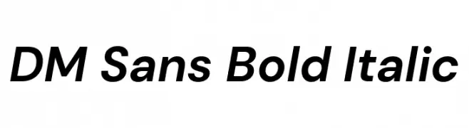
( Copyright 2014-2017 Indian Type Foundry (info@indiantypefoundry.com). )
A bold, italicized sans-serif font with a modern and dynamic style.
![DM Sans Bold Italic font caratteri gratis]() Scaricare 556 Downloads@WebFont
Scaricare 556 Downloads@WebFont -
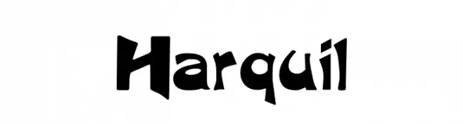
( Fonts by Altsys Metamorphosis )
A bold, angular font with a playful yet aggressive style.
![Harquil font caratteri gratis]() Scaricare 556 Downloads@WebFont
Scaricare 556 Downloads@WebFont -
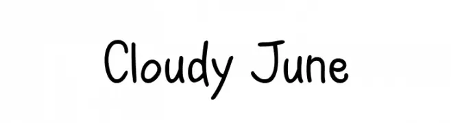
( Fonts by Misti Hammers - mistifonts.com - Personal-use only. For commercial use please contact owner. )
A playful, handwritten font with smooth, rounded strokes and a casual style.
![Cloudy June font caratteri gratis]() Scaricare 556 Downloads@WebFont
Scaricare 556 Downloads@WebFont -
( Fonts by ShyFonts )
A playful, informal font with rounded, hand-drawn letterforms.
![SF Arch Rival Extended font caratteri gratis]() Scaricare 556 Downloads@WebFont
Scaricare 556 Downloads@WebFont -
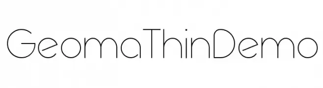
( Fonts by www.studiotypo.com - Personal-use only. For commercial use please contact owner. )
A sleek, geometric font with thin lines and a modern, minimalist style.
![Geoma Thin Demo font caratteri gratis]() Scaricare 556 Downloads@WebFont
Scaricare 556 Downloads@WebFont -
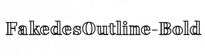
( Cyril Mikhailov - www.behance.net/cyril_mikhailov )
A bold, outlined serif font with a modern twist.
![FakedesOutline-Bold font caratteri gratis]() Scaricare 556 Downloads@WebFont
Scaricare 556 Downloads@WebFont -
( Fonts by Dominique Demetz )
A playful, handwritten font with rounded, irregular letterforms.
![Chase Regular font caratteri gratis]() Scaricare 556 Downloads@WebFont
Scaricare 556 Downloads@WebFont -
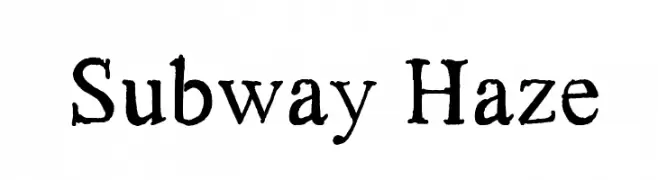
![Subway Haze font caratteri gratis]() Scaricare 556 Downloads@WebFont
Scaricare 556 Downloads@WebFont -
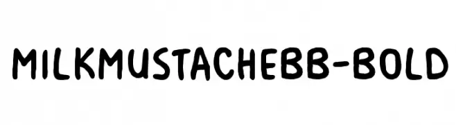
( Fonts by www.blambot.com )
A bold, playful handwritten font with rounded edges and a whimsical style.
![MilkMustacheBB-Bold font caratteri gratis]() Scaricare 556 Downloads@WebFont
Scaricare 556 Downloads@WebFont -
![aerosol menace font caratteri gratis]() Scaricare 556 Downloads@WebFont
Scaricare 556 Downloads@WebFont -
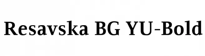
( Fonts by www.tipometar.org )
A bold, classic serif font with strong strokes and elegant serifs.
![Resavska BG YU-Bold font caratteri gratis]() Scaricare 556 Downloads@WebFont
Scaricare 556 Downloads@WebFont -
( Fonts by www.houseoflime.com )
A bold, decorative font with a starry texture, perfect for creative projects.
![Stars font caratteri gratis]() Scaricare 556 Downloads@WebFont
Scaricare 556 Downloads@WebFont -
( Fonts by Ward Zwart - wardzwart.blogspot.com - free for personal use only! )
A bold, textured font with a vintage, distressed style.
![cacavia01 font caratteri gratis]() Scaricare 556 Downloads@WebFont
Scaricare 556 Downloads@WebFont -
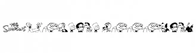
![Simpsons MmmmFont font caratteri gratis]() Scaricare 556 Downloads@WebFont
Scaricare 556 Downloads@WebFont -
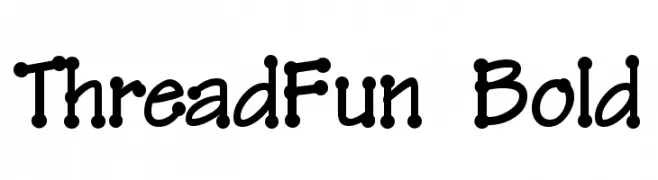
![ThreadFun Bold font caratteri gratis]() Scaricare 556 Downloads@WebFont
Scaricare 556 Downloads@WebFont


Quali sono i font più popolari adesso?
Poppins, Roboto, Montserrat, Open Sans e Lato sono molto usati per le forme pulite e l'ampia applicabilità — dall'identità di marca alle landing page e ai poster.
Quali font si usano spesso nei loghi?
Le sans serif geometriche (es. Poppins, famiglie in stile Gotham) sono scelte comuni per un branding pulito e scalabile. Per un tocco personale restano valide script e stili manoscritti. Abbina un display deciso per i titoli a un corpo testo neutro per riconoscibilità ed equilibrio.
Ogni quanto si aggiorna la lista?
Con regolarità, in base ai download e all'attività reale. Torna spesso per scoprire in anticipo le nuove preferite.
💡 Consiglio: aggiungi ai preferiti — le tendenze cambiano in fretta e i font top di oggi possono ispirare il rebranding di domani.