Benvenuto nelle Font Più Popolari — dove popolarità e qualità si incontrano. Qui trovi i font più scaricati e usati dell'anno. Se cerchi scelte sicure per logo, web o social, inizia da qui.
Ogni font top si distingue per equilibrio, leggibilità e versatilità. Troverai sans serif moderne, script eleganti, serif vintage e display minimalisti.
-
( Fonts by Vladimir Nikolic )
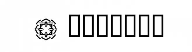
A bold, decorative font with playful circular cutouts and thick outlines.
 Scaricare 116 Downloads@WebFont
 -
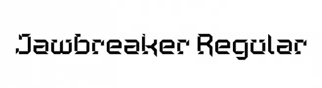
( Fonts by Andrew McCluskey - nalgames.com. Personal-use only. For commercial use please contact owner. )
A bold, geometric font with sharp angles and a futuristic style.
![Jawbreaker Regular font caratteri gratis]() Scaricare 116 Downloads@WebFont
Scaricare 116 Downloads@WebFont -
( https://www.facebook.com/JHewettIllustration )
A playful, informal handwritten font with uneven strokes and a casual style.
![JEH font caratteri gratis]() Scaricare 116 Downloads@WebFont
Scaricare 116 Downloads@WebFont -
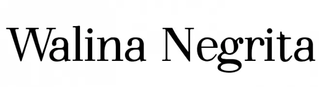
( Fonts by Adrián Yanes )
A classic serif font with bold, elegant curves and a modern touch.
![Walina Negrita font caratteri gratis]() Scaricare 116 Downloads@WebFont
Scaricare 116 Downloads@WebFont -
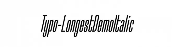
( Studio Typo - www.studiotypo.com )
A sleek, italic font with elongated, narrow characters and a modern style.
![Typo-Longest Demo Italic font caratteri gratis]() Scaricare 116 Downloads@WebFont
Scaricare 116 Downloads@WebFont -
-
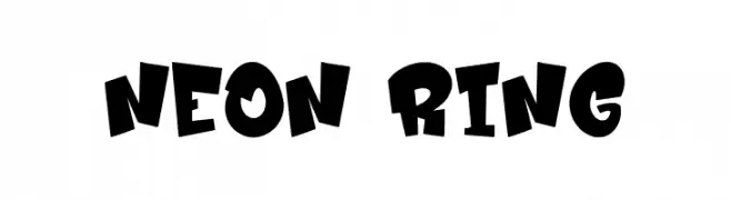
( Fonts by Asep Rendi )
A bold, playful font with uneven strokes and a cartoon-like appearance.
![Neon Ring font caratteri gratis]() Scaricare 116 Downloads@WebFont
Scaricare 116 Downloads@WebFont -
![Designs1 font caratteri gratis]() Scaricare 116 Downloads@WebFont
Scaricare 116 Downloads@WebFont -
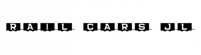
( Fonts by Jeff Levine. FREEWARE )
A playful, train-themed decorative font with bold, uniform characters.
![Rail Cars JL font caratteri gratis]() Scaricare 116 Downloads@WebFont
Scaricare 116 Downloads@WebFont -
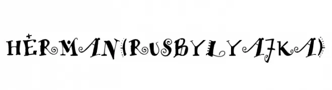
( Fonts by FONTS BY LYAJKA - Personal-use only. For commercial use please contact owner. )
A whimsical and decorative font with playful embellishments.
![HERMAN(RUS BY LYAJKA) font caratteri gratis]() Scaricare 116 Downloads@WebFont
Scaricare 116 Downloads@WebFont -
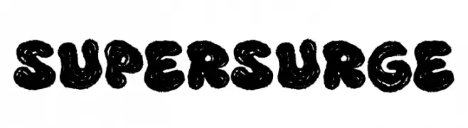
( Fonts by fsuarez913 )
A bold, textured font with a playful, hand-drawn style.
![Super Surge font caratteri gratis]() Scaricare 116 Downloads@WebFont
Scaricare 116 Downloads@WebFont

Quali sono i font più popolari adesso?
Poppins, Roboto, Montserrat, Open Sans e Lato sono molto usati per le forme pulite e l'ampia applicabilità — dall'identità di marca alle landing page e ai poster.
Quali font si usano spesso nei loghi?
Le sans serif geometriche (es. Poppins, famiglie in stile Gotham) sono scelte comuni per un branding pulito e scalabile. Per un tocco personale restano valide script e stili manoscritti. Abbina un display deciso per i titoli a un corpo testo neutro per riconoscibilità ed equilibrio.
Ogni quanto si aggiorna la lista?
Con regolarità, in base ai download e all'attività reale. Torna spesso per scoprire in anticipo le nuove preferite.
💡 Consiglio: aggiungi ai preferiti — le tendenze cambiano in fretta e i font top di oggi possono ispirare il rebranding di domani.