Benvenuto nelle Font Più Popolari — dove popolarità e qualità si incontrano. Qui trovi i font più scaricati e usati dell'anno. Se cerchi scelte sicure per logo, web o social, inizia da qui.
Ogni font top si distingue per equilibrio, leggibilità e versatilità. Troverai sans serif moderne, script eleganti, serif vintage e display minimalisti.
-
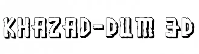
( Fonts by Daniel Zadorozny - www.iconian.com )
A bold, 3D stone-textured font with a rugged, angular design.
 Scaricare 115 Downloads@WebFont
 -
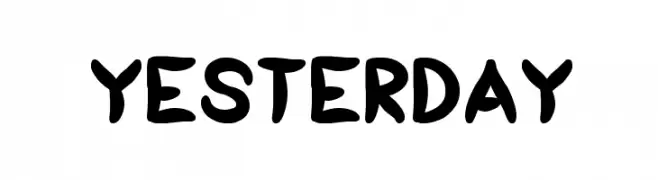
( Fonts by Wino S Kadir - weknow - www.revolge.com/shop/weknow/ - Personal-use only. For commercial use please contact owner. )
A bold, playful handwritten font with rounded, dynamic letterforms.
![yesterday font caratteri gratis]() Scaricare 115 Downloads@WebFont
Scaricare 115 Downloads@WebFont -
( Fonts by CannotIntoSpaceFonts - KineticPlasma Fonts - Personal-use only. For commercial use please contact owner. )
A bold, 3D geometric font with a striking shadow effect.
![Warsaw Gothic 3D font caratteri gratis]() Scaricare 115 Downloads@WebFont
Scaricare 115 Downloads@WebFont -
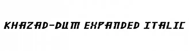
( Fonts by Daniel Zadorozny - www.iconian.com )
Bold, angular, and italicized with an expanded width, perfect for dynamic headlines.
![Khazad-Dum Expanded Italic font caratteri gratis]() Scaricare 115 Downloads@WebFont
Scaricare 115 Downloads@WebFont -
( Fonts by Woodcutter )
A pictographic icon font themed around Thai culture and landmarks.
![Thailand Icons font caratteri gratis]() Scaricare 115 Downloads@WebFont
Scaricare 115 Downloads@WebFont -
-
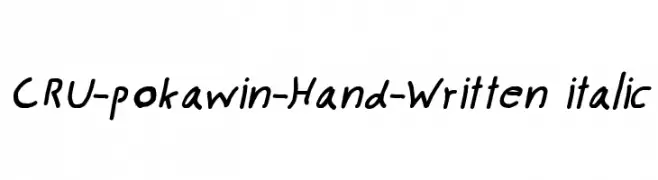
![CRU-pokawin-Hand-Written italic font caratteri gratis]() Scaricare 115 Downloads@WebFont
Scaricare 115 Downloads@WebFont -
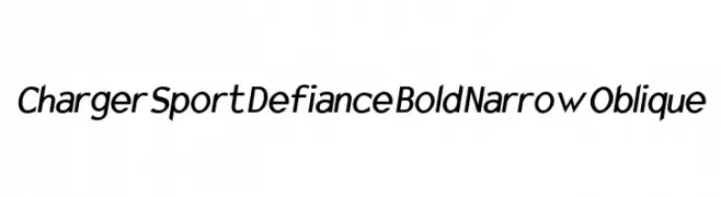
![Charger Sport Defiance Bold Narrow Oblique font caratteri gratis]() Scaricare 115 Downloads@WebFont
Scaricare 115 Downloads@WebFont -
( Fonts by Woodcutter )
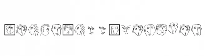
A playful decorative font featuring a variety of expressive cat faces.
![Cat Faces font caratteri gratis]() Scaricare 115 Downloads@WebFont
Scaricare 115 Downloads@WebFont -
( Fonts by Manfred Klein. Free for private and charity use. Free for commercial with donation to organizations )
Hand-drawn, abstract font made of expressive face sketches.
![HeadsCallSketches font caratteri gratis]() Scaricare 115 Downloads@WebFont
Scaricare 115 Downloads@WebFont -
( Blahfonts - www.gwydir.demon.co.uk/giles/ )
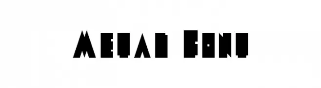
A bold, angular, and geometric decorative typeface.
![Metal Font font caratteri gratis]() Scaricare 115 Downloads@WebFont
Scaricare 115 Downloads@WebFont


Quali sono i font più popolari adesso?
Poppins, Roboto, Montserrat, Open Sans e Lato sono molto usati per le forme pulite e l'ampia applicabilità — dall'identità di marca alle landing page e ai poster.
Quali font si usano spesso nei loghi?
Le sans serif geometriche (es. Poppins, famiglie in stile Gotham) sono scelte comuni per un branding pulito e scalabile. Per un tocco personale restano valide script e stili manoscritti. Abbina un display deciso per i titoli a un corpo testo neutro per riconoscibilità ed equilibrio.
Ogni quanto si aggiorna la lista?
Con regolarità, in base ai download e all'attività reale. Torna spesso per scoprire in anticipo le nuove preferite.
💡 Consiglio: aggiungi ai preferiti — le tendenze cambiano in fretta e i font top di oggi possono ispirare il rebranding di domani.