Benvenuto nelle Font Più Popolari — dove popolarità e qualità si incontrano. Qui trovi i font più scaricati e usati dell'anno. Se cerchi scelte sicure per logo, web o social, inizia da qui.
Ogni font top si distingue per equilibrio, leggibilità e versatilità. Troverai sans serif moderne, script eleganti, serif vintage e display minimalisti.
-
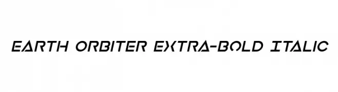
( Fonts by Daniel Zadorozny - www.iconian.com - Personal-use only. For commercial use please contact owner. )
A bold, italicized font with a futuristic and dynamic design.
 Scaricare 115 Downloads@WebFont
 -
( Copyright (c) 2015, Cadson Demak (info@cadsondemak.com) )
A thin, elegant italic font with a refined and sophisticated style.
![Taviraj Thin Italic font caratteri gratis]() Scaricare 115 Downloads@WebFont
Scaricare 115 Downloads@WebFont -
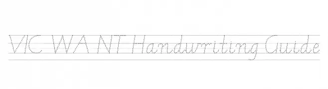
( DaShiz )
A dotted cursive handwriting guide for learning letter formation.
![VIC WA NT Handwriting Guide font caratteri gratis]() Scaricare 115 Downloads@WebFont
Scaricare 115 Downloads@WebFont -
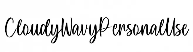
( Fonts by Yumna Family - yumna Type - Personal-use only. For commercial use please contact owner. )
A playful, flowing script font with bold, wavy lines and elegant curves.
![Cloudy Wavy Personal Use font caratteri gratis]() Scaricare 115 Downloads@WebFont
Scaricare 115 Downloads@WebFont -
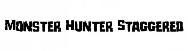
( Iconian Fonts - Daniel Zadorozny - www.iconian.com )
A bold, rugged font with staggered, uneven characters for a dynamic look.
![Monster Hunter Staggered font caratteri gratis]() Scaricare 115 Downloads@WebFont
Scaricare 115 Downloads@WebFont -
-
( Fonts by Kong Font - https://fontkong.com/ - Personal-use only. For commercial use please contact owner. )
An elegant, cursive font with decorative flourishes and smooth curves.
![Simply Sugary font caratteri gratis]() Scaricare 115 Downloads@WebFont
Scaricare 115 Downloads@WebFont -
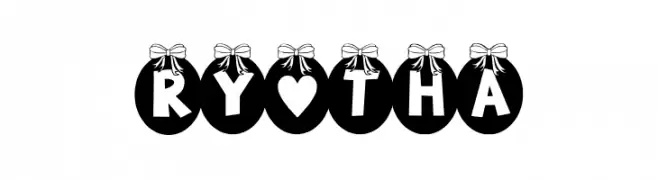
( Fonts by Docallisme HAS )
A decorative font with uppercase letters in ornamented circles topped with bows.
![RY-THA font caratteri gratis]() Scaricare 115 Downloads@WebFont
Scaricare 115 Downloads@WebFont -
( Dan Roseman )
A bold, playful font with a cartoon-like, retro style.
![Baum font caratteri gratis]() Scaricare 115 Downloads@WebFont
Scaricare 115 Downloads@WebFont -
( Fonts by Mariyana )
A fluid, cursive font with an elegant handwritten style.
![Salting font caratteri gratis]() Scaricare 115 Downloads@WebFont
Scaricare 115 Downloads@WebFont -
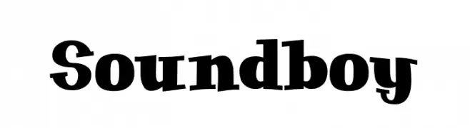
( Fonts by Kustomtype )
A bold, playful font with unique curvature and whimsical flair.
![Soundboy font caratteri gratis]() Scaricare 115 Downloads@WebFont
Scaricare 115 Downloads@WebFont


Quali sono i font più popolari adesso?
Poppins, Roboto, Montserrat, Open Sans e Lato sono molto usati per le forme pulite e l'ampia applicabilità — dall'identità di marca alle landing page e ai poster.
Quali font si usano spesso nei loghi?
Le sans serif geometriche (es. Poppins, famiglie in stile Gotham) sono scelte comuni per un branding pulito e scalabile. Per un tocco personale restano valide script e stili manoscritti. Abbina un display deciso per i titoli a un corpo testo neutro per riconoscibilità ed equilibrio.
Ogni quanto si aggiorna la lista?
Con regolarità, in base ai download e all'attività reale. Torna spesso per scoprire in anticipo le nuove preferite.
💡 Consiglio: aggiungi ai preferiti — le tendenze cambiano in fretta e i font top di oggi possono ispirare il rebranding di domani.