Benvenuto nelle Font Più Popolari — dove popolarità e qualità si incontrano. Qui trovi i font più scaricati e usati dell'anno. Se cerchi scelte sicure per logo, web o social, inizia da qui.
Ogni font top si distingue per equilibrio, leggibilità e versatilità. Troverai sans serif moderne, script eleganti, serif vintage e display minimalisti.
-
 Scaricare 114 Downloads@WebFont
 -
( Fonts by Edric Studio - Personal-use only. For commercial use please contact owner. )
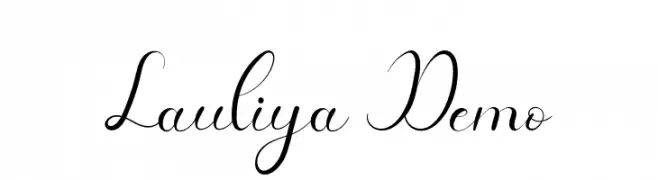
An elegant, flowing script font with high contrast and graceful curves.
![Lauliya Demo font caratteri gratis]() Scaricare 114 Downloads@WebFont
Scaricare 114 Downloads@WebFont -
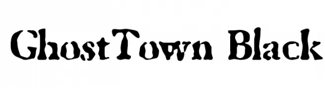
![GhostTown Black font caratteri gratis]() Scaricare 114 Downloads@WebFont
Scaricare 114 Downloads@WebFont -
( Fonts by Kong Font - fontkong.com - Personal-use only. For commercial use please contact owner. )
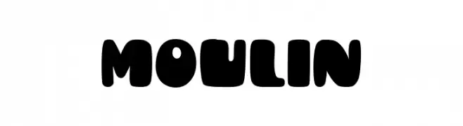
A bold, rounded font with a playful and retro vibe.
![Moulin font caratteri gratis]() Scaricare 114 Downloads@WebFont
Scaricare 114 Downloads@WebFont -
( Fonts by wepfont - Wahyu Eka Prasetya - Personal-use only. For commercial use please contact owner. )
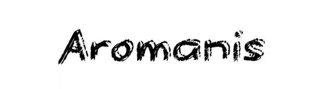
A bold, textured font with a hand-drawn, energetic style.
![Aromanis font caratteri gratis]() Scaricare 114 Downloads@WebFont
Scaricare 114 Downloads@WebFont -
-
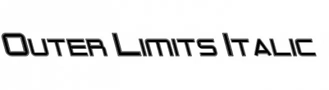
![Outer Limits Italic font caratteri gratis]() Scaricare 114 Downloads@WebFont
Scaricare 114 Downloads@WebFont -
( Fonts by FONTS BY LYAJKA - Personal-use only. For commercial use please contact owner. )
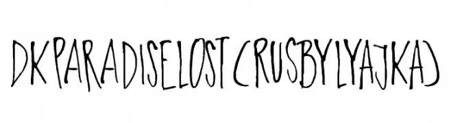
A hand-drawn, playful font with tall, slender letters and varying stroke widths.
![DK Paradise Lost(RUS BY LYAJKA) font caratteri gratis]() Scaricare 114 Downloads@WebFont
Scaricare 114 Downloads@WebFont -
( Fonts by Baka - Kyakirun - bakafonts.kyakirun.com )
A whimsical, hand-drawn font inspired by traditional Japanese hiragana.
![Yura_Hiragana font caratteri gratis]() Scaricare 114 Downloads@WebFont
Scaricare 114 Downloads@WebFont -
( Font by Eric Wirjanata. All of my font are donation based. You can support by buying something from here. http://society6.com/EricWirjanata )
A playful, handwritten font with irregular, whimsical strokes.
![killerpanda font caratteri gratis]() Scaricare 114 Downloads@WebFont
Scaricare 114 Downloads@WebFont -
( Sean Dalton - seandalton.com.au )
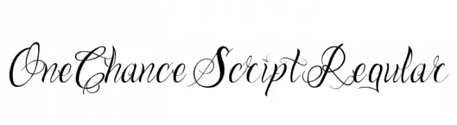
An elegant script font with intricate swirls and flourishes, perfect for sophisticated designs.
![One Chance Script Regular font caratteri gratis]() Scaricare 114 Downloads@WebFont
Scaricare 114 Downloads@WebFont


Quali sono i font più popolari adesso?
Poppins, Roboto, Montserrat, Open Sans e Lato sono molto usati per le forme pulite e l'ampia applicabilità — dall'identità di marca alle landing page e ai poster.
Quali font si usano spesso nei loghi?
Le sans serif geometriche (es. Poppins, famiglie in stile Gotham) sono scelte comuni per un branding pulito e scalabile. Per un tocco personale restano valide script e stili manoscritti. Abbina un display deciso per i titoli a un corpo testo neutro per riconoscibilità ed equilibrio.
Ogni quanto si aggiorna la lista?
Con regolarità, in base ai download e all'attività reale. Torna spesso per scoprire in anticipo le nuove preferite.
💡 Consiglio: aggiungi ai preferiti — le tendenze cambiano in fretta e i font top di oggi possono ispirare il rebranding di domani.