Benvenuto nelle Font Più Popolari — dove popolarità e qualità si incontrano. Qui trovi i font più scaricati e usati dell'anno. Se cerchi scelte sicure per logo, web o social, inizia da qui.
Ogni font top si distingue per equilibrio, leggibilità e versatilità. Troverai sans serif moderne, script eleganti, serif vintage e display minimalisti.
-
Caratteri di spideraysfonts. For commercial use please contact the owner.
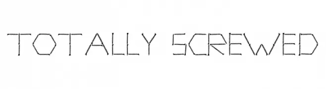
( TOTALLY SCREWED )
A playful, mechanical font with characters resembling screws and bolts.
 Scaricare 114 Downloads@WebFont
 -
( Fonts by Graham Meade - GemFonts )
A bold, modern font with geometric shapes and high contrast.
![Pecot combined font caratteri gratis]() Scaricare 114 Downloads@WebFont
Scaricare 114 Downloads@WebFont -
( Noto is a trademark of Google Inc. Noto fonts are open source. All Noto fonts are published under the SIL Open Font License, Version 1.1 )
A modern, clean sans-serif typeface with excellent readability.
![Noto Sans Tamil Medium font caratteri gratis]() Scaricare 114 Downloads@WebFont
Scaricare 114 Downloads@WebFont -
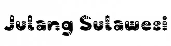
( Fonts by Belycia Mailoa )
A playful, bird-inspired decorative font with bold, rounded characters.
![Julang Sulawesi font caratteri gratis]() Scaricare 114 Downloads@WebFont
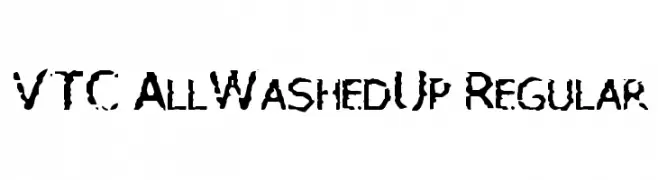
Scaricare 114 Downloads@WebFont -
![VTC AllWashedUp Regular font caratteri gratis]() Scaricare 114 Downloads@WebFont
Scaricare 114 Downloads@WebFont -
-
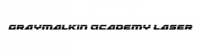
( Fonts by Daniel Zadorozny - www.iconian.com )
A futuristic, bold font with a laser-cut, three-dimensional appearance.
![Graymalkin Academy Laser font caratteri gratis]() Scaricare 114 Downloads@WebFont
Scaricare 114 Downloads@WebFont -
( Fonts by Peter S. Baker - Personal-use only. For commercial use please contact owner. )
A medieval, calligraphic font with ornate and angular forms.
![Eadui font caratteri gratis]() Scaricare 114 Downloads@WebFont
Scaricare 114 Downloads@WebFont -
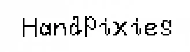
![HandPixies font caratteri gratis]() Scaricare 114 Downloads@WebFont
Scaricare 114 Downloads@WebFont -
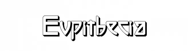
( Intellecta Design - new.myfonts.com/search/intellecta/fonts/?sort=sales?refby=paulow )
A bold, geometric font with a 3D shadow effect and sharp angles.
![Eupithecia font caratteri gratis]() Scaricare 114 Downloads@WebFont
Scaricare 114 Downloads@WebFont -
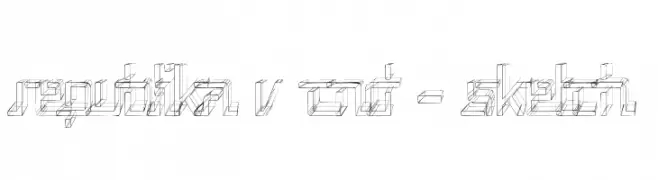
( Fonts by Apostrophic Lab )
A sketch-like, three-dimensional font with a modern, geometric design.
![Republika V Cnd - Sketch font caratteri gratis]() Scaricare 114 Downloads@WebFont
Scaricare 114 Downloads@WebFont


Quali sono i font più popolari adesso?
Poppins, Roboto, Montserrat, Open Sans e Lato sono molto usati per le forme pulite e l'ampia applicabilità — dall'identità di marca alle landing page e ai poster.
Quali font si usano spesso nei loghi?
Le sans serif geometriche (es. Poppins, famiglie in stile Gotham) sono scelte comuni per un branding pulito e scalabile. Per un tocco personale restano valide script e stili manoscritti. Abbina un display deciso per i titoli a un corpo testo neutro per riconoscibilità ed equilibrio.
Ogni quanto si aggiorna la lista?
Con regolarità, in base ai download e all'attività reale. Torna spesso per scoprire in anticipo le nuove preferite.
💡 Consiglio: aggiungi ai preferiti — le tendenze cambiano in fretta e i font top di oggi possono ispirare il rebranding di domani.