Benvenuto nelle Font Più Popolari — dove popolarità e qualità si incontrano. Qui trovi i font più scaricati e usati dell'anno. Se cerchi scelte sicure per logo, web o social, inizia da qui.
Ogni font top si distingue per equilibrio, leggibilità e versatilità. Troverai sans serif moderne, script eleganti, serif vintage e display minimalisti.
-
( Fonts by Digital Graphics Labs - www.digitalgraphiclabs.com )
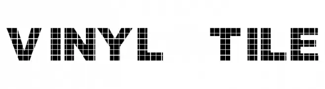
A bold, grid-patterned font with a modern, industrial look.
 Scaricare 549 Downloads@WebFont
 -
( Fonts by a Neale Davidson - www.pixelsagas.com. Personal-use only. For commercial use please contact owner. )
A bold, geometric font with Art Deco influences and sharp, clean lines.
![Crichton font caratteri gratis]() Scaricare 549 Downloads@WebFont
Scaricare 549 Downloads@WebFont -
![Stigmata font caratteri gratis]() Scaricare 549 Downloads
Scaricare 549 Downloads -
( Fonts by Balpirick Studio - https://www.creativefabrica.com/designer/balpirick/ref/308299/ - Personal-use only. For commercial use please contact owner. )
A dynamic, brush-style handwritten font with expressive strokes.
![Rawless font caratteri gratis]() Scaricare 549 Downloads@WebFont
Scaricare 549 Downloads@WebFont -
( Fonts by Miss Tiina at www.misstiina.com (please check the website before use) )
A casual, friendly handwritten font with smooth, flowing strokes.
![MTF Jude font caratteri gratis]() Scaricare 549 Downloads@WebFont
Scaricare 549 Downloads@WebFont -
-
( Fonts by Justin Callaghan - mickeyavenue.com Commerciali Caratteri )
A geometric Art Deco font with sharp angles and elegant curves.
![DecoTech font caratteri gratis]() Scaricare 549 Downloads
Scaricare 549 Downloads -
( mlkwsn - Malik Wisnu )
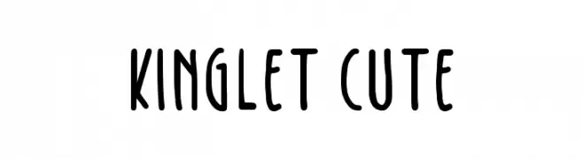
A playful handwritten font with rounded edges and a casual style.
![Kinglet Cute font caratteri gratis]() Scaricare 549 Downloads@WebFont
Scaricare 549 Downloads@WebFont -
( Aaron Amar - www.behance.net/aaronamar )
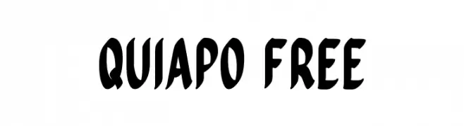
A bold, dynamic font with a playful and energetic style.
![Quiapo Free font caratteri gratis]() Scaricare 549 Downloads@WebFont
Scaricare 549 Downloads@WebFont -
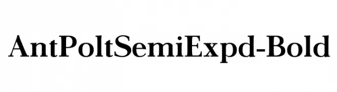
![AntPoltSemiExpd-Bold font caratteri gratis]() Scaricare 549 Downloads@WebFont
Scaricare 549 Downloads@WebFont -
( Copyright (c) 2015 by Jasper de Waard. All rights reserved. )
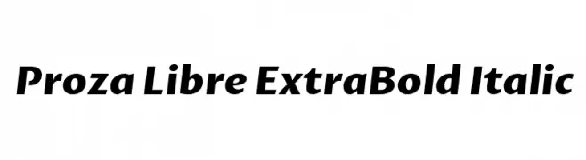
A bold, italic typeface with a modern and dynamic style.
![Proza Libre ExtraBold Italic font caratteri gratis]() Scaricare 548 Downloads@WebFont
Scaricare 548 Downloads@WebFont -
( Fonts by Måns Grebäck )
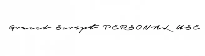
A graceful, cursive script font with a natural handwritten style.
![Graced Script PERSONAL USE font caratteri gratis]() Scaricare 548 Downloads@WebFont
Scaricare 548 Downloads@WebFont -
( www.decloedtkristof.be )
A playful, bold handwritten font with a lively and informal style.
![Geschrift font caratteri gratis]() Scaricare 548 Downloads@WebFont
Scaricare 548 Downloads@WebFont -
( Fonts are free for a personal use only - www.cuttyfruty.com )
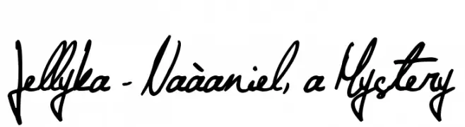
A fluid and elegant handwritten script with expressive strokes.
![Jellyka - Naàaniel, a Mystery font caratteri gratis]() Scaricare 548 Downloads@WebFont
Scaricare 548 Downloads@WebFont -
( Fonts by Agathe M.Joyce - www.foundmyfont.com - Personal-use only. For commercial use please contact owner. )
A playful and elegant script font with flowing, cursive letters and decorative flourishes.
![Sweetheart Birthday font caratteri gratis]() Scaricare 548 Downloads@WebFont
Scaricare 548 Downloads@WebFont -
( Fonts by Chris Vile )
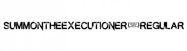
A bold, distressed font with a gritty, textured appearance.
![SummontheExecutioner-Regular font caratteri gratis]() Scaricare 548 Downloads@WebFont
Scaricare 548 Downloads@WebFont -
( Fonts by www.philing.net )
A casual, handwritten font with a flowing and connected style.
![Georges font caratteri gratis]() Scaricare 548 Downloads@WebFont
Scaricare 548 Downloads@WebFont -
( Fonts by Xerographer Fonts )
A bold, retro-inspired font with dynamic strokes and angular serifs.
![WickedSeventies font caratteri gratis]() Scaricare 548 Downloads@WebFont
Scaricare 548 Downloads@WebFont -
( Copyright (c) 2016 by Red Hat, Inc. All rights reserved. )
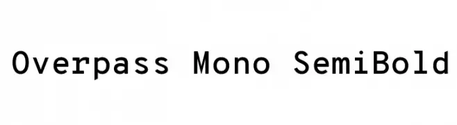
A clean, modern monospaced font with medium contrast and semi-bold weight.
![Overpass Mono SemiBold font caratteri gratis]() Scaricare 548 Downloads@WebFont
Scaricare 548 Downloads@WebFont -
( Fonts by Manfred Klein - manfred-klein.ina-mar.com )
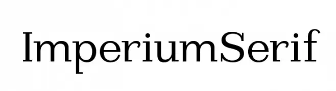
A classic serif typeface with sharp serifs and balanced proportions, ideal for formal and professional use.
![ImperiumSerif font caratteri gratis]() Scaricare 548 Downloads@WebFont
Scaricare 548 Downloads@WebFont -
( Fonts by Casady & Greene )
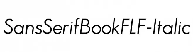
A modern, italic sans-serif font with clean lines and excellent readability.
![SansSerifBookFLF-Italic font caratteri gratis]() Scaricare 548 Downloads@WebFont
Scaricare 548 Downloads@WebFont -
![KR Sword In The Stone font caratteri gratis]() Scaricare 548 Downloads@WebFont
Scaricare 548 Downloads@WebFont -
( Fonts by Locomotype )
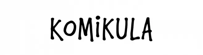
A playful, handwritten font with bold, rounded strokes and a comic book style.
![Komikula font caratteri gratis]() Scaricare 548 Downloads@WebFont
Scaricare 548 Downloads@WebFont -
( Fonts by Ben Nathan )
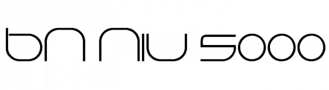
A sleek, futuristic font with geometric and minimalist design elements.
![BN Niv 5000 font caratteri gratis]() Scaricare 548 Downloads@WebFont
Scaricare 548 Downloads@WebFont -
( Fonts by Eknoji Studio - www.eknojistudio.com - Personal-use only. For commercial use please contact owner. )
A modern, rounded monospaced font with a clean and uniform appearance.
![Home Away font caratteri gratis]() Scaricare 548 Downloads@WebFont
Scaricare 548 Downloads@WebFont -
( Fonts by Castcraft Software - opti.netii.net - check the website before use )
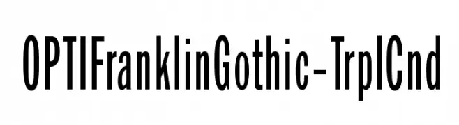
A tall, narrow, and modern typeface with high legibility.
![OPTIFranklinGothic-TrplCnd font caratteri gratis]() Scaricare 548 Downloads@WebFont
Scaricare 548 Downloads@WebFont -
( Fonts by Altsys Metamorphosis )
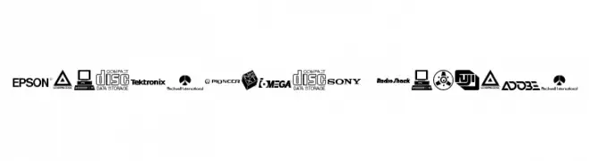
A diverse collection of electronics company logos showcasing varied typography styles.
![Electronics Regular font caratteri gratis]() Scaricare 548 Downloads@WebFont
Scaricare 548 Downloads@WebFont -
![Rina font caratteri gratis]() Scaricare 548 Downloads@WebFont
Scaricare 548 Downloads@WebFont -
![font3933 font caratteri gratis]() Scaricare 548 Downloads@WebFont
Scaricare 548 Downloads@WebFont -
( Fonts by Alphabet & Type: Typography & Graphic - Paolo Vannucci - www.alphabetype.it )
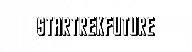
A bold, futuristic font with a 3D shadow effect.
![StarTrekFuture font caratteri gratis]() Scaricare 548 Downloads@WebFont
Scaricare 548 Downloads@WebFont -
( Jane Bond )
A casual, handwritten font with a playful yet structured appearance.
![003 Engineer's Hand font caratteri gratis]() Scaricare 548 Downloads@WebFont
Scaricare 548 Downloads@WebFont -
![Gaivota font caratteri gratis]() Scaricare 548 Downloads@WebFont
Scaricare 548 Downloads@WebFont -
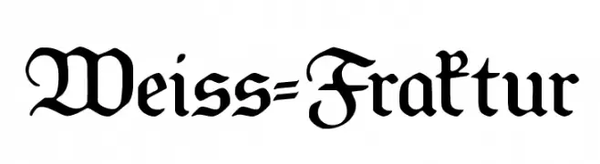
![Weiss-Fraktur font caratteri gratis]() Scaricare 548 Downloads@WebFont
Scaricare 548 Downloads@WebFont -
( Fonts by Hanna Bie )
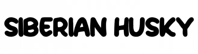
A bold, playful font with rounded edges and a hand-drawn feel.
![Siberian Husky font caratteri gratis]() Scaricare 548 Downloads@WebFont
Scaricare 548 Downloads@WebFont -
( Magang Letterhend - www.letterhend.com )
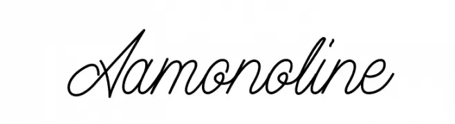
A graceful script font with fluid, cursive lines and elegant flourishes.
![Aamonoline font caratteri gratis]() Scaricare 548 Downloads@WebFont
Scaricare 548 Downloads@WebFont -
( Fonts by Simon Cozens )
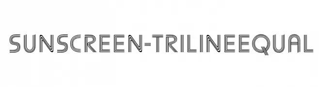
A modern triline font with geometric, parallel line design.
![Sunscreen-TrilineEqual font caratteri gratis]() Scaricare 548 Downloads@WebFont
Scaricare 548 Downloads@WebFont


Quali sono i font più popolari adesso?
Poppins, Roboto, Montserrat, Open Sans e Lato sono molto usati per le forme pulite e l'ampia applicabilità — dall'identità di marca alle landing page e ai poster.
Quali font si usano spesso nei loghi?
Le sans serif geometriche (es. Poppins, famiglie in stile Gotham) sono scelte comuni per un branding pulito e scalabile. Per un tocco personale restano valide script e stili manoscritti. Abbina un display deciso per i titoli a un corpo testo neutro per riconoscibilità ed equilibrio.
Ogni quanto si aggiorna la lista?
Con regolarità, in base ai download e all'attività reale. Torna spesso per scoprire in anticipo le nuove preferite.
💡 Consiglio: aggiungi ai preferiti — le tendenze cambiano in fretta e i font top di oggi possono ispirare il rebranding di domani.