Benvenuto nelle Font Più Popolari — dove popolarità e qualità si incontrano. Qui trovi i font più scaricati e usati dell'anno. Se cerchi scelte sicure per logo, web o social, inizia da qui.
Ogni font top si distingue per equilibrio, leggibilità e versatilità. Troverai sans serif moderne, script eleganti, serif vintage e display minimalisti.
-
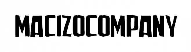
( Woodcutter - woodcutter Manero - www.woodcutter.es )
A bold, handcrafted font with a strong, impactful design.
 Scaricare 113 Downloads@WebFont
 -
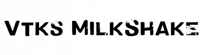
( Fonts by douglas vitkauskas - Personal-use only. For commercial use please contact owner. )
A bold, distressed font with a grunge texture and vintage appeal.
![Vtks MilkShake font caratteri gratis]() Scaricare 113 Downloads@WebFont
Scaricare 113 Downloads@WebFont -
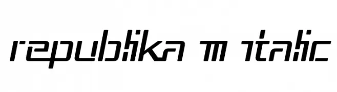
( Fonts by Apostrophic Lab )
A modern, italic font with geometric precision and a dynamic, futuristic style.
![Republika III Italic font caratteri gratis]() Scaricare 113 Downloads@WebFont
Scaricare 113 Downloads@WebFont -
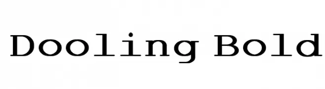
( Annie de la Vega )
A bold slab serif font with strong, block-like serifs and a robust appearance.
![Dooling Bold font caratteri gratis]() Scaricare 113 Downloads@WebFont
Scaricare 113 Downloads@WebFont -
( Fonts by a Neale Davidson - www.pixelsagas.com. Personal-use only. For commercial use please contact owner. )
A decorative, fantasy-inspired font with sharp, angular lines and intricate details.
![Barazhad font caratteri gratis]() Scaricare 113 Downloads@WebFont
Scaricare 113 Downloads@WebFont -
-
( Fonts by Daniel Zadorozny - www.iconian.com )
A bold, futuristic font with geometric shapes and a dynamic slant.
![Han Solo Leftalic font caratteri gratis]() Scaricare 113 Downloads@WebFont
Scaricare 113 Downloads@WebFont -
( Fonts by Andrew McCluskey - nalgames.com. Personal-use only. For commercial use please contact owner. )
A tall, narrow font with a modern, geometric design.
![Nonchalant Love font caratteri gratis]() Scaricare 113 Downloads@WebFont
Scaricare 113 Downloads@WebFont -
( Fonts by Kaman L )
A decorative font inspired by Mahjong tiles, featuring intricate patterns and cultural motifs.
![Hi Mahjong Regular font caratteri gratis]() Scaricare 113 Downloads@WebFont
Scaricare 113 Downloads@WebFont -
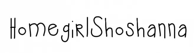
![HomegirlShoshanna font caratteri gratis]() Scaricare 113 Downloads@WebFont
Scaricare 113 Downloads@WebFont -
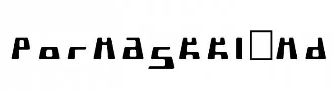
( Fonts by TarmSaft Font Factory - http://www.aska.nu/tarmsaft/ )
A bold, geometric font with a futuristic and edgy design.
![PormaskKlämd font caratteri gratis]() Scaricare 113 Downloads
Scaricare 113 Downloads
Quali sono i font più popolari adesso?
Poppins, Roboto, Montserrat, Open Sans e Lato sono molto usati per le forme pulite e l'ampia applicabilità — dall'identità di marca alle landing page e ai poster.
Quali font si usano spesso nei loghi?
Le sans serif geometriche (es. Poppins, famiglie in stile Gotham) sono scelte comuni per un branding pulito e scalabile. Per un tocco personale restano valide script e stili manoscritti. Abbina un display deciso per i titoli a un corpo testo neutro per riconoscibilità ed equilibrio.
Ogni quanto si aggiorna la lista?
Con regolarità, in base ai download e all'attività reale. Torna spesso per scoprire in anticipo le nuove preferite.
💡 Consiglio: aggiungi ai preferiti — le tendenze cambiano in fretta e i font top di oggi possono ispirare il rebranding di domani.