Benvenuto nelle Font Più Popolari — dove popolarità e qualità si incontrano. Qui trovi i font più scaricati e usati dell'anno. Se cerchi scelte sicure per logo, web o social, inizia da qui.
Ogni font top si distingue per equilibrio, leggibilità e versatilità. Troverai sans serif moderne, script eleganti, serif vintage e display minimalisti.
-
 Scaricare 557 Downloads@WebFont
 -
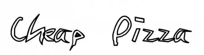
![Cheap Pizza font caratteri gratis]() Scaricare 557 Downloads@WebFont
Scaricare 557 Downloads@WebFont -
( Fonts by Kong Font )
A bold, playful font with a whimsical, retro aesthetic.
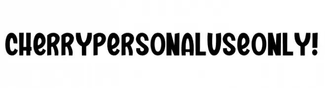
![Cherry PERSONAL USE ONLY! font caratteri gratis]() Scaricare 557 Downloads@WebFont
Scaricare 557 Downloads@WebFont -
( Fonts by Tom Kolter - www.ghostsofbigfoot.com )
A bold, high-contrast serif font with elongated, narrow characters and sharp serifs.
![Honest Merchant font caratteri gratis]() Scaricare 557 Downloads@WebFont
Scaricare 557 Downloads@WebFont -
( Fonts by Mr Fisk - Mike Larsson - fontorama.net )
A bold, distressed font with a hand-drawn, grunge aesthetic.
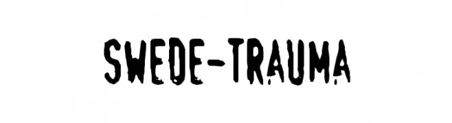
![Swede-Trauma font caratteri gratis]() Scaricare 557 Downloads@WebFont
Scaricare 557 Downloads@WebFont -
( Dimka.com - dimka.com/fonts )
A playful, handwritten font with smooth, rounded edges and consistent stroke width.
![Xarrovv font caratteri gratis]() Scaricare 557 Downloads@WebFont
Scaricare 557 Downloads@WebFont -
( Fonts by Cat.B - Agathe M.Joyce - Personal-use only. For commercial use please contact owner. )
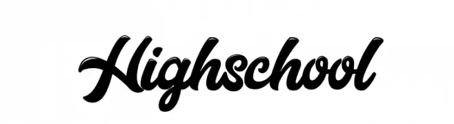
A bold, flowing script font with elegant, cursive letterforms.
![Highschool font caratteri gratis]() Scaricare 557 Downloads@WebFont
Scaricare 557 Downloads@WebFont -
( Fonts by CannotIntoSpaceFonts - KineticPlasma Fonts - Personal-use only. For commercial use please contact owner. )
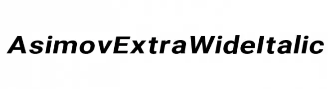
A bold, wide, and italic font with a modern and dynamic style.
![Asimov Extra Wide Italic font caratteri gratis]() Scaricare 557 Downloads@WebFont
Scaricare 557 Downloads@WebFont -
( Fonts by Holydie Studio - Personal-use only. For commercial use please contact owner. )
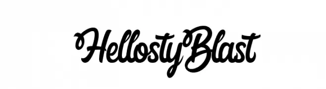
A bold, flowing script font with elegant curves and connected letters.
![Hellosty Blast font caratteri gratis]() Scaricare 557 Downloads@WebFont
Scaricare 557 Downloads@WebFont -
![Dinamika Medium font caratteri gratis]() Scaricare 557 Downloads@WebFont
Scaricare 557 Downloads@WebFont -
![Vantrel font caratteri gratis]() Scaricare 557 Downloads@WebFont
Scaricare 557 Downloads@WebFont -
( Fonts by Mans Greback - Personal-use only. For commercial use please contact owner. )
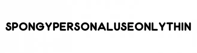
A playful, rounded font with bold, uniform strokes and smooth curves.
![Spongy PERSONAL USE ONLY Thin font caratteri gratis]() Scaricare 557 Downloads@WebFont
Scaricare 557 Downloads@WebFont -
( Fonts by Graham Meade - GemFonts )
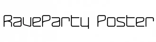
A modern, geometric font with uniform line thickness and rounded edges.
![RaveParty Poster font caratteri gratis]() Scaricare 557 Downloads@WebFont
Scaricare 557 Downloads@WebFont -
( Irina ModBlackmoon - modblackmoon.com/ )
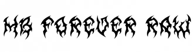
A bold, aggressive font with sharp, jagged edges and a tribal flame-like design.
![MB Forever Raw font caratteri gratis]() Scaricare 557 Downloads@WebFont
Scaricare 557 Downloads@WebFont -
( Fonts by Subectype & Orenari )
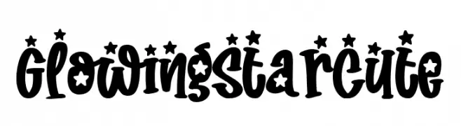
A playful, star-adorned font with bold, rounded characters.
![Glowing Star Cute font caratteri gratis]() Scaricare 557 Downloads@WebFont
Scaricare 557 Downloads@WebFont -
( Fonts by a Max Infeld - XEROGRAPHER FONTS - xerographer.blogspot.com . Personal-use only. For commercial use please contact owner. )
A bold, italicized font with a dynamic, wind-swept appearance.
![WindyMetro font caratteri gratis]() Scaricare 557 Downloads@WebFont
Scaricare 557 Downloads@WebFont -
![ArTarumianIshxan font caratteri gratis]() Scaricare 557 Downloads@WebFont
Scaricare 557 Downloads@WebFont -
![splatter font caratteri gratis]() Scaricare 557 Downloads@WebFont
Scaricare 557 Downloads@WebFont -
( Fonts by www.impallari.com )
A bold, cursive typeface with elegant, flowing connections and classic calligraphic style.
![Lobsterbeta8 font caratteri gratis]() Scaricare 557 Downloads@WebFont
Scaricare 557 Downloads@WebFont -
( Personal-use only. For commercial use please contact owner. )
A clean, modern sans-serif font with consistent stroke width and excellent readability.
![LaylaBasicArabic font caratteri gratis]() Scaricare 557 Downloads@WebFont
Scaricare 557 Downloads@WebFont -
( Fonts by Chank Co. - www.chank.com )
A bold, futuristic font with a unique outlined, three-dimensional style.
![AlienMushrooms font caratteri gratis]() Scaricare 557 Downloads@WebFont
Scaricare 557 Downloads@WebFont -
![Paper Johnny Eins font caratteri gratis]() Scaricare 557 Downloads@WebFont
Scaricare 557 Downloads@WebFont -
( Fonts by Nicola Williams )
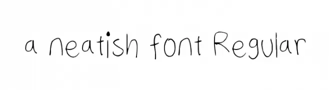
A playful, handwritten font with thin, uneven strokes and a casual style.
![a neatish font Regular font caratteri gratis]() Scaricare 556 Downloads@WebFont
Scaricare 556 Downloads@WebFont -
( Fonts by dot colon - Personal-use only. For commercial use please contact owner. )
A modern, ultra-light sans-serif font with clean lines and balanced spacing.
![Aileron UltraLight font caratteri gratis]() Scaricare 556 Downloads@WebFont
Scaricare 556 Downloads@WebFont -
![Tattoo Sailor font caratteri gratis]() Scaricare 556 Downloads@WebFont
Scaricare 556 Downloads@WebFont -
( Fonts by Benoit Sjoholm - www.benoitsjoholm.com - All my fonts are for sale )
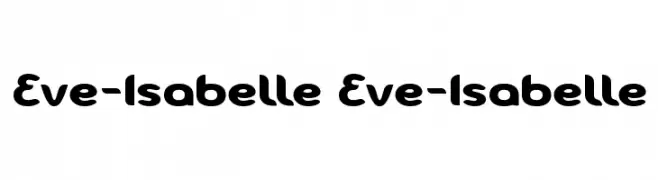
A bold, rounded font with smooth curves and a playful style.
![Eve-Isabelle Eve-Isabelle font caratteri gratis]() Scaricare 556 Downloads@WebFont
Scaricare 556 Downloads@WebFont -
( Fonts by Graham Meade - GemFonts )
A sleek, elongated oblique font with a modern and dynamic style.
![Tall Films Oblique font caratteri gratis]() Scaricare 556 Downloads@WebFont
Scaricare 556 Downloads@WebFont -
( ViactionType - Lukman Hidayat - www.myfonts.com/foundry/Viaction_Type/ )
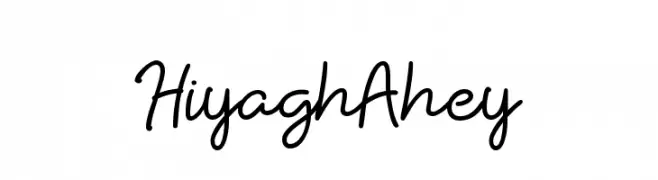
A playful, casual handwritten font with smooth, flowing lines.
![HiyaghAhey font caratteri gratis]() Scaricare 556 Downloads@WebFont
Scaricare 556 Downloads@WebFont -
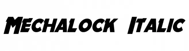
![Mechalock Italic font caratteri gratis]() Scaricare 556 Downloads@WebFont
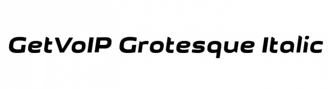
Scaricare 556 Downloads@WebFont -
![GetVoIP Grotesque Italic font caratteri gratis]() Scaricare 556 Downloads@WebFont
Scaricare 556 Downloads@WebFont -
( Fonts by Casady & Greene )
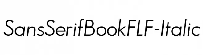
A modern, italic sans-serif font with clean lines and excellent readability.
![SansSerifBookFLF-Italic font caratteri gratis]() Scaricare 556 Downloads@WebFont
Scaricare 556 Downloads@WebFont -
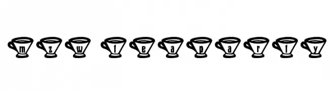
![mzw teaparty font caratteri gratis]() Scaricare 556 Downloads@WebFont
Scaricare 556 Downloads@WebFont -
![Tengkorak_COE font caratteri gratis]() Scaricare 556 Downloads@WebFont
Scaricare 556 Downloads@WebFont -
( www.hanodedfonts.com )
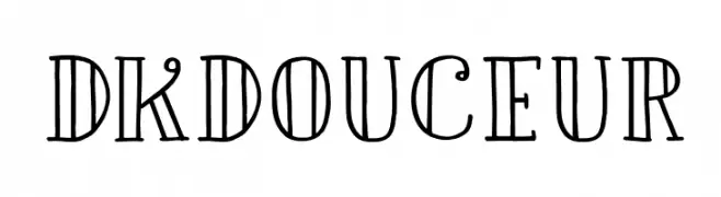
A whimsical and decorative font with vintage-modern elements and playful serifs.
![DKDouceur font caratteri gratis]() Scaricare 556 Downloads@WebFont
Scaricare 556 Downloads@WebFont -
( Fonts by Alex Tomlinson - Skyhaven Fonts - shfonts.com )
A modern, clean sans-serif font with geometric letterforms and uniform stroke width.
![TheRealWorld-Regular font caratteri gratis]() Scaricare 556 Downloads@WebFont
Scaricare 556 Downloads@WebFont


Quali sono i font più popolari adesso?
Poppins, Roboto, Montserrat, Open Sans e Lato sono molto usati per le forme pulite e l'ampia applicabilità — dall'identità di marca alle landing page e ai poster.
Quali font si usano spesso nei loghi?
Le sans serif geometriche (es. Poppins, famiglie in stile Gotham) sono scelte comuni per un branding pulito e scalabile. Per un tocco personale restano valide script e stili manoscritti. Abbina un display deciso per i titoli a un corpo testo neutro per riconoscibilità ed equilibrio.
Ogni quanto si aggiorna la lista?
Con regolarità, in base ai download e all'attività reale. Torna spesso per scoprire in anticipo le nuove preferite.
💡 Consiglio: aggiungi ai preferiti — le tendenze cambiano in fretta e i font top di oggi possono ispirare il rebranding di domani.