Benvenuto nelle Font Più Popolari — dove popolarità e qualità si incontrano. Qui trovi i font più scaricati e usati dell'anno. Se cerchi scelte sicure per logo, web o social, inizia da qui.
Ogni font top si distingue per equilibrio, leggibilità e versatilità. Troverai sans serif moderne, script eleganti, serif vintage e display minimalisti.
-
( Fonts by Apostrophic Lab )
A bold, outlined font with a modern, sporty aesthetic.
 Scaricare 111 Downloads@WebFont
 -
![Samurai Terrapin Super-Italic font caratteri gratis]() Scaricare 111 Downloads@WebFont
Scaricare 111 Downloads@WebFont -
![SplashBlobsnDots font caratteri gratis]() Scaricare 111 Downloads@WebFont
Scaricare 111 Downloads@WebFont -
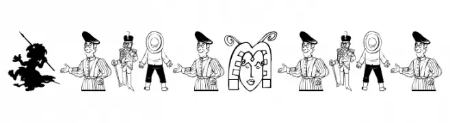
( Fonts by Manfred Klein. Free for private and charity use. Free for commercial with donation to organizations )
Cartoonish, illustrated font with each letter as a unique character.
![LeuteHeute font caratteri gratis]() Scaricare 111 Downloads@WebFont
Scaricare 111 Downloads@WebFont -
( Fonts by bob istheowl http://luc.devroye.org/bobistheowl.html )
A display font made up of bold, graphic street art illustrations.
![ObeyEssence font caratteri gratis]() Scaricare 111 Downloads@WebFont
Scaricare 111 Downloads@WebFont -
-
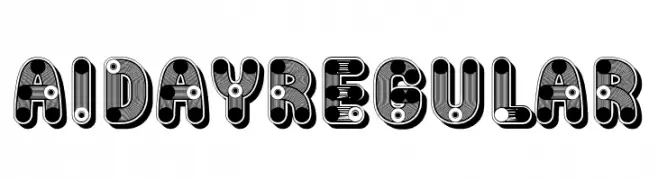
( Fonts by Vladimir Nikolic )
A bold, playful font with layered, colorful designs and rounded edges.
![Aiday Regular font caratteri gratis]() Scaricare 111 Downloads@WebFont
Scaricare 111 Downloads@WebFont -
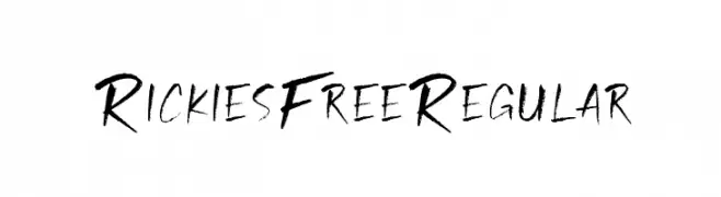
( Craft Supply Co. - creativemarket.com/craftsupplyco )
A bold, expressive handwritten font with dynamic strokes.
![Rickies Free Regular font caratteri gratis]() Scaricare 111 Downloads@WebFont
Scaricare 111 Downloads@WebFont -
Caratteri di Sabrcreative. For commercial use please contact the owner.
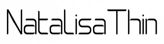
( Natalisa )
A thin, geometric font with a modern and minimalist design.
![Natalisa Thin font caratteri gratis]() Scaricare 111 Downloads@WebFont
Scaricare 111 Downloads@WebFont -
( Fonts by Graphix Line Studio - Personal-use only. For commercial use please contact owner. )
A lively, flowing script font with elegant curves and a handwritten style.
![Sunglow font caratteri gratis]() Scaricare 111 Downloads@WebFont
Scaricare 111 Downloads@WebFont -
( Fonts by Manfred Klein. Free for private and charity use. Free for commercial with donation to organizations )
Hand-sketched, illustrative font with figures in motion.
![SketchedMen font caratteri gratis]() Scaricare 111 Downloads@WebFont
Scaricare 111 Downloads@WebFont


Quali sono i font più popolari adesso?
Poppins, Roboto, Montserrat, Open Sans e Lato sono molto usati per le forme pulite e l'ampia applicabilità — dall'identità di marca alle landing page e ai poster.
Quali font si usano spesso nei loghi?
Le sans serif geometriche (es. Poppins, famiglie in stile Gotham) sono scelte comuni per un branding pulito e scalabile. Per un tocco personale restano valide script e stili manoscritti. Abbina un display deciso per i titoli a un corpo testo neutro per riconoscibilità ed equilibrio.
Ogni quanto si aggiorna la lista?
Con regolarità, in base ai download e all'attività reale. Torna spesso per scoprire in anticipo le nuove preferite.
💡 Consiglio: aggiungi ai preferiti — le tendenze cambiano in fretta e i font top di oggi possono ispirare il rebranding di domani.