Benvenuto nelle Font Più Popolari — dove popolarità e qualità si incontrano. Qui trovi i font più scaricati e usati dell'anno. Se cerchi scelte sicure per logo, web o social, inizia da qui.
Ogni font top si distingue per equilibrio, leggibilità e versatilità. Troverai sans serif moderne, script eleganti, serif vintage e display minimalisti.
-
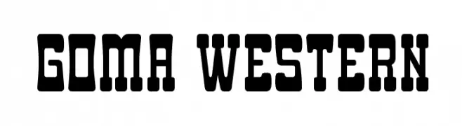
( Fonts by Goma Shin - www.geocities.jp/gomarice_font/ - Personal-use only. For commercial use please contact owner. )
A bold, Western-style font with blocky, rugged characters.
 Scaricare 110 Downloads@WebFont
 -
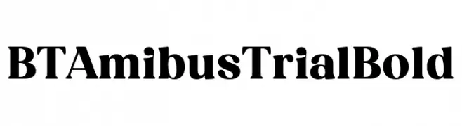
( Fonts by BeauType Studio - beautique.vn - Personal-use only. For commercial use please contact owner. )
A bold serif font with strong strokes and tight character spacing, ideal for impactful headlines.
![BT Amibus Trial Bold font caratteri gratis]() Scaricare 110 Downloads@WebFont
Scaricare 110 Downloads@WebFont -
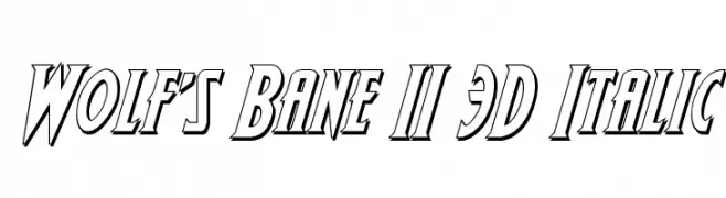
( Fonts by Daniel Zadorozny - www.iconian.com )
A bold, 3D italic font with dynamic angles and shadow effects.
![Wolf's Bane II 3D Italic font caratteri gratis]() Scaricare 110 Downloads@WebFont
Scaricare 110 Downloads@WebFont -
( Fonts by Brixdee - jack-oatley.com - Personal-use only. For commercial use please contact owner. )
A bold, pixelated font inspired by classic 8-bit video games.
![Pixel Inversions Regular font caratteri gratis]() Scaricare 110 Downloads@WebFont
Scaricare 110 Downloads@WebFont -
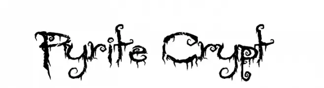
( Fonts by Andrew Hart - dirt2.com )
A decorative font with a dripping, organic style, perfect for bold, eye-catching designs.
![Pyrite Crypt font caratteri gratis]() Scaricare 110 Downloads@WebFont
Scaricare 110 Downloads@WebFont -
-
![Varmint Normal font caratteri gratis]() Scaricare 110 Downloads@WebFont
Scaricare 110 Downloads@WebFont -
( Fonts by Vladimir Nikolic )
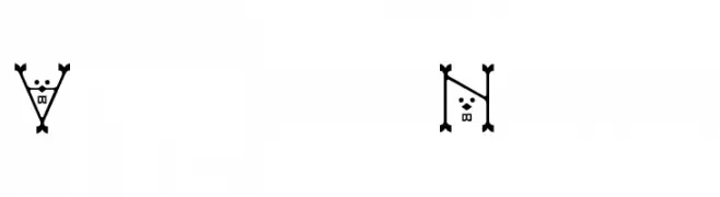
A whimsical and playful font with cartoonish creature-like characters.
![Skepping Regular font caratteri gratis]() Scaricare 110 Downloads@WebFont
Scaricare 110 Downloads@WebFont -
( Fonts by Elbanadha Creative - Personal-use only. For commercial use please contact owner. )
A playful, rounded font with a hand-drawn, whimsical style.
![KIDSPLAY DEMO font caratteri gratis]() Scaricare 110 Downloads@WebFont
Scaricare 110 Downloads@WebFont -
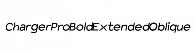
![Charger Pro Bold Extended Oblique font caratteri gratis]() Scaricare 110 Downloads@WebFont
Scaricare 110 Downloads@WebFont -
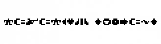
![ROTORcap Symbols font caratteri gratis]() Scaricare 110 Downloads@WebFont
Scaricare 110 Downloads@WebFont


Quali sono i font più popolari adesso?
Poppins, Roboto, Montserrat, Open Sans e Lato sono molto usati per le forme pulite e l'ampia applicabilità — dall'identità di marca alle landing page e ai poster.
Quali font si usano spesso nei loghi?
Le sans serif geometriche (es. Poppins, famiglie in stile Gotham) sono scelte comuni per un branding pulito e scalabile. Per un tocco personale restano valide script e stili manoscritti. Abbina un display deciso per i titoli a un corpo testo neutro per riconoscibilità ed equilibrio.
Ogni quanto si aggiorna la lista?
Con regolarità, in base ai download e all'attività reale. Torna spesso per scoprire in anticipo le nuove preferite.
💡 Consiglio: aggiungi ai preferiti — le tendenze cambiano in fretta e i font top di oggi possono ispirare il rebranding di domani.