Benvenuto nelle Font Più Popolari — dove popolarità e qualità si incontrano. Qui trovi i font più scaricati e usati dell'anno. Se cerchi scelte sicure per logo, web o social, inizia da qui.
Ogni font top si distingue per equilibrio, leggibilità e versatilità. Troverai sans serif moderne, script eleganti, serif vintage e display minimalisti.
-
 Scaricare 535 Downloads@WebFont
 -
( Fonts by Masato Shimojima - Personal-use only. For commercial use please contact owner. )
A playful, bold font with rounded edges and a hand-drawn feel.
![Celon font caratteri gratis]() Scaricare 535 Downloads@WebFont
Scaricare 535 Downloads@WebFont -
( Fonts by RaffaSyad Studio - www.creativefabrica.com/designer/r-studio/ - Personal-use only. For commercial use please contact owner. )
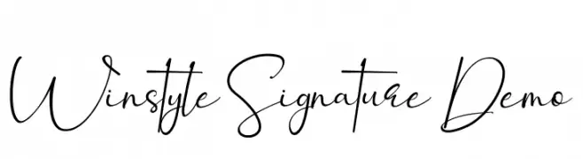
An elegant, cursive font with flowing lines and graceful curves.
![Winstyle Signature Demo font caratteri gratis]() Scaricare 535 Downloads@WebFont
Scaricare 535 Downloads@WebFont -
( Fonts by www.blambot.com )
A bold, heavy font with a distressed, rugged appearance.
![CryptCreep Heavy BB font caratteri gratis]() Scaricare 535 Downloads@WebFont
Scaricare 535 Downloads@WebFont -
( Fonts by Andreas Hofeld - www.fontgrube.de )
A classic serif font with elegant curves and refined details.
![Paternoster AH font caratteri gratis]() Scaricare 535 Downloads
Scaricare 535 Downloads -
-
( Fonts by Nick Curtis - www.nicksfonts.com )
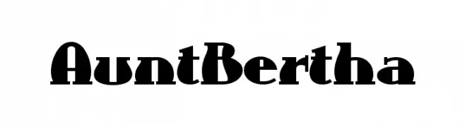
A bold, decorative font with geometric cutouts and striking design.
![AuntBertha font caratteri gratis]() Scaricare 535 Downloads
Scaricare 535 Downloads -
( Personal-use only. For commercial use please contact owner. )
A bold serif font with a classic and slightly whimsical style.
![Coelacanth Subheading Bold font caratteri gratis]() Scaricare 535 Downloads@WebFont
Scaricare 535 Downloads@WebFont -
( Fonts by Jen Jones )
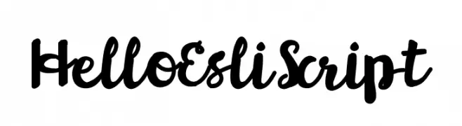
A bold, playful script font with a handwritten style.
![HelloEsliScript font caratteri gratis]() Scaricare 535 Downloads@WebFont
Scaricare 535 Downloads@WebFont -
( Fonts by Studio Floris Voorveld www.florisvoorveld.com. Personal-use only. For commercial use please contact owner. )
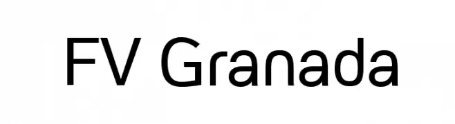
A modern, geometric sans-serif font with clean lines and excellent readability.
![FV Granada font caratteri gratis]() Scaricare 535 Downloads@WebFont
Scaricare 535 Downloads@WebFont -
![Tinet font caratteri gratis]() Scaricare 535 Downloads@WebFont
Scaricare 535 Downloads@WebFont -
( Fonts by Sam Wang )
A playful, casual script font with a handwritten style.
![LibbyScript font caratteri gratis]() Scaricare 535 Downloads@WebFont
Scaricare 535 Downloads@WebFont -
( Fonts by Manfred Klein - manfred-klein.ina-mar.com )
A classic Blackletter font with bold, ornate characters and high contrast strokes.
![FlyingHollander font caratteri gratis]() Scaricare 535 Downloads@WebFont
Scaricare 535 Downloads@WebFont -
![Florabet font caratteri gratis]() Scaricare 535 Downloads@WebFont
Scaricare 535 Downloads@WebFont -
![pixelFJ8pt1 Normal font caratteri gratis]() Scaricare 535 Downloads@WebFont
Scaricare 535 Downloads@WebFont -
( Fonts by Jacob Fisher - www.pizzadude.dk )
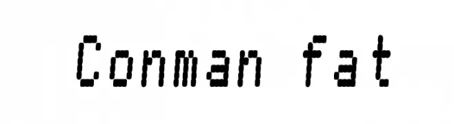
A pixelated, digital-style font with a retro, blocky appearance.
![Conman fat font caratteri gratis]() Scaricare 535 Downloads@WebFont
Scaricare 535 Downloads@WebFont -
( Fonts by ShyFonts )
A playful, cartoon-like font with rounded, hand-drawn characters.
![SF Toontime Extended font caratteri gratis]() Scaricare 535 Downloads@WebFont
Scaricare 535 Downloads@WebFont -
( Fonts by weknow - Wino S Kadir )
A bold, modern geometric font ideal for impactful headlines and branding.
![WEST JAVA font caratteri gratis]() Scaricare 535 Downloads@WebFont
Scaricare 535 Downloads@WebFont -
( Fonts by a Neale Davidson - www.pixelsagas.com. Personal-use only. For commercial use please contact owner. )
A bold, italicized font with a modern and dynamic style.
![Schnaubelt Bold Italic font caratteri gratis]() Scaricare 535 Downloads@WebFont
Scaricare 535 Downloads@WebFont -
![HollywoodHills font caratteri gratis]() Scaricare 535 Downloads@WebFont
Scaricare 535 Downloads@WebFont -
( Twicolabs Fontdation - Fahrizal Tawakkal - fontdation.com )
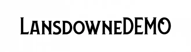
A bold serif font with sharp, angular serifs and a modern yet classic style.
![LansdowneDEMO font caratteri gratis]() Scaricare 535 Downloads@WebFont
Scaricare 535 Downloads@WebFont -
( Fonts by Darcy Baldwin - darcybaldwin.com. Free for personal use only )
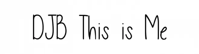
A playful, handwritten font with tall, narrow letters and a casual style.
![DJB This is Me font caratteri gratis]() Scaricare 535 Downloads@WebFont
Scaricare 535 Downloads@WebFont -
( Copyright 2018 The Major Mono Project Authors (https://github.com/googlefonts/majormono) )
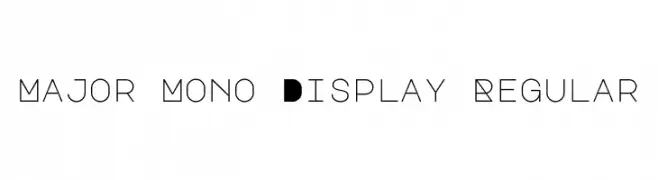
A geometric, monospaced font with bold, decorative uppercase letters and clean lowercase characters.
![Major Mono Display Regular font caratteri gratis]() Scaricare 535 Downloads@WebFont
Scaricare 535 Downloads@WebFont -
![The Classy Dots font caratteri gratis]() Scaricare 535 Downloads@WebFont
Scaricare 535 Downloads@WebFont -
( Fonts by www.typodermicfonts.com - Ray Larabie )
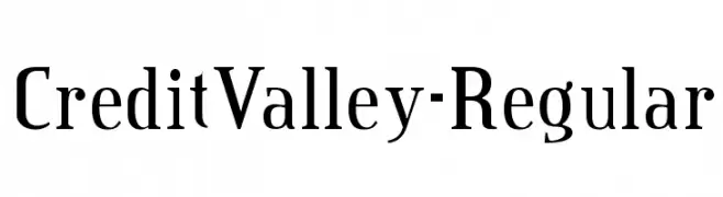
A classic serif font with a modern touch, offering elegance and versatility.
![CreditValley-Regular font caratteri gratis]() Scaricare 535 Downloads@WebFont
Scaricare 535 Downloads@WebFont -
( Fonts by Khurasan )
A bold, playful handwritten font with rounded, energetic characters.
![Socake font caratteri gratis]() Scaricare 535 Downloads@WebFont
Scaricare 535 Downloads@WebFont -
( Fonts by Thirtypath - Personal-use only. For commercial use please contact owner. )
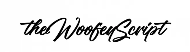
A dynamic and elegant script font with flowing, interconnected characters.
![theWoofeyScript font caratteri gratis]() Scaricare 535 Downloads@WebFont
Scaricare 535 Downloads@WebFont -
( Fonts by Darko Kuzmanović )
A playful, rounded font with smooth curves and a friendly appearance.
![Loosey Sans font caratteri gratis]() Scaricare 535 Downloads@WebFont
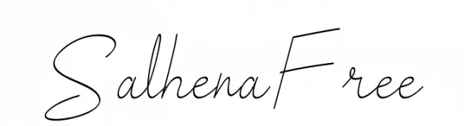
Scaricare 535 Downloads@WebFont -
![Salhena Free font caratteri gratis]() Scaricare 535 Downloads@WebFont
Scaricare 535 Downloads@WebFont -
![PT Lullaby font caratteri gratis]() Scaricare 535 Downloads@WebFont
Scaricare 535 Downloads@WebFont -
( Fonts by www.iconian.com - Personal-use only. For commercial use please contact owner. )
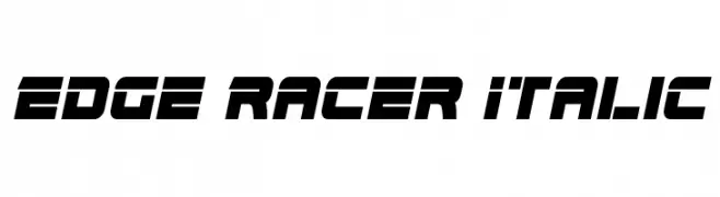
A bold, italicized font with a futuristic and dynamic style.
![Edge Racer Italic font caratteri gratis]() Scaricare 535 Downloads@WebFont
Scaricare 535 Downloads@WebFont -
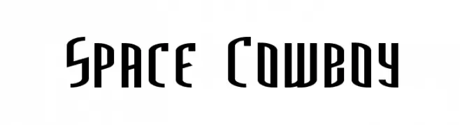
( Fonts by Marty Bee - www.martybee.com )
A futuristic, bold font with tall, narrow letterforms and sharp angles.
![Space Cowboy font caratteri gratis]() Scaricare 535 Downloads@WebFont
Scaricare 535 Downloads@WebFont -
![Club Fluffy font caratteri gratis]() Scaricare 535 Downloads@WebFont
Scaricare 535 Downloads@WebFont -
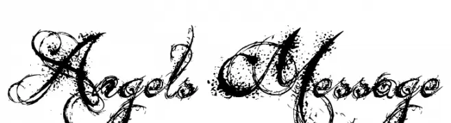
( Fonts by Jonathan Harris - www.tattoowoo.com )
An intricate, decorative font with swirling, vine-like embellishments.
![Angels Message font caratteri gratis]() Scaricare 535 Downloads@WebFont
Scaricare 535 Downloads@WebFont -
( Fonts by 4th february - Personal-use only. For commercial use please contact owner. )
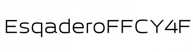
A modern, geometric sans-serif font with balanced spacing and clear legibility.
![EsqaderoFFCY4F font caratteri gratis]() Scaricare 535 Downloads@WebFont
Scaricare 535 Downloads@WebFont -
( Fonts by Daniel Zadorozny - www.iconian.com - Free for personal use )
A bold, geometric, and futuristic font with a condensed structure.
![Gemina Condensed font caratteri gratis]() Scaricare 535 Downloads@WebFont
Scaricare 535 Downloads@WebFont


Quali sono i font più popolari adesso?
Poppins, Roboto, Montserrat, Open Sans e Lato sono molto usati per le forme pulite e l'ampia applicabilità — dall'identità di marca alle landing page e ai poster.
Quali font si usano spesso nei loghi?
Le sans serif geometriche (es. Poppins, famiglie in stile Gotham) sono scelte comuni per un branding pulito e scalabile. Per un tocco personale restano valide script e stili manoscritti. Abbina un display deciso per i titoli a un corpo testo neutro per riconoscibilità ed equilibrio.
Ogni quanto si aggiorna la lista?
Con regolarità, in base ai download e all'attività reale. Torna spesso per scoprire in anticipo le nuove preferite.
💡 Consiglio: aggiungi ai preferiti — le tendenze cambiano in fretta e i font top di oggi possono ispirare il rebranding di domani.