Benvenuto nelle Font Più Popolari — dove popolarità e qualità si incontrano. Qui trovi i font più scaricati e usati dell'anno. Se cerchi scelte sicure per logo, web o social, inizia da qui.
Ogni font top si distingue per equilibrio, leggibilità e versatilità. Troverai sans serif moderne, script eleganti, serif vintage e display minimalisti.
-
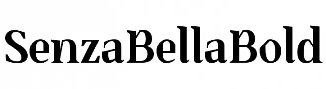
( Ryan Williamson )
A bold serif font with sharp serifs and a modern classic style.
 Scaricare 109 Downloads@WebFont
 -
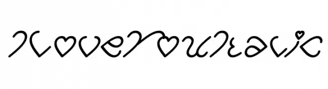
( weknow - Wino S Kadir - www.creativefabrica.com/designer/weknow/ )
A whimsical, heart-themed font with smooth, flowing strokes and medium weight.
![I Love You Italic font caratteri gratis]() Scaricare 109 Downloads@WebFont
Scaricare 109 Downloads@WebFont -
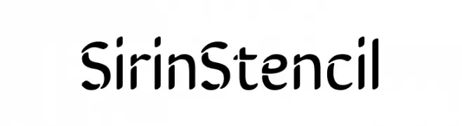
![SirinStencil font caratteri gratis]() Scaricare 109 Downloads@WebFont
Scaricare 109 Downloads@WebFont -
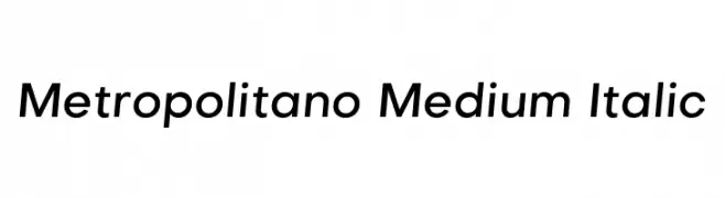
( Fonts by Fonts by Alex Slobzheninov & Chris M. Simpson / Changes by Cristiano Sobral - Personal-use only. For commercial use please contact owner. )
A sleek, modern sans-serif typeface with a slight italic slant and medium weight.
![Metropolitano Medium Italic font caratteri gratis]() Scaricare 109 Downloads@WebFont
Scaricare 109 Downloads@WebFont -
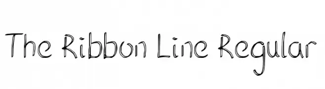
( Fonts by Brixdee - jack-oatley.com - Personal-use only. For commercial use please contact owner. )
A playful, hand-drawn font with a ribbon-like, whimsical style.
![The Ribbon Line Regular font caratteri gratis]() Scaricare 109 Downloads@WebFont
Scaricare 109 Downloads@WebFont -
-
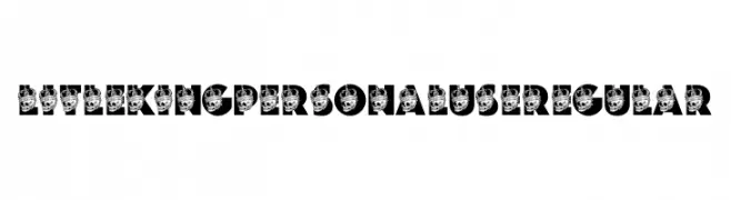
( Fonts by Billy Argel Fonts ® )
A bold, decorative font with a skull and crown motif, ideal for striking designs.
![LITLE KING PERSONAL USE Regular font caratteri gratis]() Scaricare 109 Downloads@WebFont
Scaricare 109 Downloads@WebFont -
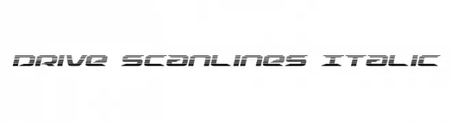
( Fonts by Daniel Zadorozny - www.iconian.com )
A futuristic, italic font with a scanline effect and sharp, clean lines.
![Drive Scanlines Italic font caratteri gratis]() Scaricare 109 Downloads@WebFont
Scaricare 109 Downloads@WebFont -
( Fonts by Iconian Fonts )
A bold, condensed, and italic font with a dramatic and energetic style.
![Creepy Crawlers Condensed Italic font caratteri gratis]() Scaricare 109 Downloads@WebFont
Scaricare 109 Downloads@WebFont -
![CiSf OpenHand Bold Extended font caratteri gratis]() Scaricare 109 Downloads@WebFont
Scaricare 109 Downloads@WebFont -
( Fonts by Kat`s Fun Fonts - Personal-use only. For commercial use please contact owner. )
A playful font with letters emerging from cloud-like shapes, perfect for fun and creative projects.
![KR Shake font caratteri gratis]() Scaricare 109 Downloads@WebFont
Scaricare 109 Downloads@WebFont


Quali sono i font più popolari adesso?
Poppins, Roboto, Montserrat, Open Sans e Lato sono molto usati per le forme pulite e l'ampia applicabilità — dall'identità di marca alle landing page e ai poster.
Quali font si usano spesso nei loghi?
Le sans serif geometriche (es. Poppins, famiglie in stile Gotham) sono scelte comuni per un branding pulito e scalabile. Per un tocco personale restano valide script e stili manoscritti. Abbina un display deciso per i titoli a un corpo testo neutro per riconoscibilità ed equilibrio.
Ogni quanto si aggiorna la lista?
Con regolarità, in base ai download e all'attività reale. Torna spesso per scoprire in anticipo le nuove preferite.
💡 Consiglio: aggiungi ai preferiti — le tendenze cambiano in fretta e i font top di oggi possono ispirare il rebranding di domani.