Benvenuto nelle Font Più Popolari — dove popolarità e qualità si incontrano. Qui trovi i font più scaricati e usati dell'anno. Se cerchi scelte sicure per logo, web o social, inizia da qui.
Ogni font top si distingue per equilibrio, leggibilità e versatilità. Troverai sans serif moderne, script eleganti, serif vintage e display minimalisti.
-
( Fonts by Chris Vile - fontmonger.com - Personal-use only. For commercial use please contact owner. )
A bold, angular font with sharp edges and a modern, geometric style.
 Scaricare 113 Downloads@WebFont
 -
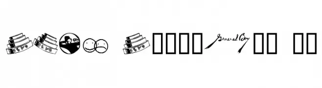
( Fonts by Manfred Klein. Free for private and charity use. Free for commercial with donation to organizations )
Decorative pictogram font with hand signs, symbols, and motifs in black-and-white squares.
![BlackWhiteSigns font caratteri gratis]() Scaricare 113 Downloads@WebFont
Scaricare 113 Downloads@WebFont -
![SF Plasmatica Shaded Italic font caratteri gratis]() Scaricare 113 Downloads@WebFont
Scaricare 113 Downloads@WebFont -
( Fonts by ingoFonts. http://www.ingofonts.de )
A pixelated, retro-style font with a blocky, digital appearance.
![DePixel-Illegiblereduced font caratteri gratis]() Scaricare 113 Downloads@WebFont
Scaricare 113 Downloads@WebFont -
( Fonts by www.houseoflime.com )
An ornate, decorative font with intricate floral patterns and a Gothic style.
![German Caps font caratteri gratis]() Scaricare 113 Downloads@WebFont
Scaricare 113 Downloads@WebFont -
-
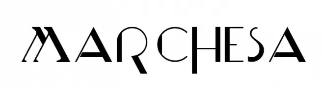
( Fonts by skomii - Personal-use only. For commercial use please contact owner. )
A modern serif font with sharp angles and geometric elements.
![Marchesa font caratteri gratis]() Scaricare 113 Downloads@WebFont
Scaricare 113 Downloads@WebFont -
![DEVO Dingbats 10 font caratteri gratis]() Scaricare 113 Downloads@WebFont
Scaricare 113 Downloads@WebFont -
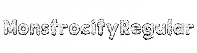
( Esmeralda Mejia - creativemarket.com/esmeralda.mej%C3%ADa )
A bold, textured font with a playful, monstrous design.
![Monstrocity Regular font caratteri gratis]() Scaricare 113 Downloads@WebFont
Scaricare 113 Downloads@WebFont -
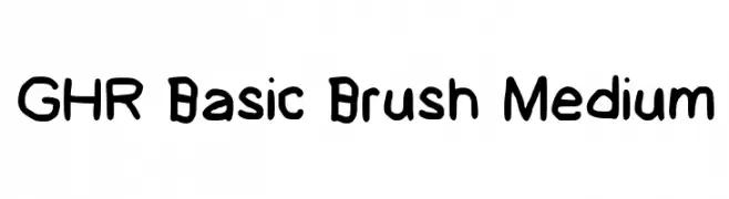
( GeelynEdits - plus.google.com/u/0/108461348931992643310/ )
A playful, brush-style font with rounded, hand-drawn strokes.
![GHR Basic Brush Medium font caratteri gratis]() Scaricare 113 Downloads@WebFont
Scaricare 113 Downloads@WebFont -
( Fonts by Lekearls )
A playful, handwritten-style font with a casual and friendly appearance.
![Kindergarten Regular font caratteri gratis]() Scaricare 113 Downloads@WebFont
Scaricare 113 Downloads@WebFont

Quali sono i font più popolari adesso?
Poppins, Roboto, Montserrat, Open Sans e Lato sono molto usati per le forme pulite e l'ampia applicabilità — dall'identità di marca alle landing page e ai poster.
Quali font si usano spesso nei loghi?
Le sans serif geometriche (es. Poppins, famiglie in stile Gotham) sono scelte comuni per un branding pulito e scalabile. Per un tocco personale restano valide script e stili manoscritti. Abbina un display deciso per i titoli a un corpo testo neutro per riconoscibilità ed equilibrio.
Ogni quanto si aggiorna la lista?
Con regolarità, in base ai download e all'attività reale. Torna spesso per scoprire in anticipo le nuove preferite.
💡 Consiglio: aggiungi ai preferiti — le tendenze cambiano in fretta e i font top di oggi possono ispirare il rebranding di domani.