Benvenuto nelle Font Più Popolari — dove popolarità e qualità si incontrano. Qui trovi i font più scaricati e usati dell'anno. Se cerchi scelte sicure per logo, web o social, inizia da qui.
Ogni font top si distingue per equilibrio, leggibilità e versatilità. Troverai sans serif moderne, script eleganti, serif vintage e display minimalisti.
-
( Fonts by Des Gomez )
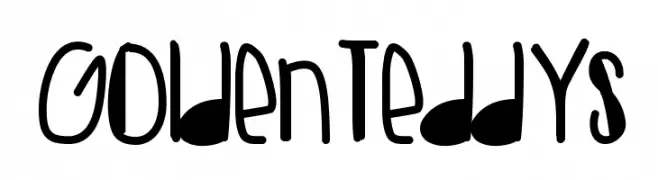
A playful, hand-drawn font with bold, rounded characters and whimsical symbols.
 Scaricare 108 Downloads@WebFont
 -
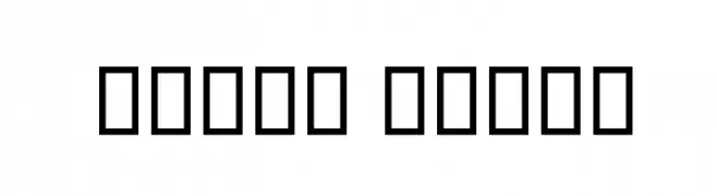
( گالری فانت فارسی پژوهش آريانا - only compatible with Farsi and Arabic )
A bold, modern font with uniform stroke width and strong presence.
![Print Black font caratteri gratis]() Scaricare 108 Downloads@WebFont
Scaricare 108 Downloads@WebFont -
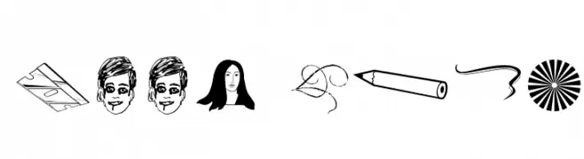
( Fonts by Blue Vinyl - Jess Latham - www.bvfonts.com )
Eclectic hand-drawn dingbat font with playful icons and symbols.
![Kool Ding font caratteri gratis]() Scaricare 108 Downloads@WebFont
Scaricare 108 Downloads@WebFont -
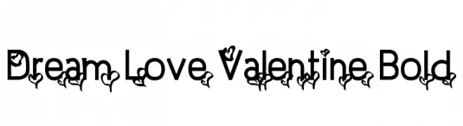
( Fonts by a Typeface Leone - www.tipografialeone.net. Personal-use only. For commercial use please contact owner. )
A bold, decorative font with heart motifs for a romantic and playful style.
![Dream Love Valentine Bold font caratteri gratis]() Scaricare 108 Downloads@WebFont
Scaricare 108 Downloads@WebFont -
( Fonts by Ikrar Bey Khubaib - Personal-use only. For commercial use please contact owner. )
A bold, brush-style script font with a playful and dynamic character.
![Somebody font caratteri gratis]() Scaricare 108 Downloads@WebFont
Scaricare 108 Downloads@WebFont -
-
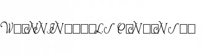
( Fonts by Paul Lloyd )
An elegant, condensed script font with ornate uppercase letters.
![Wrenn Initials Condensed font caratteri gratis]() Scaricare 108 Downloads@WebFont
Scaricare 108 Downloads@WebFont -
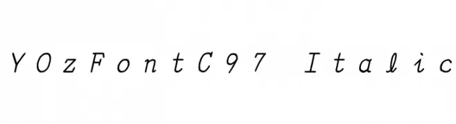
![YOzFontC97 Italic font caratteri gratis]() Scaricare 108 Downloads@WebFont
Scaricare 108 Downloads@WebFont -
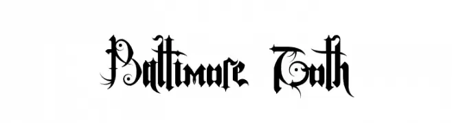
( Lanark - Kurt Tesnau - strangegeometry.com )
An ornate Gothic font with intricate details and decorative flourishes.
![Baltimore Goth font caratteri gratis]() Scaricare 108 Downloads@WebFont
Scaricare 108 Downloads@WebFont -
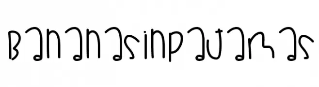
( Fonts by Des Gomez )
A playful, handwritten font with a casual and friendly style.
![BananasInPajamas font caratteri gratis]() Scaricare 108 Downloads@WebFont
Scaricare 108 Downloads@WebFont -
![YOzFontCP97 Bold Italic font caratteri gratis]() Scaricare 108 Downloads@WebFont
Scaricare 108 Downloads@WebFont

Quali sono i font più popolari adesso?
Poppins, Roboto, Montserrat, Open Sans e Lato sono molto usati per le forme pulite e l'ampia applicabilità — dall'identità di marca alle landing page e ai poster.
Quali font si usano spesso nei loghi?
Le sans serif geometriche (es. Poppins, famiglie in stile Gotham) sono scelte comuni per un branding pulito e scalabile. Per un tocco personale restano valide script e stili manoscritti. Abbina un display deciso per i titoli a un corpo testo neutro per riconoscibilità ed equilibrio.
Ogni quanto si aggiorna la lista?
Con regolarità, in base ai download e all'attività reale. Torna spesso per scoprire in anticipo le nuove preferite.
💡 Consiglio: aggiungi ai preferiti — le tendenze cambiano in fretta e i font top di oggi possono ispirare il rebranding di domani.