Benvenuto nelle Font Più Popolari — dove popolarità e qualità si incontrano. Qui trovi i font più scaricati e usati dell'anno. Se cerchi scelte sicure per logo, web o social, inizia da qui.
Ogni font top si distingue per equilibrio, leggibilità e versatilità. Troverai sans serif moderne, script eleganti, serif vintage e display minimalisti.
-
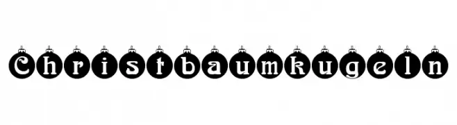
( Fonts by Dieter Steffmann )
A festive, ornament-themed font ideal for holiday designs.
 Scaricare 541 Downloads@WebFont
 -
( Fonts by Yusa Studio )
Playful, bold handwritten font.
![Hellobean font caratteri gratis]() Scaricare 541 Downloads@WebFont
Scaricare 541 Downloads@WebFont -
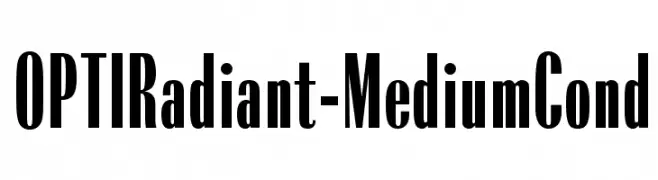
( Fonts by Castcraft Software - OPTI Fonts Archive - opti.netii.net - Personal-use only. For commercial use please contact owner. )
A bold, condensed font with high contrast and a modern, structured style.
![OPTIRadiant-MediumCond font caratteri gratis]() Scaricare 541 Downloads@WebFont
Scaricare 541 Downloads@WebFont -
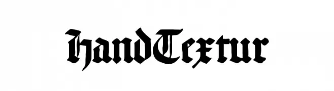
( Fonts by www.peter-wiegel.de. Personal-use only. For commercial use please contact owner. )
A bold, classic blackletter font with intricate and dramatic strokes.
![HandTextur font caratteri gratis]() Scaricare 541 Downloads@WebFont
Scaricare 541 Downloads@WebFont -
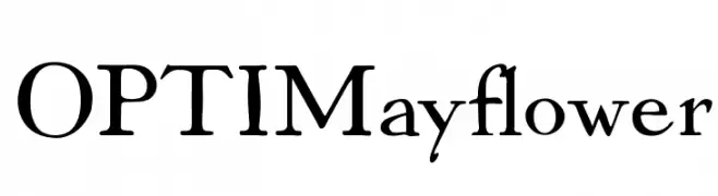
( Fonts by Castcraft Software - opti.netii.net - check the website before use )
A classic serif font with elegant curves and a refined, sophisticated appearance.
![OPTIMayflower font caratteri gratis]() Scaricare 541 Downloads@WebFont
Scaricare 541 Downloads@WebFont -
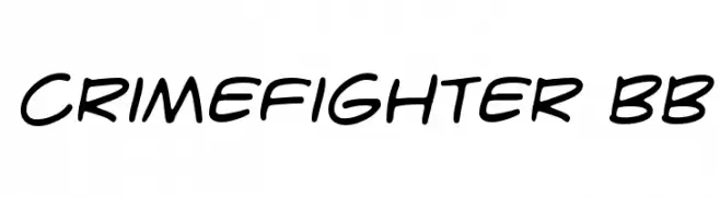
( Fonts by www.blambot.com )
A bold, handwritten-style font with smooth, fluid strokes.
![CrimeFighter BB font caratteri gratis]() Scaricare 541 Downloads@WebFont
Scaricare 541 Downloads@WebFont -
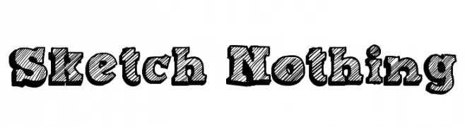
( Fonts by Galdino Otten - galdinootten.com )
A bold, sketch-style font with a hand-drawn, textured appearance.
![Sketch Nothing font caratteri gratis]() Scaricare 541 Downloads@WebFont
Scaricare 541 Downloads@WebFont -
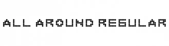
( behance.net/baldivieso )
A modern, dot-based font with a playful and digital aesthetic.
![All Around Regular font caratteri gratis]() Scaricare 541 Downloads@WebFont
Scaricare 541 Downloads@WebFont -
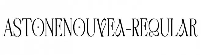
Caratteri di gatype. For commercial use please contact the owner.
( Free for personal use )
An elegant serif typeface with high contrast and Art Nouveau influences.
![AstoneNouvea-Regular font caratteri gratis]() Scaricare 541 Downloads@WebFont
Scaricare 541 Downloads@WebFont -
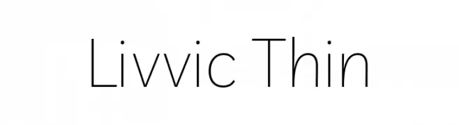
( Copyright 2019 The Livvic Project Authors (https://github.com/Fonthausen/Livvic) )
A modern, thin sans-serif font with a clean and minimalist design.
![Livvic Thin font caratteri gratis]() Scaricare 541 Downloads@WebFont
Scaricare 541 Downloads@WebFont -
![Club Fluffy font caratteri gratis]() Scaricare 541 Downloads@WebFont
Scaricare 541 Downloads@WebFont -
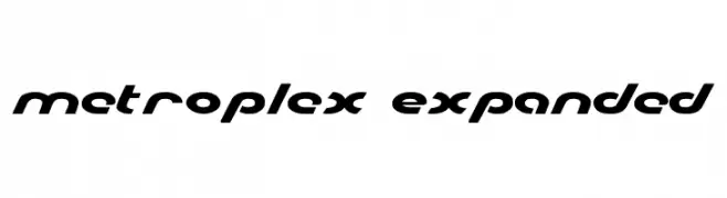
( Fonts by Iconian Fonts - Daniel Zadorozny )
A bold, expanded font with a futuristic and geometric design.
![Metroplex Expanded font caratteri gratis]() Scaricare 541 Downloads@WebFont
Scaricare 541 Downloads@WebFont -
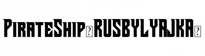
( Fonts by FONTS BY LYAJKA - Personal-use only. For commercial use please contact owner. )
A bold, angular font with a geometric, pirate-themed style.
![Pirate Ship(RUS BY LYAJKA) font caratteri gratis]() Scaricare 541 Downloads@WebFont
Scaricare 541 Downloads@WebFont -
( Fonts by David Rakowski )
An ornate, decorative font with intricate patterns in capital letters.
![ChristensenCaps Regular font caratteri gratis]() Scaricare 541 Downloads@WebFont
Scaricare 541 Downloads@WebFont -
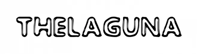
( Fonts by www.woodcutter.es - woodcutter Manero - Personal-use only. For commercial use please contact owner. )
A playful, bold font with a thick outline and three-dimensional appearance.
![The Laguna font caratteri gratis]() Scaricare 541 Downloads@WebFont
Scaricare 541 Downloads@WebFont -
( Fonts by Ikiiko Type )
A bold, distressed font with sharp angles and a dynamic style.
![TJOEKIL KAJOE ikiiko.com font caratteri gratis]() Scaricare 541 Downloads@WebFont
Scaricare 541 Downloads@WebFont -
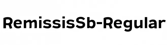
( Typodermic Fonts - Ray Larabie - www.typodermicfonts.com/ )
A bold, modern sans-serif font with clean lines and strong presence.
![RemissisSb-Regular font caratteri gratis]() Scaricare 541 Downloads@WebFont
Scaricare 541 Downloads@WebFont -
![Axaxax-Regular font caratteri gratis]() Scaricare 540 Downloads@WebFont
Scaricare 540 Downloads@WebFont -
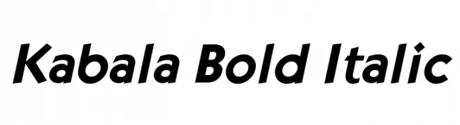
( Fonts by softerviews.org )
A bold, italic font with dynamic slant and strong legibility.
![Kabala Bold Italic font caratteri gratis]() Scaricare 540 Downloads@WebFont
Scaricare 540 Downloads@WebFont -
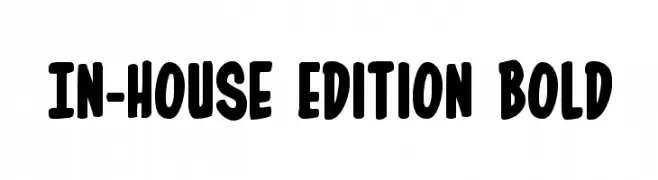
( Fonts by Daniel Zadorozny - www.iconian.com )
A bold, playful font with rounded edges and a hand-drawn feel.
![In-House Edition Bold font caratteri gratis]() Scaricare 540 Downloads@WebFont
Scaricare 540 Downloads@WebFont -
Caratteri di vladocar. For commercial use please contact the owner.
( Easter Joy )
A playful dotted font with slanted characters and a cohesive, decorative style.
![Easter Joy font caratteri gratis]() Scaricare 540 Downloads@WebFont
Scaricare 540 Downloads@WebFont -
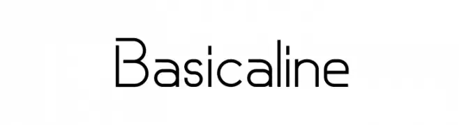
Caratteri di RCgraphics. For commercial use please contact the owner.
( You can use this font for free for Non-Commercial (Personal) use, but if you want to use it for Commercial use you will need to purchase a license here : https://rcgraphics.fr/shop/ The personnal and/or non-commercial uses of this font are FREE. )
A clean, modern sans-serif font with geometric uniformity.
![Basicaline font caratteri gratis]() Scaricare 540 Downloads@WebFont
Scaricare 540 Downloads@WebFont -
![Rundfunk font caratteri gratis]() Scaricare 540 Downloads@WebFont
Scaricare 540 Downloads@WebFont -
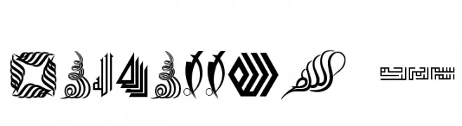
![Besmellah 5 font caratteri gratis]() Scaricare 540 Downloads@WebFont
Scaricare 540 Downloads@WebFont -
( These fonts are free to use in any private, recreational manner.For commercial go to www.flopdesign.com/fordesign/font.html )
A modern serif font with elegant curves and a classic touch.
![ParismatchRegular font caratteri gratis]() Scaricare 540 Downloads@WebFont
Scaricare 540 Downloads@WebFont -
( گالری فانت فارسی پژوهش آريانا - only compatible with Farsi and Arabic )
A bold, geometric font with a modern and futuristic design.
![Zaytoon font caratteri gratis]() Scaricare 540 Downloads@WebFont
Scaricare 540 Downloads@WebFont -
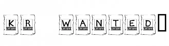
![KR Wanted! font caratteri gratis]() Scaricare 540 Downloads@WebFont
Scaricare 540 Downloads@WebFont -
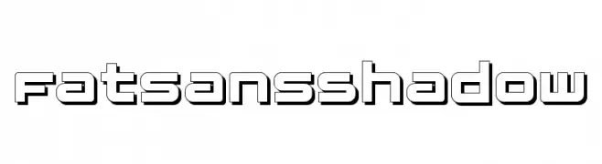
( Fonts by Manfred Klein - manfred-klein.ina-mar.com )
A bold, geometric font with a shadow effect for a modern, three-dimensional look.
![FatsansShadow font caratteri gratis]() Scaricare 540 Downloads@WebFont
Scaricare 540 Downloads@WebFont -
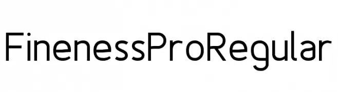
( Fonts by www.asleycruz.com - Asley Cruz - Personal-use only. For commercial use please contact owner. )
A modern, clean sans-serif font with uniform strokes and excellent legibility.
![Fineness Pro Regular font caratteri gratis]() Scaricare 540 Downloads@WebFont
Scaricare 540 Downloads@WebFont -
( www.mawns.com )
A bold, playful font with rounded, cartoon-like characters.
![Celebrater PERSONAL USE font caratteri gratis]() Scaricare 540 Downloads@WebFont
Scaricare 540 Downloads@WebFont -
( Fonts by MadeType - Personal-use only. For commercial use please contact owner. )
A modern, geometric sans-serif font with a light weight and minimalist design.
![MADEEvolveSansEVO-Light font caratteri gratis]() Scaricare 540 Downloads@WebFont
Scaricare 540 Downloads@WebFont -
( Fonts by Paul Reid - tracertong.co.uk )
A bold, angular font with a modern and futuristic style.
![Gothikka font caratteri gratis]() Scaricare 540 Downloads@WebFont
Scaricare 540 Downloads@WebFont -
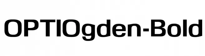
( Fonts by Castcraft Software - OPTI Fonts Archive - opti.netii.net - Personal-use only. For commercial use please contact owner. )
A bold, modern sans-serif font with clean lines and a strong presence.
![OPTIOgden-Bold font caratteri gratis]() Scaricare 540 Downloads@WebFont
Scaricare 540 Downloads@WebFont -
( Fonts by Cathy Davies - cathydavies.com )
A bold, modern font with geometric structure and high contrast, ideal for impactful headlines.
![Soft Hits font caratteri gratis]() Scaricare 540 Downloads@WebFont
Scaricare 540 Downloads@WebFont -
( Fonts by www.typodermicfonts.com - Ray Larabie )
A bold, linocut-inspired font with a dynamic, handcrafted appearance.
![BlueHighwayLinocut-Regular font caratteri gratis]() Scaricare 540 Downloads@WebFont
Scaricare 540 Downloads@WebFont


Quali sono i font più popolari adesso?
Poppins, Roboto, Montserrat, Open Sans e Lato sono molto usati per le forme pulite e l'ampia applicabilità — dall'identità di marca alle landing page e ai poster.
Quali font si usano spesso nei loghi?
Le sans serif geometriche (es. Poppins, famiglie in stile Gotham) sono scelte comuni per un branding pulito e scalabile. Per un tocco personale restano valide script e stili manoscritti. Abbina un display deciso per i titoli a un corpo testo neutro per riconoscibilità ed equilibrio.
Ogni quanto si aggiorna la lista?
Con regolarità, in base ai download e all'attività reale. Torna spesso per scoprire in anticipo le nuove preferite.
💡 Consiglio: aggiungi ai preferiti — le tendenze cambiano in fretta e i font top di oggi possono ispirare il rebranding di domani.