Benvenuto nelle Font Più Popolari — dove popolarità e qualità si incontrano. Qui trovi i font più scaricati e usati dell'anno. Se cerchi scelte sicure per logo, web o social, inizia da qui.
Ogni font top si distingue per equilibrio, leggibilità e versatilità. Troverai sans serif moderne, script eleganti, serif vintage e display minimalisti.
-
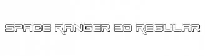
( Fonts by Daniel Zadorozny - www.iconian.com )
A futuristic, geometric font with bold, angular lines and a 3D effect.
 Scaricare 108 Downloads@WebFont
 -
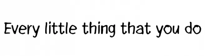
( Fonts by www.junkohanhero.com - Personal-use only. For commercial use please contact owner. )
A playful, hand-drawn font with bold, rounded strokes and a whimsical charm.
![Every little thing that you do font caratteri gratis]() Scaricare 108 Downloads@WebFont
Scaricare 108 Downloads@WebFont -
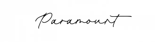
( Fonts by Aestherica Studio )
A flowing, cursive script font with elegant, interconnected characters.
![Paramount font caratteri gratis]() Scaricare 108 Downloads@WebFont
Scaricare 108 Downloads@WebFont -
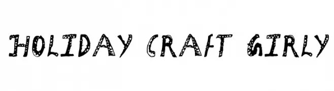
( Fonts by Faraz Ahmad )
A playful, hand-drawn font with decorative patterns and a whimsical style.
![Holiday Craft Girly font caratteri gratis]() Scaricare 108 Downloads@WebFont
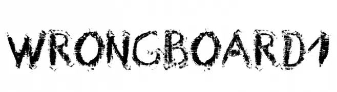
Scaricare 108 Downloads@WebFont -
![Wrong Board 1 font caratteri gratis]() Scaricare 108 Downloads@WebFont
Scaricare 108 Downloads@WebFont -
-
( Fonts by Ferdiansyah )
A bold, expressive script font with high contrast and decorative flourishes.
![LoveMoment font caratteri gratis]() Scaricare 108 Downloads@WebFont
Scaricare 108 Downloads@WebFont -
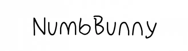
( Fonts by Cannot Into Space Fonts )
A playful, handwritten font with a whimsical and informal style.
![NumbBunny font caratteri gratis]() Scaricare 108 Downloads@WebFont
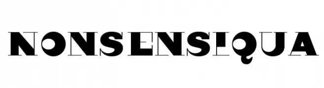
Scaricare 108 Downloads@WebFont -
( Fonts by Manfred Klein. Free for private and charity use. Free for commercial with donation to organizations )
A bold, modern font with a mix of solid and outlined elements for a striking look.
![Nonsensiqua font caratteri gratis]() Scaricare 108 Downloads@WebFont
Scaricare 108 Downloads@WebFont -
( Fonts by junkohanhero )
A bold, distressed font with a vintage, rugged style.
![Nollanaama font caratteri gratis]() Scaricare 108 Downloads@WebFont
Scaricare 108 Downloads@WebFont -
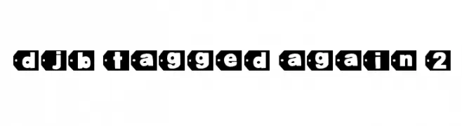
( Fonts by Darcy Baldwin )
A bold, decorative font with characters enclosed in tag-like shapes.
![DJB Tagged Again 2 font caratteri gratis]() Scaricare 108 Downloads@WebFont
Scaricare 108 Downloads@WebFont


Quali sono i font più popolari adesso?
Poppins, Roboto, Montserrat, Open Sans e Lato sono molto usati per le forme pulite e l'ampia applicabilità — dall'identità di marca alle landing page e ai poster.
Quali font si usano spesso nei loghi?
Le sans serif geometriche (es. Poppins, famiglie in stile Gotham) sono scelte comuni per un branding pulito e scalabile. Per un tocco personale restano valide script e stili manoscritti. Abbina un display deciso per i titoli a un corpo testo neutro per riconoscibilità ed equilibrio.
Ogni quanto si aggiorna la lista?
Con regolarità, in base ai download e all'attività reale. Torna spesso per scoprire in anticipo le nuove preferite.
💡 Consiglio: aggiungi ai preferiti — le tendenze cambiano in fretta e i font top di oggi possono ispirare il rebranding di domani.