Benvenuto nelle Font Più Popolari — dove popolarità e qualità si incontrano. Qui trovi i font più scaricati e usati dell'anno. Se cerchi scelte sicure per logo, web o social, inizia da qui.
Ogni font top si distingue per equilibrio, leggibilità e versatilità. Troverai sans serif moderne, script eleganti, serif vintage e display minimalisti.
-
 Scaricare 107 Downloads@WebFont
 -
( Fonts by wep - Wahyu Eka Prasetya - Personal-use only. For commercial use please contact owner. )
A bold, dynamic handwritten font with brush-like strokes and an energetic appearance.
![Binasa font caratteri gratis]() Scaricare 107 Downloads@WebFont
Scaricare 107 Downloads@WebFont -
( Fonts by Manfred Klein. Free for private and charity use. Free for commercial with donation to organizations )
Decorative pictographic font with ancient, glyph-like symbols in bold circles.
![HiddenSignsRings font caratteri gratis]() Scaricare 107 Downloads@WebFont
Scaricare 107 Downloads@WebFont -
( Fonts by Mr.Zyan Graphics be.net/zyangraphics )
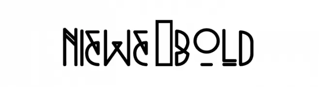
A modern, geometric font with bold lines and unique shapes.
![Niewe-Bold font caratteri gratis]() Scaricare 107 Downloads@WebFont
Scaricare 107 Downloads@WebFont -
( Fonts by Daniel Zadorozny - www.iconian.com )
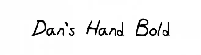
A bold, handwritten-style font with a playful and informal appearance.
![Dan's Hand Bold font caratteri gratis]() Scaricare 107 Downloads@WebFont
Scaricare 107 Downloads@WebFont -
-
( Copyright (c) 2011-2012, Ana Sanfelippo (anasanfe@gmail.com), with Reserved Font Name 'Almendra' )
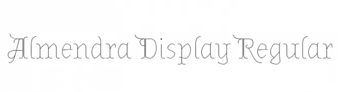
An elegant and decorative serif font with thin strokes and unique serifs.
![Almendra Display Regular font caratteri gratis]() Scaricare 107 Downloads@WebFont
Scaricare 107 Downloads@WebFont -
( Fonts by Cristiano Sobral - Personal-use only. For commercial use please contact owner. )
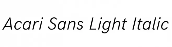
A modern, light, italic sans-serif font with sleek and fluid character design.
![Acari Sans Light Italic font caratteri gratis]() Scaricare 107 Downloads@WebFont
Scaricare 107 Downloads@WebFont -
![Gotharctica 3D Italic font caratteri gratis]() Scaricare 107 Downloads@WebFont
Scaricare 107 Downloads@WebFont -
( Fonts by Daniel Zadorozny - www.iconian.com - Free for personal use )
A bold, 3D italic font with a futuristic and dynamic style.
![Tigershark 3D Italic font caratteri gratis]() Scaricare 107 Downloads@WebFont
Scaricare 107 Downloads@WebFont -
![RoughTpugh font caratteri gratis]() Scaricare 107 Downloads@WebFont
Scaricare 107 Downloads@WebFont


Quali sono i font più popolari adesso?
Poppins, Roboto, Montserrat, Open Sans e Lato sono molto usati per le forme pulite e l'ampia applicabilità — dall'identità di marca alle landing page e ai poster.
Quali font si usano spesso nei loghi?
Le sans serif geometriche (es. Poppins, famiglie in stile Gotham) sono scelte comuni per un branding pulito e scalabile. Per un tocco personale restano valide script e stili manoscritti. Abbina un display deciso per i titoli a un corpo testo neutro per riconoscibilità ed equilibrio.
Ogni quanto si aggiorna la lista?
Con regolarità, in base ai download e all'attività reale. Torna spesso per scoprire in anticipo le nuove preferite.
💡 Consiglio: aggiungi ai preferiti — le tendenze cambiano in fretta e i font top di oggi possono ispirare il rebranding di domani.