Benvenuto nelle Font Più Popolari — dove popolarità e qualità si incontrano. Qui trovi i font più scaricati e usati dell'anno. Se cerchi scelte sicure per logo, web o social, inizia da qui.
Ogni font top si distingue per equilibrio, leggibilità e versatilità. Troverai sans serif moderne, script eleganti, serif vintage e display minimalisti.
-
( گالری فانت فارسی پژوهش آريانا - only compatible with Farsi and Arabic )
A futuristic, geometric font with sharp angles and clean lines.
 Scaricare 107 Downloads@WebFont
 -
Caratteri di jlog3000. For commercial use please contact the owner.
( Fonts by John Ocasio. Free for personal use only )
A bold, slanted, and angular font with a modern, energetic style.
![J-LOG Starkwood Sans Small Caps Italic font caratteri gratis]() Scaricare 107 Downloads@WebFont
Scaricare 107 Downloads@WebFont -
![KR Happy Veggies! font caratteri gratis]() Scaricare 107 Downloads@WebFont
Scaricare 107 Downloads@WebFont -
( Fonts by www.chequered.ink - Chequered Ink - Personal-use only. For commercial use please contact owner. )
A futuristic font with bold, circular, and geometric elements.
![DotLirium Regular font caratteri gratis]() Scaricare 107 Downloads@WebFont
Scaricare 107 Downloads@WebFont -
( Fonts by Ianmikraz )
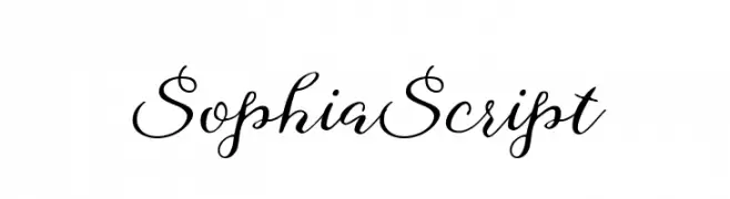
An elegant script font with flowing, handwritten-style characters.
![SophiaScript font caratteri gratis]() Scaricare 107 Downloads@WebFont
Scaricare 107 Downloads@WebFont -
-
( Fonts by Maulana Creative - Gilang Maulana - Personal-use only. For commercial use please contact owner. )
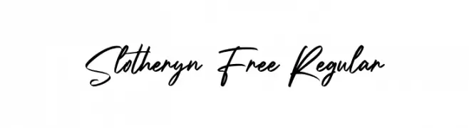
A dynamic and fluid script font with elegant, flowing letterforms.
![Slotheryn Free Regular font caratteri gratis]() Scaricare 107 Downloads@WebFont
Scaricare 107 Downloads@WebFont -
( Fonts by Mozilla )
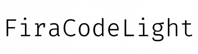
A clean, modern monospaced typeface ideal for coding.
![Fira Code Light font caratteri gratis]() Scaricare 107 Downloads@WebFont
Scaricare 107 Downloads@WebFont -
( Fonts by Vunira Design )
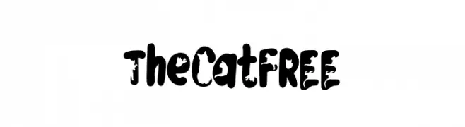
A bold, playful font with a distressed, grungy texture.
![TheCatFREE font caratteri gratis]() Scaricare 107 Downloads@WebFont
Scaricare 107 Downloads@WebFont -
( Fonts by Giri K )
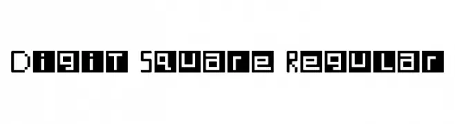
A geometric, pixelated font with a modern, tech-inspired design.
![Digit Square Regular font caratteri gratis]() Scaricare 107 Downloads@WebFont
Scaricare 107 Downloads@WebFont -
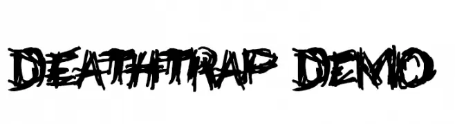
![Deathtrap DEMO font caratteri gratis]() Scaricare 107 Downloads@WebFont
Scaricare 107 Downloads@WebFont


Quali sono i font più popolari adesso?
Poppins, Roboto, Montserrat, Open Sans e Lato sono molto usati per le forme pulite e l'ampia applicabilità — dall'identità di marca alle landing page e ai poster.
Quali font si usano spesso nei loghi?
Le sans serif geometriche (es. Poppins, famiglie in stile Gotham) sono scelte comuni per un branding pulito e scalabile. Per un tocco personale restano valide script e stili manoscritti. Abbina un display deciso per i titoli a un corpo testo neutro per riconoscibilità ed equilibrio.
Ogni quanto si aggiorna la lista?
Con regolarità, in base ai download e all'attività reale. Torna spesso per scoprire in anticipo le nuove preferite.
💡 Consiglio: aggiungi ai preferiti — le tendenze cambiano in fretta e i font top di oggi possono ispirare il rebranding di domani.