Benvenuto nelle Font Più Popolari — dove popolarità e qualità si incontrano. Qui trovi i font più scaricati e usati dell'anno. Se cerchi scelte sicure per logo, web o social, inizia da qui.
Ogni font top si distingue per equilibrio, leggibilità e versatilità. Troverai sans serif moderne, script eleganti, serif vintage e display minimalisti.
-
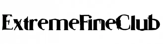
( Fonts by Woodcutter )
A bold, gothic-style font with a dramatic, distressed appearance.
 Scaricare 106 Downloads@WebFont
 -
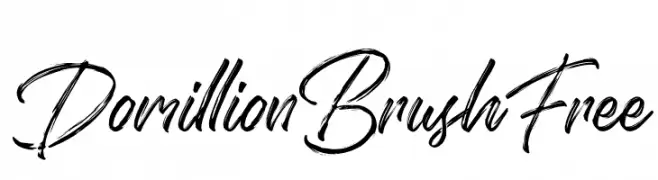
( Fonts by Ardyana Types - Ardyana Putra - Personal-use only. For commercial use please contact owner. )
A dynamic brush script font with fluid, expressive strokes.
![Domillion Brush Free font caratteri gratis]() Scaricare 106 Downloads@WebFont
Scaricare 106 Downloads@WebFont -
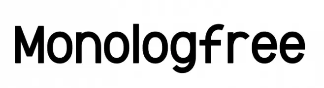
( Fonts by Sandylukee - Sandy Luke Nugroho - Personal-use only. For commercial use please contact owner. )
A modern sans-serif font with clean lines and a slightly condensed structure.
![Monolog-free font caratteri gratis]() Scaricare 106 Downloads@WebFont
Scaricare 106 Downloads@WebFont -
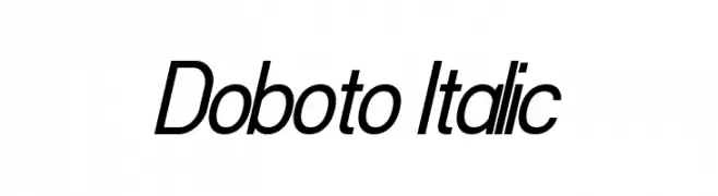
( Fonts by Dan P. Lyons - Personal-use only. For commercial use please contact owner. )
A sleek, modern italic font with streamlined letterforms and elegant curves.
![Doboto Italic font caratteri gratis]() Scaricare 106 Downloads@WebFont
Scaricare 106 Downloads@WebFont -
![Scaberous font caratteri gratis]() Scaricare 106 Downloads@WebFont
Scaricare 106 Downloads@WebFont -
-
![SpringVibe font caratteri gratis]() Scaricare 106 Downloads@WebFont
Scaricare 106 Downloads@WebFont -
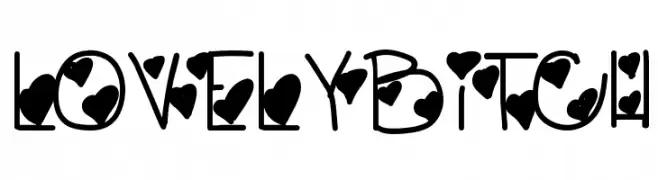
( Fonts by Des Gomez )
A playful, heart-themed decorative font with bold, rounded characters.
![LovelyBitch font caratteri gratis]() Scaricare 106 Downloads@WebFont
Scaricare 106 Downloads@WebFont -
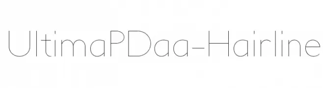
( Alan Prescott - prescottdesignshop.com )
A modern, ultra-thin font with geometric shapes and clean lines.
![UltimaPDaa-Hairline font caratteri gratis]() Scaricare 106 Downloads@WebFont
Scaricare 106 Downloads@WebFont -
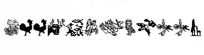
( Fonts by Manfred Klein. Free for private and charity use. Free for commercial with donation to organizations )
Ornate woodcut illustration font with pictorial glyphs.
![Woodcuts2007 font caratteri gratis]() Scaricare 106 Downloads@WebFont
Scaricare 106 Downloads@WebFont -
( Fonts by www.dcoxy.com )
A decorative font with abstract, tribal-inspired designs and intricate patterns.
![formes2 font caratteri gratis]() Scaricare 106 Downloads@WebFont
Scaricare 106 Downloads@WebFont

Quali sono i font più popolari adesso?
Poppins, Roboto, Montserrat, Open Sans e Lato sono molto usati per le forme pulite e l'ampia applicabilità — dall'identità di marca alle landing page e ai poster.
Quali font si usano spesso nei loghi?
Le sans serif geometriche (es. Poppins, famiglie in stile Gotham) sono scelte comuni per un branding pulito e scalabile. Per un tocco personale restano valide script e stili manoscritti. Abbina un display deciso per i titoli a un corpo testo neutro per riconoscibilità ed equilibrio.
Ogni quanto si aggiorna la lista?
Con regolarità, in base ai download e all'attività reale. Torna spesso per scoprire in anticipo le nuove preferite.
💡 Consiglio: aggiungi ai preferiti — le tendenze cambiano in fretta e i font top di oggi possono ispirare il rebranding di domani.