Benvenuto nelle Font Più Popolari — dove popolarità e qualità si incontrano. Qui trovi i font più scaricati e usati dell'anno. Se cerchi scelte sicure per logo, web o social, inizia da qui.
Ogni font top si distingue per equilibrio, leggibilità e versatilità. Troverai sans serif moderne, script eleganti, serif vintage e display minimalisti.
-
( Fonts by Graham Meade - GemFonts )
A bold, modern sans-serif font with geometric lines.
 Scaricare 5656 Downloads@WebFont
 -
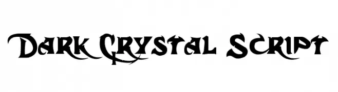
( Fonts by Dennis Ludlow - Sharkshock Productions )
A bold, gothic-inspired font with sharp, angular edges and intricate details.
![Dark Crystal Script font caratteri gratis]() Scaricare 5656 Downloads@WebFont
Scaricare 5656 Downloads@WebFont -
( Copyright (c) 2014, Indian Type Foundry (info@indiantypefoundry.com). )
A modern, geometric sans-serif font with clean lines and structured appearance.
![Rajdhani font caratteri gratis]() Scaricare 5655 Downloads@WebFont
Scaricare 5655 Downloads@WebFont -
![MOON KNIGHT font caratteri gratis]() Scaricare 5654 Downloads@WebFont
Scaricare 5654 Downloads@WebFont -
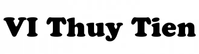
![VI Thuy Tien font caratteri gratis]() Scaricare 5654 Downloads@WebFont
Scaricare 5654 Downloads@WebFont -
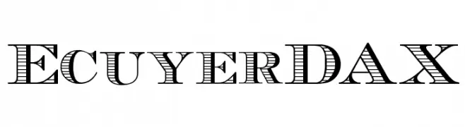
![EcuyerDAX font caratteri gratis]() Scaricare 5654 Downloads@WebFont
Scaricare 5654 Downloads@WebFont -
( Fonts by Mike Lecky - www.superfunk.com )
A bold, distressed font with a grunge aesthetic and rough edges.
![Mark font caratteri gratis]() Scaricare 5651 Downloads@WebFont
Scaricare 5651 Downloads@WebFont -
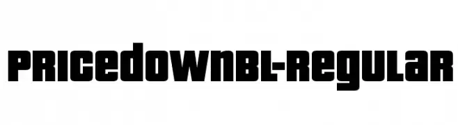
( Fonts by www.typodermicfonts.com - Ray Larabie )
A bold, geometric font with thick strokes and a strong, commanding presence.
![PricedownBl-Regular font caratteri gratis]() Scaricare 5650 Downloads@WebFont
Scaricare 5650 Downloads@WebFont -
( Fonts by Bright Ideas )
A playful, heart-adorned font with bold, rounded outlines.
![Newlywed font caratteri gratis]() Scaricare 5650 Downloads@WebFont
Scaricare 5650 Downloads@WebFont -
( Free for personal use )
A geometric, modern font with clean lines and uniform stroke width.
![Mathematical Bold font caratteri gratis]() Scaricare 5647 Downloads@WebFont
Scaricare 5647 Downloads@WebFont -
![CSD-Block-Bold font caratteri gratis]() Scaricare 5646 Downloads@WebFont
Scaricare 5646 Downloads@WebFont -
![Caligula Regular font caratteri gratis]() Scaricare 5646 Downloads@WebFont
Scaricare 5646 Downloads@WebFont -
![Diablo Heavy font caratteri gratis]() Scaricare 5646 Downloads@WebFont
Scaricare 5646 Downloads@WebFont -
( Fonts by herofonts.com. Personal-use only. For commercial use please contact owner. )
A bold, distressed font with a rugged, vintage aesthetic.
![Google spies font caratteri gratis]() Scaricare 5645 Downloads@WebFont
Scaricare 5645 Downloads@WebFont -
![Venera700 font caratteri gratis]() Scaricare 5638 Downloads@WebFont
Scaricare 5638 Downloads@WebFont -
( Fonts by Dieter Steffmann )
A bold and intricate Blackletter font with dramatic, ornate letterforms.
![Alte Schwabacher font caratteri gratis]() Scaricare 5638 Downloads@WebFont
Scaricare 5638 Downloads@WebFont -
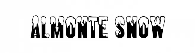
![Almonte Snow font caratteri gratis]() Scaricare 5638 Downloads@WebFont
Scaricare 5638 Downloads@WebFont -
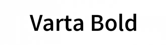
( Copyright (c) 2014-2015, Sorkin Type Co (sorkintype.com | sorkintype@gmail.com) )
A bold, modern sans-serif font with excellent legibility and a professional appearance.
![Varta Bold font caratteri gratis]() Scaricare 5636 Downloads@WebFont
Scaricare 5636 Downloads@WebFont -
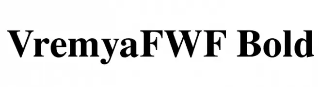
( Fonts by Casady & Greene )
A bold, high-contrast serif font with a classic and authoritative style.
![VremyaFWF Bold font caratteri gratis]() Scaricare 5634 Downloads@WebFont
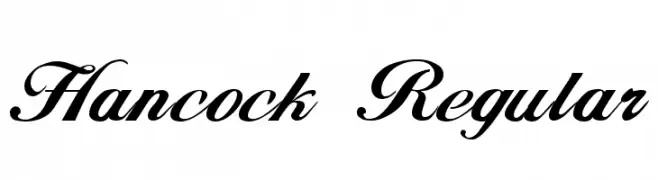
Scaricare 5634 Downloads@WebFont -
![Hancock Regular font caratteri gratis]() Scaricare 5634 Downloads@WebFont
Scaricare 5634 Downloads@WebFont -
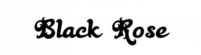
( Fonts by Bright Ideas )
An ornate and decorative font with bold, intricate details.
![Black Rose font caratteri gratis]() Scaricare 5634 Downloads@WebFont
Scaricare 5634 Downloads@WebFont -
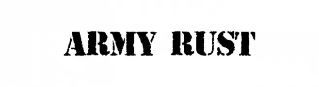
( Fonts by Jayde Garrow - GarrowGlitch - http://jaydegarrow.wix.com/jaydefonts. Personal-use only. For commercial use please contact owner. )
A bold, distressed font with a rugged, industrial look.
![ARMY RUST font caratteri gratis]() Scaricare 5632 Downloads@WebFont
Scaricare 5632 Downloads@WebFont -
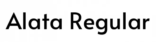
( Copyright 2016 The Alata Project Authors (https://github.com/sorkintype/alata) )
A modern, geometric sans-serif font with clean lines and even strokes.
![Alata Regular font caratteri gratis]() Scaricare 5627 Downloads@WebFont
Scaricare 5627 Downloads@WebFont -
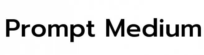
( Copyright (c) 2015, Cadson Demak (info@cadsondemak.com) )
A modern, clean sans-serif font with excellent legibility and balanced proportions.
![Prompt Medium font caratteri gratis]() Scaricare 5626 Downloads@WebFont
Scaricare 5626 Downloads@WebFont -
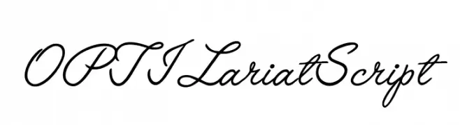
( Fonts by Castcraft Software - opti.netii.net - check the website before use )
A graceful and elegant script font with a flowing, cursive style.
![OPTILariatScript font caratteri gratis]() Scaricare 5625 Downloads@WebFont
Scaricare 5625 Downloads@WebFont -
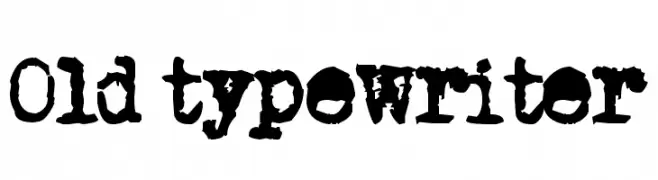
![Old typewriter font caratteri gratis]() Scaricare 5624 Downloads@WebFont
Scaricare 5624 Downloads@WebFont -
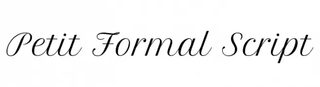
( Copyright (c) 2011, Pablo Impallari (www.impallari.com|impallari@gmail.com), )
A refined and elegant script font with flowing, cursive letterforms.
![Petit Formal Script font caratteri gratis]() Scaricare 5622 Downloads@WebFont
Scaricare 5622 Downloads@WebFont -
![Bienville font caratteri gratis]() Scaricare 5621 Downloads@WebFont
Scaricare 5621 Downloads@WebFont -
( Fonts by Creative.Lafont - creativemarket.com/creative.lafont. Personal-use only. For commercial use please contact owner. )
An elegant script font with flowing, cursive letterforms and delicate swashes.
![ahattomdemo font caratteri gratis]() Scaricare 5620 Downloads@WebFont
Scaricare 5620 Downloads@WebFont -
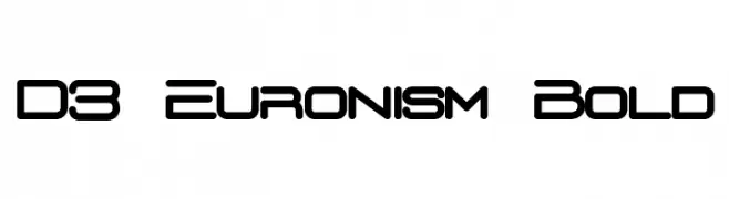
( Fonts by www.DigitalDreamDesign.net )
A futuristic, geometric font with rounded edges and consistent stroke width.
![D3 Euronism Bold font caratteri gratis]() Scaricare 5620 Downloads@WebFont
Scaricare 5620 Downloads@WebFont -
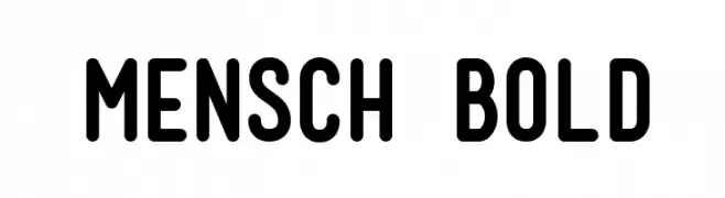
( Fonts by Aktab Studio creativemarket.com/aktab.studio - Personal-use only. For commercial use please contact owner. )
A bold, rounded sans-serif font with a modern and friendly appearance.
![Mensch Bold font caratteri gratis]() Scaricare 5618 Downloads@WebFont
Scaricare 5618 Downloads@WebFont -
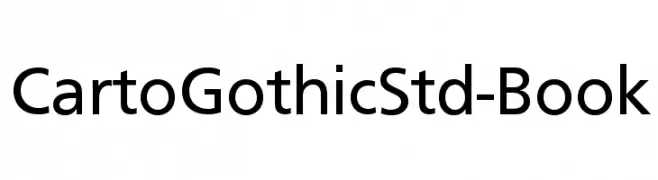
( Please visit www.fontsite.com before you use! )
A modern, geometric sans-serif font with clean lines and balanced characters.
![CartoGothicStd-Book font caratteri gratis]() Scaricare 5618 Downloads@WebFont
Scaricare 5618 Downloads@WebFont -
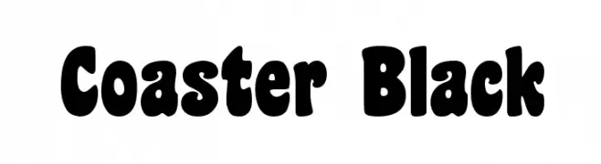
( Fonts by Dieter Steffmann )
A bold, rounded font with a playful, retro style.
![Coaster Black font caratteri gratis]() Scaricare 5618 Downloads@WebFont
Scaricare 5618 Downloads@WebFont -
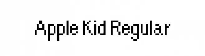
![Apple Kid Regular font caratteri gratis]() Scaricare 5616 Downloads@WebFont
Scaricare 5616 Downloads@WebFont -
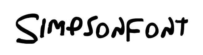
( Fonts by Dennis Ludlow - Sharkshock )
A playful, handwritten font with bold, rounded strokes and a casual style.
![Simpsonfont font caratteri gratis]() Scaricare 5616 Downloads@WebFont
Scaricare 5616 Downloads@WebFont


Quali sono i font più popolari adesso?
Poppins, Roboto, Montserrat, Open Sans e Lato sono molto usati per le forme pulite e l'ampia applicabilità — dall'identità di marca alle landing page e ai poster.
Quali font si usano spesso nei loghi?
Le sans serif geometriche (es. Poppins, famiglie in stile Gotham) sono scelte comuni per un branding pulito e scalabile. Per un tocco personale restano valide script e stili manoscritti. Abbina un display deciso per i titoli a un corpo testo neutro per riconoscibilità ed equilibrio.
Ogni quanto si aggiorna la lista?
Con regolarità, in base ai download e all'attività reale. Torna spesso per scoprire in anticipo le nuove preferite.
💡 Consiglio: aggiungi ai preferiti — le tendenze cambiano in fretta e i font top di oggi possono ispirare il rebranding di domani.