Benvenuto nelle Font Più Popolari — dove popolarità e qualità si incontrano. Qui trovi i font più scaricati e usati dell'anno. Se cerchi scelte sicure per logo, web o social, inizia da qui.
Ogni font top si distingue per equilibrio, leggibilità e versatilità. Troverai sans serif moderne, script eleganti, serif vintage e display minimalisti.
-
 Scaricare 538 Downloads@WebFont
 -
( Fonts by Mica Asato - Personal-use only. For commercial use please contact owner. )
A bold, expressive handwritten font with a brush-like appearance.
![Mika font caratteri gratis]() Scaricare 538 Downloads@WebFont
Scaricare 538 Downloads@WebFont -
( Fonts by Dieter Steffmann )
A bold, calligraphic font with flowing strokes and dramatic curves.
![Kohelet Regular font caratteri gratis]() Scaricare 538 Downloads@WebFont
Scaricare 538 Downloads@WebFont -
( Macul Inc )
A bold, expressive script font with elegant, flowing letterforms.
![Hugtophia font caratteri gratis]() Scaricare 538 Downloads@WebFont
Scaricare 538 Downloads@WebFont -
( Fonts by or from www.graffitifonts.net )
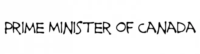
A playful, hand-drawn font with irregular, wavy strokes and a whimsical style.
![Prime Minister of Canada font caratteri gratis]() Scaricare 538 Downloads@WebFont
Scaricare 538 Downloads@WebFont -
( Fonts by Nurf Designs - Personal-use only. For commercial use please contact owner. )
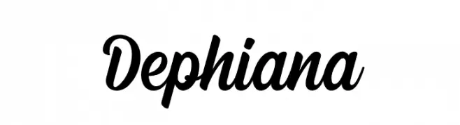
A bold, expressive script font with flowing, cursive letterforms.
![Dephiana font caratteri gratis]() Scaricare 538 Downloads@WebFont
Scaricare 538 Downloads@WebFont -
( Fonts by David Rakowski )
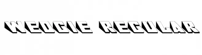
A bold, three-dimensional font with a geometric, shadowed design.
![Wedgie Regular font caratteri gratis]() Scaricare 538 Downloads@WebFont
Scaricare 538 Downloads@WebFont -
( Fonts by www.junkohanhero.com - Personal-use only. For commercial use please contact owner. )
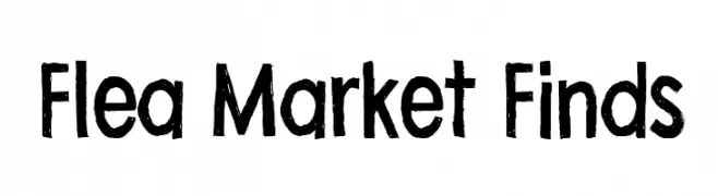
A bold, hand-drawn font with a vintage, rustic charm.
![Flea Market Finds font caratteri gratis]() Scaricare 538 Downloads@WebFont
Scaricare 538 Downloads@WebFont -
( Fonts by Graham Meade - GemFonts )
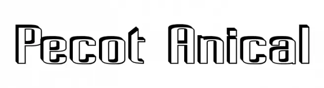
A bold, geometric outline font with a modern, industrial aesthetic.
![Pecot Anical font caratteri gratis]() Scaricare 538 Downloads@WebFont
Scaricare 538 Downloads@WebFont -
![Zilap Tribu font caratteri gratis]() Scaricare 538 Downloads@WebFont
Scaricare 538 Downloads@WebFont -
![DKKeswick font caratteri gratis]() Scaricare 538 Downloads@WebFont
Scaricare 538 Downloads@WebFont -
![Brook Flair Regular font caratteri gratis]() Scaricare 538 Downloads@WebFont
Scaricare 538 Downloads@WebFont -
( Fonts by Dieter Steffmann )
A classic blackletter font with ornate, intricate letterforms.
![WestminsterGotisch font caratteri gratis]() Scaricare 538 Downloads@WebFont
Scaricare 538 Downloads@WebFont -
( Fonts by a Neale Davidson - www.pixelsagas.com. Personal-use only. For commercial use please contact owner. )
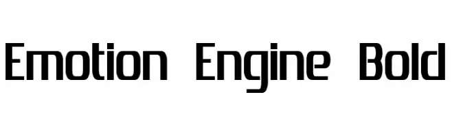
A bold, modern font with geometric influences and a strong, stable presence.
![Emotion Engine Bold font caratteri gratis]() Scaricare 538 Downloads@WebFont
Scaricare 538 Downloads@WebFont -
( Fonts by Mozilla Foundation - Personal-use only. For commercial use please contact owner. )
A modern, italic sans-serif font with clean lines and excellent legibility.
![Fira Sans Book Italic font caratteri gratis]() Scaricare 538 Downloads@WebFont
Scaricare 538 Downloads@WebFont -
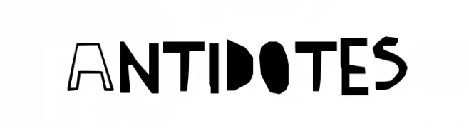
![Antidotes font caratteri gratis]() Scaricare 538 Downloads@WebFont
Scaricare 538 Downloads@WebFont -
Caratteri di danny91194. For commercial use please contact the owner.
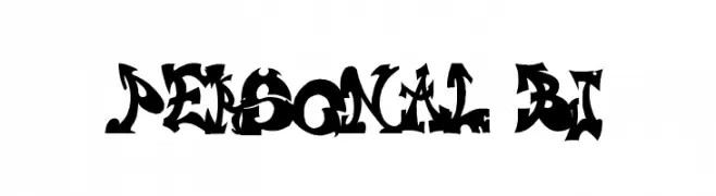
![personal bj font caratteri gratis]() Scaricare 538 Downloads@WebFont
Scaricare 538 Downloads@WebFont -
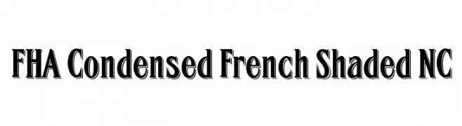
![FHA Condensed French Shaded NC font caratteri gratis]() Scaricare 538 Downloads@WebFont
Scaricare 538 Downloads@WebFont -
( Fonts by ShyFonts )
A modern, italicized outline font with bold, dynamic characters.
![SF Intellivised Outline Italic font caratteri gratis]() Scaricare 538 Downloads@WebFont
Scaricare 538 Downloads@WebFont -
![Jenn Bee font caratteri gratis]() Scaricare 538 Downloads@WebFont
Scaricare 538 Downloads@WebFont -
( Fonts by Vladimir Nikolic - www.creativefabrica.com/designer/vladimirnikolic/ - Personal-use only. For commercial use please contact owner. )
A bold, geometric font with a three-dimensional effect and modern style.
![London Regular font caratteri gratis]() Scaricare 538 Downloads@WebFont
Scaricare 538 Downloads@WebFont -
( Fonts by Tiffany Major - Gate & Lock Co )
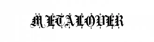
An ornate blackletter font with intricate details and a gothic style.
![metalover font caratteri gratis]() Scaricare 538 Downloads@WebFont
Scaricare 538 Downloads@WebFont -
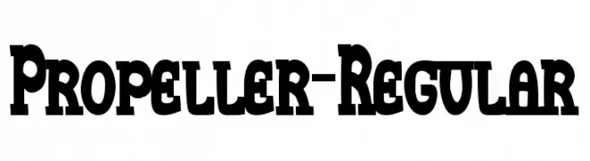
![Propeller-Regular font caratteri gratis]() Scaricare 538 Downloads@WebFont
Scaricare 538 Downloads@WebFont -
( Fonts by a Neale Davidson - www.pixelsagas.com. Personal-use only. For commercial use please contact owner. )
A bold, geometric font with sharp angles and a modern industrial style.
![Whitestone font caratteri gratis]() Scaricare 538 Downloads@WebFont
Scaricare 538 Downloads@WebFont -
( Fonts by Billy Argel Fonts - www.billyargel.com - Personal-use only. For commercial use please contact owner. )
An elegant and decorative script font with bold, intricate loops and high contrast strokes.
![Amster Personal Use Regular font caratteri gratis]() Scaricare 538 Downloads@WebFont
Scaricare 538 Downloads@WebFont -
( Fonts by Maulana Creative )
A bold, playful font with thick, rounded strokes and a whimsical style.
![Malikis Free Regular font caratteri gratis]() Scaricare 538 Downloads@WebFont
Scaricare 538 Downloads@WebFont -
![Chay's Frames font caratteri gratis]() Scaricare 538 Downloads@WebFont
Scaricare 538 Downloads@WebFont -
( Fonts by Fabrika De Typos - Marcio Hirosse - fabrikadetypos.blogspot.com )
A bold, modern font with dynamic stroke variations and rounded edges.
![Error font caratteri gratis]() Scaricare 538 Downloads@WebFont
Scaricare 538 Downloads@WebFont -
( Public domain / GPL / OFL - jlhfonts.blogspot.com/ )
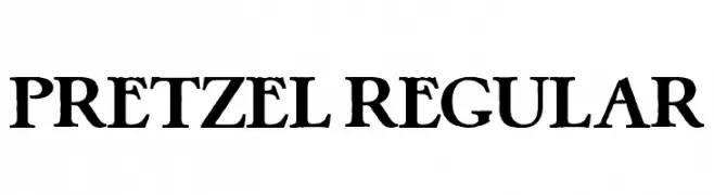
A bold, high-contrast serif font with a modern and elegant style.
![Pretzel Regular font caratteri gratis]() Scaricare 538 Downloads@WebFont
Scaricare 538 Downloads@WebFont -
( Fonts by a David Fens. Personal-use only. For commercial use please contact owner. )
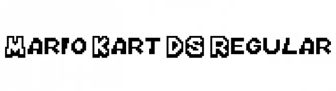
A bold, pixelated font with a retro, video game-inspired style.
![Mario Kart DS Regular font caratteri gratis]() Scaricare 538 Downloads@WebFont
Scaricare 538 Downloads@WebFont -
( Fonts by www.studiotypo.com - Personal-use only. For commercial use please contact owner. )
A bold, rounded font with a modern and friendly style.
![Wida Round Demo Bold font caratteri gratis]() Scaricare 538 Downloads@WebFont
Scaricare 538 Downloads@WebFont -
( Fonts by RBCS Studio )
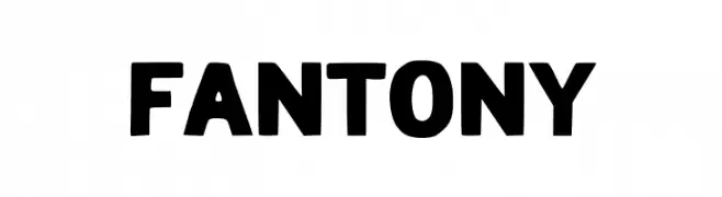
A bold, playful font with a hand-drawn, slightly irregular style.
![FANTONY font caratteri gratis]() Scaricare 538 Downloads@WebFont
Scaricare 538 Downloads@WebFont -
( Fonts by www.typodermicfonts.com - Ray Larabie )
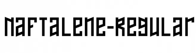
A bold, geometric font with a futuristic and angular design.
![Naftalene-Regular font caratteri gratis]() Scaricare 538 Downloads@WebFont
Scaricare 538 Downloads@WebFont -
( Fonts by Rizky Andyno Ramadhan - Dichi. Personal-use only. For commercial use please contact owner. )
A modern, light sans-serif font with a clean and minimalist design.
![Esphimere Light font caratteri gratis]() Scaricare 538 Downloads@WebFont
Scaricare 538 Downloads@WebFont -
( Fonts by Kurnia Setyadi - Personal-use only. For commercial use please contact owner. )
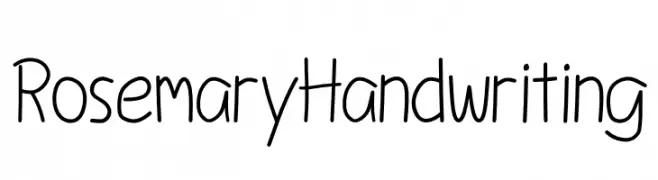
A playful, casual handwritten font with smooth, flowing lines.
![Rosemary Handwriting font caratteri gratis]() Scaricare 538 Downloads@WebFont
Scaricare 538 Downloads@WebFont


Quali sono i font più popolari adesso?
Poppins, Roboto, Montserrat, Open Sans e Lato sono molto usati per le forme pulite e l'ampia applicabilità — dall'identità di marca alle landing page e ai poster.
Quali font si usano spesso nei loghi?
Le sans serif geometriche (es. Poppins, famiglie in stile Gotham) sono scelte comuni per un branding pulito e scalabile. Per un tocco personale restano valide script e stili manoscritti. Abbina un display deciso per i titoli a un corpo testo neutro per riconoscibilità ed equilibrio.
Ogni quanto si aggiorna la lista?
Con regolarità, in base ai download e all'attività reale. Torna spesso per scoprire in anticipo le nuove preferite.
💡 Consiglio: aggiungi ai preferiti — le tendenze cambiano in fretta e i font top di oggi possono ispirare il rebranding di domani.