Benvenuto nelle Font Più Popolari — dove popolarità e qualità si incontrano. Qui trovi i font più scaricati e usati dell'anno. Se cerchi scelte sicure per logo, web o social, inizia da qui.
Ogni font top si distingue per equilibrio, leggibilità e versatilità. Troverai sans serif moderne, script eleganti, serif vintage e display minimalisti.
-
( Fonts by Woodcutter )
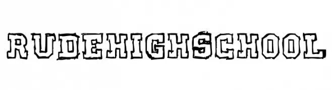
A bold, distressed font with a rugged, hand-drawn style.
 Scaricare 106 Downloads@WebFont
 -
( Fonts by Daniel Zadorozny - www.iconian.com )
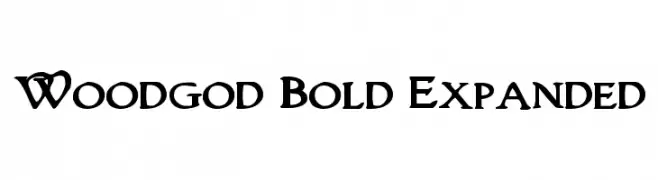
A bold, expanded decorative font with unique serifs and playful curves.
![Woodgod Bold Expanded font caratteri gratis]() Scaricare 106 Downloads@WebFont
Scaricare 106 Downloads@WebFont -
( Fonts by www.woodcutter.es - woodcutter Manero - Personal-use only. For commercial use please contact owner. )
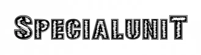
A bold, decorative font with a textured, engraved appearance.
![SPECIAL UNIT font caratteri gratis]() Scaricare 106 Downloads@WebFont
Scaricare 106 Downloads@WebFont -
( www.rauberdesign.com )
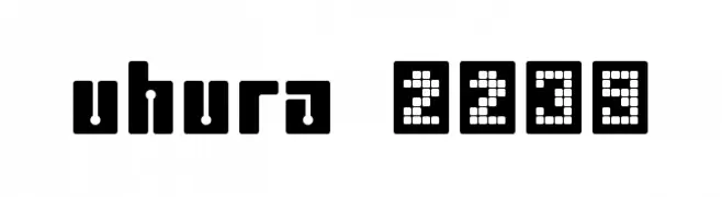
A bold, geometric font with a futuristic, digital aesthetic.
![uhura 2239 font caratteri gratis]() Scaricare 106 Downloads@WebFont
Scaricare 106 Downloads@WebFont -
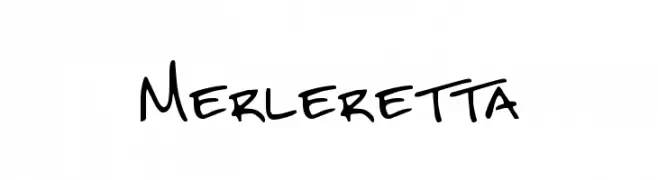
( Fresh Fonts - formerly at eccodomani.org/freshfonts/ )
A casual, handwritten style font with a playful and informal appearance.
![Merleretta font caratteri gratis]() Scaricare 106 Downloads@WebFont
Scaricare 106 Downloads@WebFont -
-
Caratteri di yuliusparyadi. For commercial use please contact the owner.
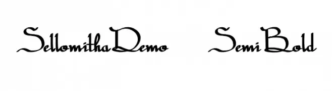
( Sellomitha )
An elegant script font with fluid, interconnected strokes and artistic flair.
![SellomithaDemo-SemiBold font caratteri gratis]() Scaricare 106 Downloads@WebFont
Scaricare 106 Downloads@WebFont -
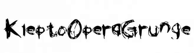
( grungeejumping.blogspot.com )
A chaotic, grungy font with jagged edges and a rebellious aesthetic.
![KleptoOperaGrunge font caratteri gratis]() Scaricare 106 Downloads@WebFont
Scaricare 106 Downloads@WebFont -
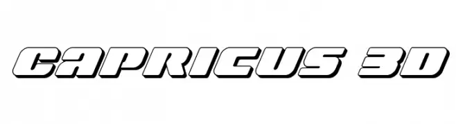
( Iconian Fonts - Daniel Zadorozny - www.iconian.com )
A bold, 3D font with a modern, geometric style.
![Capricus 3D font caratteri gratis]() Scaricare 106 Downloads@WebFont
Scaricare 106 Downloads@WebFont -
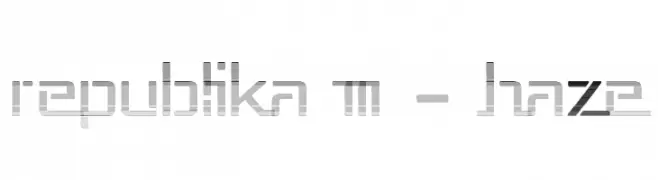
( Fonts by Apostrophic Lab )
A futuristic, geometric font with angular design and horizontal line elements.
![Republika III - Haze font caratteri gratis]() Scaricare 106 Downloads@WebFont
Scaricare 106 Downloads@WebFont -
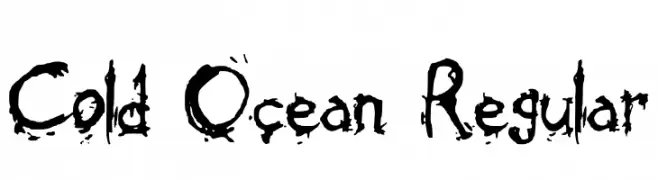
![Cold Ocean Regular font caratteri gratis]() Scaricare 106 Downloads@WebFont
Scaricare 106 Downloads@WebFont
Quali sono i font più popolari adesso?
Poppins, Roboto, Montserrat, Open Sans e Lato sono molto usati per le forme pulite e l'ampia applicabilità — dall'identità di marca alle landing page e ai poster.
Quali font si usano spesso nei loghi?
Le sans serif geometriche (es. Poppins, famiglie in stile Gotham) sono scelte comuni per un branding pulito e scalabile. Per un tocco personale restano valide script e stili manoscritti. Abbina un display deciso per i titoli a un corpo testo neutro per riconoscibilità ed equilibrio.
Ogni quanto si aggiorna la lista?
Con regolarità, in base ai download e all'attività reale. Torna spesso per scoprire in anticipo le nuove preferite.
💡 Consiglio: aggiungi ai preferiti — le tendenze cambiano in fretta e i font top di oggi possono ispirare il rebranding di domani.