Benvenuto nelle Font Più Popolari — dove popolarità e qualità si incontrano. Qui trovi i font più scaricati e usati dell'anno. Se cerchi scelte sicure per logo, web o social, inizia da qui.
Ogni font top si distingue per equilibrio, leggibilità e versatilità. Troverai sans serif moderne, script eleganti, serif vintage e display minimalisti.
-
( Fonts by Sudarman Mulka )
A playful, bold handwritten font with rounded edges and a whimsical style.
 Scaricare 105 Downloads@WebFont
 -
( Fonts by Daniel Zadorozny - www.iconian.com - Free for personal use )
A bold, geometric 3D outline font with a futuristic style.
![Universal Jack 3D font caratteri gratis]() Scaricare 105 Downloads@WebFont
Scaricare 105 Downloads@WebFont -
![Rexmone DEMO font caratteri gratis]() Scaricare 105 Downloads@WebFont
Scaricare 105 Downloads@WebFont -
( Fonts by Daniel Zadorozny - www.iconian.com )
A bold, italicized font with a halftone effect, perfect for modern and dynamic designs.
![Han Solo Halftone Italic font caratteri gratis]() Scaricare 105 Downloads@WebFont
Scaricare 105 Downloads@WebFont -
( Fonts by ijem - Ferdiansyah Ferdiansyah - Personal-use only. For commercial use please contact owner. )
A bold, dynamic script font with interconnected characters and sweeping curves.
![BigBlueBold-Bold font caratteri gratis]() Scaricare 105 Downloads@WebFont
Scaricare 105 Downloads@WebFont -
-
( Fonts by Cannot Into Space Fonts )
A bold, outlined, and italic font with a playful and dynamic style.
![NumbBunny Bold Outline Italic font caratteri gratis]() Scaricare 105 Downloads@WebFont
Scaricare 105 Downloads@WebFont -
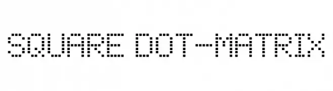
( Fonts by Krafti Lab - Onur Cem TAN - Personal-use only. For commercial use please contact owner. )
A pixelated, square dot matrix font with a digital and retro feel.
![Square Dot-Matrix font caratteri gratis]() Scaricare 105 Downloads@WebFont
Scaricare 105 Downloads@WebFont -
( Fonts by YonType Studio - Muhammad Yoni - Personal-use only. For commercial use please contact owner. )
A sophisticated script font with high contrast and elegant curves.
![Gerliya font caratteri gratis]() Scaricare 105 Downloads@WebFont
Scaricare 105 Downloads@WebFont -
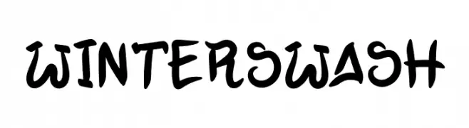
( Fonts by Illushvara )
A bold, brush-style script font with playful swashes and curves.
![Winter Swash font caratteri gratis]() Scaricare 105 Downloads@WebFont
Scaricare 105 Downloads@WebFont -
![JustifyRegular font caratteri gratis]() Scaricare 105 Downloads@WebFont
Scaricare 105 Downloads@WebFont


Quali sono i font più popolari adesso?
Poppins, Roboto, Montserrat, Open Sans e Lato sono molto usati per le forme pulite e l'ampia applicabilità — dall'identità di marca alle landing page e ai poster.
Quali font si usano spesso nei loghi?
Le sans serif geometriche (es. Poppins, famiglie in stile Gotham) sono scelte comuni per un branding pulito e scalabile. Per un tocco personale restano valide script e stili manoscritti. Abbina un display deciso per i titoli a un corpo testo neutro per riconoscibilità ed equilibrio.
Ogni quanto si aggiorna la lista?
Con regolarità, in base ai download e all'attività reale. Torna spesso per scoprire in anticipo le nuove preferite.
💡 Consiglio: aggiungi ai preferiti — le tendenze cambiano in fretta e i font top di oggi possono ispirare il rebranding di domani.