Benvenuto nelle Font Più Popolari — dove popolarità e qualità si incontrano. Qui trovi i font più scaricati e usati dell'anno. Se cerchi scelte sicure per logo, web o social, inizia da qui.
Ogni font top si distingue per equilibrio, leggibilità e versatilità. Troverai sans serif moderne, script eleganti, serif vintage e display minimalisti.
-
( Fonts by Graziano Capelli - Personal-use only. For commercial use please contact owner. )
A casual, playful handwritten font with rounded edges and a slight slant.
 Scaricare 520 Downloads@WebFont
 -
( Fonts by Goma Shin - Shintarou Nakayama www.geocities.jp/gomarice_font/ )
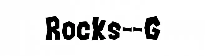
A bold, rugged font with jagged, rock-like edges.
![Rocks__G font caratteri gratis]() Scaricare 520 Downloads@WebFont
Scaricare 520 Downloads@WebFont -
( Fonts by imagex )
A bold, playful font with a comic book style and dynamic letterforms.
![Ka Blam font caratteri gratis]() Scaricare 520 Downloads@WebFont
Scaricare 520 Downloads@WebFont -
( Fonts by Thirtypath - Personal-use only. For commercial use please contact owner. )
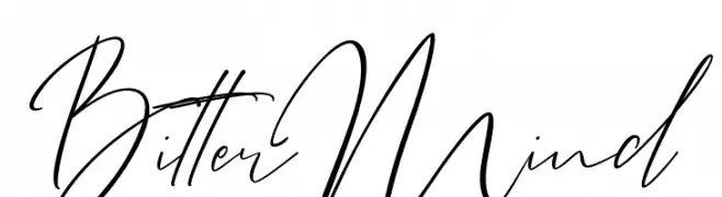
Elegant cursive font with fluid, interconnected strokes.
![BitterMind font caratteri gratis]() Scaricare 520 Downloads@WebFont
Scaricare 520 Downloads@WebFont -
( Fonts by Castcraft Software - OPTI Fonts Archive - opti.netii.net - Personal-use only. For commercial use please contact owner. )
A high-contrast, elegant font with elongated serifs and a modern aesthetic.
![OPTIRadar font caratteri gratis]() Scaricare 520 Downloads@WebFont
Scaricare 520 Downloads@WebFont -
-
( Fonts by Billy Argel - www.billyargel.com - Personal-use only. For commercial use please contact owner. )
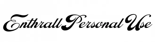
An elegant script font with ornate, flowing letterforms and high contrast.
![Enthrall Personal Use font caratteri gratis]() Scaricare 520 Downloads@WebFont
Scaricare 520 Downloads@WebFont -
( Free for personal use - pages.suddenlink.net/jasonarthur/ )
A bold, italicized font with a dynamic and modern style.
![ZhukovZippo-Italic font caratteri gratis]() Scaricare 520 Downloads@WebFont
Scaricare 520 Downloads@WebFont -
( Fonts by Sentinel Type - James Arboghast )
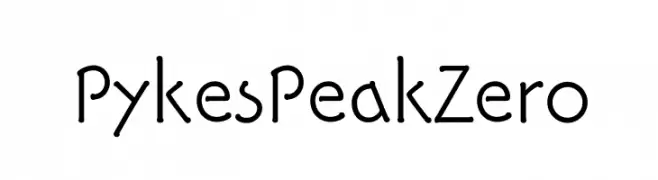
A modern, geometric font with subtle curves and a playful touch.
![PykesPeakZero font caratteri gratis]() Scaricare 520 Downloads@WebFont
Scaricare 520 Downloads@WebFont -
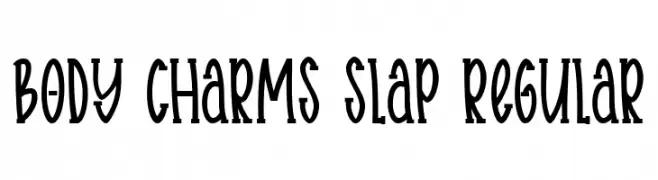
( Fonts by Ibram Syah )
A playful, hand-drawn font with tall, narrow characters and a whimsical style.
![Body charms slap Regular font caratteri gratis]() Scaricare 520 Downloads@WebFont
Scaricare 520 Downloads@WebFont -
( Fonts by Galdino Otten Fonts - www.galdinootten.com - Personal-use only. For commercial use please contact owner. )
A bold, distressed font with a textured, weathered appearance.
![Texture Road font caratteri gratis]() Scaricare 520 Downloads@WebFont
Scaricare 520 Downloads@WebFont -
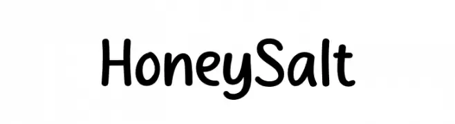
( Fonts by MJType )
A playful, rounded font with a hand-drawn, friendly appearance.
![Honey Salt font caratteri gratis]() Scaricare 520 Downloads@WebFont
Scaricare 520 Downloads@WebFont -
( Font by kingthingsfonts.co.uk )
A decorative font with bold, floral-themed characters and playful embellishments.
![Kingthings Annex font caratteri gratis]() Scaricare 519 Downloads@WebFont
Scaricare 519 Downloads@WebFont -
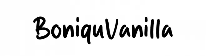
( Fonts by MJType )
A playful, informal handwritten font with smooth, rounded letterforms.
![Boniqu Vanilla font caratteri gratis]() Scaricare 519 Downloads@WebFont
Scaricare 519 Downloads@WebFont -
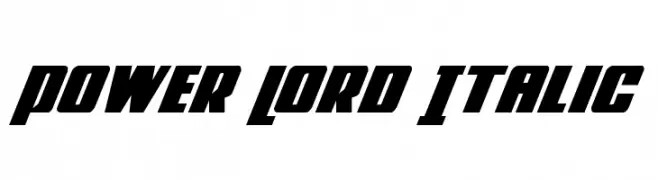
( Fonts by Daniel Zadorozny - www.iconian.com - Free for personal use )
A bold, italic font with angular lines and a dynamic, modern style.
![Power Lord Italic font caratteri gratis]() Scaricare 519 Downloads@WebFont
Scaricare 519 Downloads@WebFont -
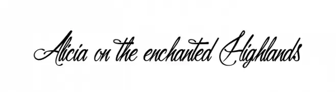
( Fonts by Maelle.K - Thomas Boucherie - Personal-use only. For commercial use please contact owner. )
A sophisticated cursive script font with elegant flourishes.
![Alicia on the enchanted Highlands font caratteri gratis]() Scaricare 519 Downloads@WebFont
Scaricare 519 Downloads@WebFont -
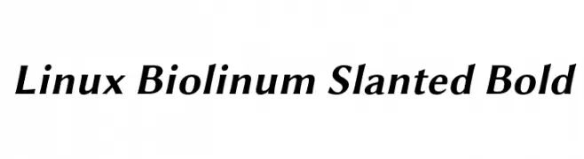
( Linux Libertine - www.linuxlibertine.org )
A bold, slanted, and modern font with elegant curves and strong presence.
![Linux Biolinum Slanted Bold font caratteri gratis]() Scaricare 519 Downloads@WebFont
Scaricare 519 Downloads@WebFont -
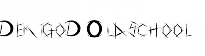
![DemigoD Oldschool font caratteri gratis]() Scaricare 519 Downloads@WebFont
Scaricare 519 Downloads@WebFont -
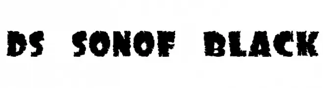
![DS SonOf Black font caratteri gratis]() Scaricare 519 Downloads@WebFont
Scaricare 519 Downloads@WebFont -
![Ornament ScrollsAndFlorishes font caratteri gratis]() Scaricare 519 Downloads@WebFont
Scaricare 519 Downloads@WebFont -
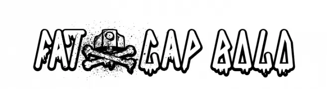
( www.qkila.com/font )
A bold, graffiti-inspired font with a dripping effect, ideal for urban-themed designs.
![FAT&CAP Bold font caratteri gratis]() Scaricare 519 Downloads@WebFont
Scaricare 519 Downloads@WebFont -
( Fonts by Ahmed Camel - Personal-use only. For commercial use please contact owner. )
A bold, playful font with unique curves and strong presence.
![Iqbal Camel Regular font caratteri gratis]() Scaricare 519 Downloads@WebFont
Scaricare 519 Downloads@WebFont -
![Panforte Pro Bold font caratteri gratis]() Scaricare 519 Downloads@WebFont
Scaricare 519 Downloads@WebFont -
( Fonts by a Colm Clafferty - colmfonts.hol.es. Personal-use only. For commercial use please contact owner. )
A jagged, rebellious font with sharp, irregular strokes for bold, edgy designs.
![LAMEBRAINS font caratteri gratis]() Scaricare 519 Downloads@WebFont
Scaricare 519 Downloads@WebFont -
( Fonts by Lantype Studio )
A playful, handwritten font with smooth, rounded edges and a casual style.
![DawetAyu font caratteri gratis]() Scaricare 519 Downloads@WebFont
Scaricare 519 Downloads@WebFont -
( Fonts by 7NTypes )
A playful, outlined font with rounded characters and a bold, friendly style.
![Best School Outline font caratteri gratis]() Scaricare 519 Downloads@WebFont
Scaricare 519 Downloads@WebFont -
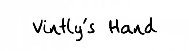
![Vintly's Hand font caratteri gratis]() Scaricare 519 Downloads@WebFont
Scaricare 519 Downloads@WebFont -
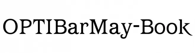
( Fonts by Castcraft Software - opti.netii.net - check the website before use )
A classic serif font with elegant and balanced characters.
![OPTIBarMay-Book font caratteri gratis]() Scaricare 519 Downloads@WebFont
Scaricare 519 Downloads@WebFont -
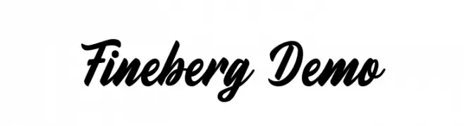
( Fonts by Farul Arjianto - creativemarket.com/typefar - Personal-use only. For commercial use please contact owner. )
A bold, cursive font with smooth, flowing lines and elegant flourishes.
![Fineberg Demo font caratteri gratis]() Scaricare 519 Downloads@WebFont
Scaricare 519 Downloads@WebFont -
( Fonts by nurfdesigns - Personal-use only. For commercial use please contact owner. )
A modern, flowing cursive font with smooth, rounded strokes and elegant connections.
![Kaibon font caratteri gratis]() Scaricare 519 Downloads@WebFont
Scaricare 519 Downloads@WebFont -
( Fonts by Ingo Zimmermann - www.ingofonts.com. Personal-use only. For commercial use please contact owner. )
Bold, italicized font with a modern and dynamic style.
![WendelinReduced-FettKursiv font caratteri gratis]() Scaricare 519 Downloads@WebFont
Scaricare 519 Downloads@WebFont -
![Hussar Ekologiczne 2 font caratteri gratis]() Scaricare 519 Downloads@WebFont
Scaricare 519 Downloads@WebFont -
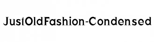
( Fonts by Manfred Klein - manfred-klein.ina-mar.com )
A classic serif font with a condensed width and medium contrast, offering elegance and readability.
![JustOldFashion-Condensed font caratteri gratis]() Scaricare 519 Downloads@WebFont
Scaricare 519 Downloads@WebFont -
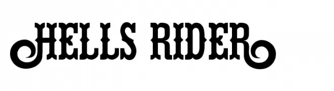
( Fonts by Chris Vile - fontmonger.com - Personal-use only. For commercial use please contact owner. )
A bold, vintage-inspired serif font with high contrast and strong serifs.
![Hells Rider font caratteri gratis]() Scaricare 519 Downloads@WebFont
Scaricare 519 Downloads@WebFont -
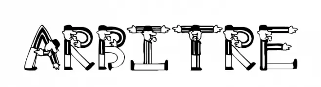
![Arbitre font caratteri gratis]() Scaricare 519 Downloads@WebFont
Scaricare 519 Downloads@WebFont -
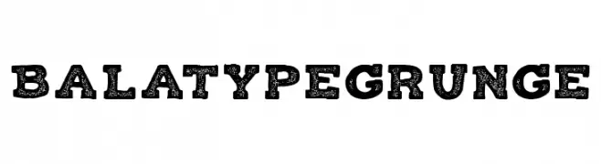
( Fonts by Roman Paslavskiy )
A bold, distressed font with a grunge texture and vintage appeal.
![Balatype Grunge font caratteri gratis]() Scaricare 519 Downloads@WebFont
Scaricare 519 Downloads@WebFont


Quali sono i font più popolari adesso?
Poppins, Roboto, Montserrat, Open Sans e Lato sono molto usati per le forme pulite e l'ampia applicabilità — dall'identità di marca alle landing page e ai poster.
Quali font si usano spesso nei loghi?
Le sans serif geometriche (es. Poppins, famiglie in stile Gotham) sono scelte comuni per un branding pulito e scalabile. Per un tocco personale restano valide script e stili manoscritti. Abbina un display deciso per i titoli a un corpo testo neutro per riconoscibilità ed equilibrio.
Ogni quanto si aggiorna la lista?
Con regolarità, in base ai download e all'attività reale. Torna spesso per scoprire in anticipo le nuove preferite.
💡 Consiglio: aggiungi ai preferiti — le tendenze cambiano in fretta e i font top di oggi possono ispirare il rebranding di domani.