Benvenuto nelle Font Più Popolari — dove popolarità e qualità si incontrano. Qui trovi i font più scaricati e usati dell'anno. Se cerchi scelte sicure per logo, web o social, inizia da qui.
Ogni font top si distingue per equilibrio, leggibilità e versatilità. Troverai sans serif moderne, script eleganti, serif vintage e display minimalisti.
-
( Fonts by Daniel Zadorozny - www.iconian.com )
A futuristic, angular font with geometric shapes and a dynamic slant.
 Scaricare 105 Downloads@WebFont
 -
( Fonts by Bud White. Personal-use only. For commercial use please contact owner. )
A modern, geometric font with clean, rounded edges and uniform line weight.
![Ohdoad font caratteri gratis]() Scaricare 105 Downloads@WebFont
Scaricare 105 Downloads@WebFont -
( Fonts by idebareng )
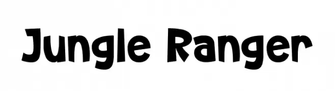
A bold, playful font with dynamic and slightly irregular letterforms.
![Jungle Ranger font caratteri gratis]() Scaricare 104 Downloads@WebFont
Scaricare 104 Downloads@WebFont -
( Fonts by www.26plus-zeichen.de )
A bold, geometric font inspired by origami, featuring sharp angles and a modern aesthetic.
![RealOrigami font caratteri gratis]() Scaricare 104 Downloads@WebFont
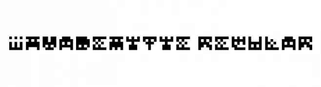
Scaricare 104 Downloads@WebFont -
![InvadeMytye Regular font caratteri gratis]() Scaricare 104 Downloads@WebFont
Scaricare 104 Downloads@WebFont -
-
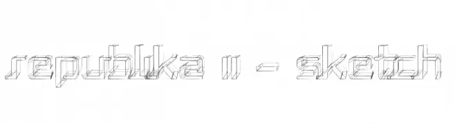
( Fonts by Apostrophic Lab )
A sketch-style, three-dimensional font with geometric and angular design.
![Republika II - Sketch font caratteri gratis]() Scaricare 104 Downloads@WebFont
Scaricare 104 Downloads@WebFont -
![Bork Bork Opposite Oblique font caratteri gratis]() Scaricare 104 Downloads@WebFont
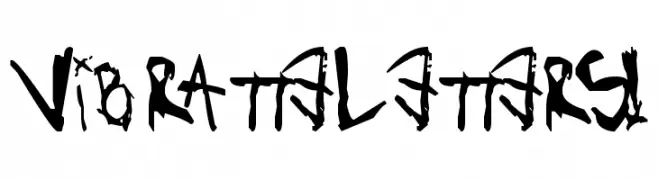
Scaricare 104 Downloads@WebFont -
![VibratteLetters! font caratteri gratis]() Scaricare 104 Downloads@WebFont
Scaricare 104 Downloads@WebFont -
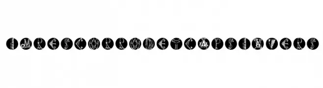
( Fonts by Manfred Klein. Free for private and charity use. Free for commercial with donation to organizations )
A decorative and artistic font with intricate designs within circular boundaries.
![ImresCorrodetCapsInvers font caratteri gratis]() Scaricare 104 Downloads@WebFont
Scaricare 104 Downloads@WebFont -
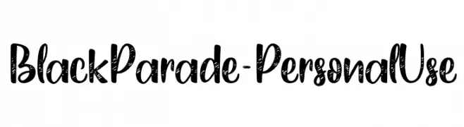
( Fonts by Typhoon Type - Suthi Srisopha - Personal-use only. For commercial use please contact owner. )
A bold, hand-drawn font with a textured, artistic style.
![Black Parade - Personal Use font caratteri gratis]() Scaricare 104 Downloads@WebFont
Scaricare 104 Downloads@WebFont


Quali sono i font più popolari adesso?
Poppins, Roboto, Montserrat, Open Sans e Lato sono molto usati per le forme pulite e l'ampia applicabilità — dall'identità di marca alle landing page e ai poster.
Quali font si usano spesso nei loghi?
Le sans serif geometriche (es. Poppins, famiglie in stile Gotham) sono scelte comuni per un branding pulito e scalabile. Per un tocco personale restano valide script e stili manoscritti. Abbina un display deciso per i titoli a un corpo testo neutro per riconoscibilità ed equilibrio.
Ogni quanto si aggiorna la lista?
Con regolarità, in base ai download e all'attività reale. Torna spesso per scoprire in anticipo le nuove preferite.
💡 Consiglio: aggiungi ai preferiti — le tendenze cambiano in fretta e i font top di oggi possono ispirare il rebranding di domani.