Benvenuto nelle Font Più Popolari — dove popolarità e qualità si incontrano. Qui trovi i font più scaricati e usati dell'anno. Se cerchi scelte sicure per logo, web o social, inizia da qui.
Ogni font top si distingue per equilibrio, leggibilità e versatilità. Troverai sans serif moderne, script eleganti, serif vintage e display minimalisti.
-
( Fonts by Jacob Fisher - www.pizzadude.dk )
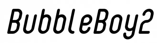
A modern, rounded font with smooth, elongated characters and consistent stroke width.
 Scaricare 529 Downloads@WebFont
 -
( Fonts by Castcraft Software - OPTI Fonts Archive - opti.netii.net - Personal-use only. For commercial use please contact owner. )
A high-contrast, elegant font with elongated serifs and a modern aesthetic.
![OPTIRadar font caratteri gratis]() Scaricare 529 Downloads@WebFont
Scaricare 529 Downloads@WebFont -
( Fonts by Edric Studio )
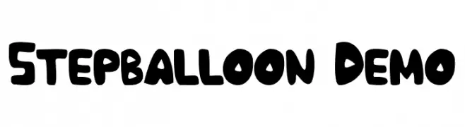
A bold, playful font with rounded, balloon-like characters.
![Stepballoon Demo font caratteri gratis]() Scaricare 529 Downloads@WebFont
Scaricare 529 Downloads@WebFont -
( Fonts by Zetafonts )
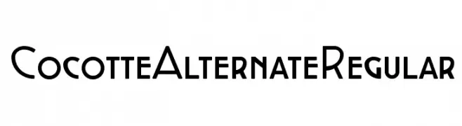
A modern, geometric font with bold uppercase and smooth lowercase letters.
![Cocotte Alternate Regular font caratteri gratis]() Scaricare 529 Downloads@WebFont
Scaricare 529 Downloads@WebFont -
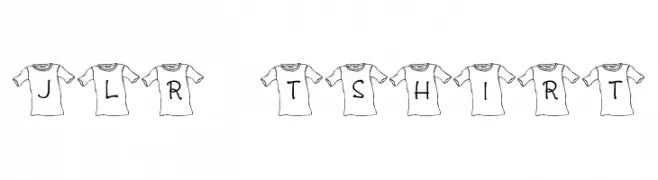
![JLR T-Shirt font caratteri gratis]() Scaricare 529 Downloads@WebFont
Scaricare 529 Downloads@WebFont -
( Fonts by ShyFonts )
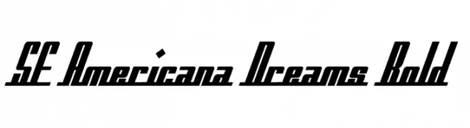
A bold, slanted, and condensed font with high contrast and dynamic style.
![SF Americana Dreams Bold font caratteri gratis]() Scaricare 529 Downloads@WebFont
Scaricare 529 Downloads@WebFont -
( Fonts by Steve Gardner - www.explogos.com. Personal-use only. For commercial use please contact owner. )
A bold, modern sans-serif font with clean lines and strong geometric shapes.
![Sans Statement Regular font caratteri gratis]() Scaricare 529 Downloads@WebFont
Scaricare 529 Downloads@WebFont -
( Fonts by billyargel.blogspot.com - Billy Argel )
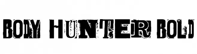
A bold, distressed font with a grunge aesthetic and strong visual impact.
![BODY HUNTER Bold font caratteri gratis]() Scaricare 529 Downloads@WebFont
Scaricare 529 Downloads@WebFont -
( Fonts by Castcraft Software - opti.netii.net - check the website before use )
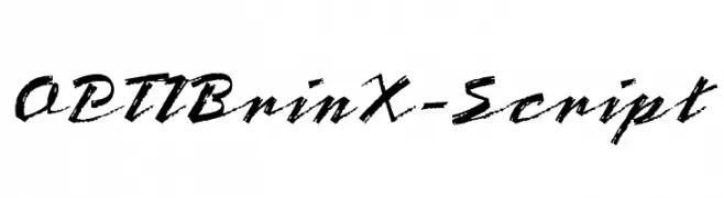
A bold, brush-style script font with dynamic and expressive strokes.
![OPTIBrinX-Script font caratteri gratis]() Scaricare 529 Downloads@WebFont
Scaricare 529 Downloads@WebFont -
![ChinChan font caratteri gratis]() Scaricare 529 Downloads@WebFont
Scaricare 529 Downloads@WebFont -
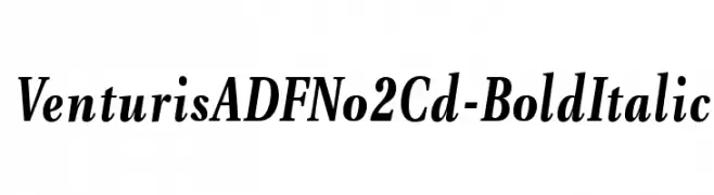
( Fonts by Arkandis Digital Foundry )
A bold, italic serif font with a classic and elegant style.
![VenturisADFNo2Cd-BoldItalic font caratteri gratis]() Scaricare 529 Downloads@WebFont
Scaricare 529 Downloads@WebFont -
![Bionique font caratteri gratis]() Scaricare 529 Downloads@WebFont
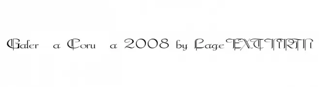
Scaricare 529 Downloads@WebFont -
![Galerìa Coruña 2008 by Lage EXT NRM font caratteri gratis]() Scaricare 529 Downloads@WebFont
Scaricare 529 Downloads@WebFont -
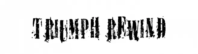
( Fonts by billyargel.blogspot.com - Billy Argel )
A bold, distressed font with a vintage, grunge aesthetic.
![TRIUMPH REWIND font caratteri gratis]() Scaricare 528 Downloads@WebFont
Scaricare 528 Downloads@WebFont -
( Fonts by Klaus Johansen - www.listemageren.dK )
Illustrations of various aeroplanes in a structured grid format.
![Aeroplanes font caratteri gratis]() Scaricare 528 Downloads@WebFont
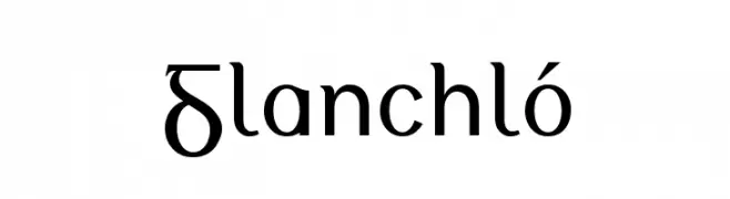
Scaricare 528 Downloads@WebFont -
![Glanchló font caratteri gratis]() Scaricare 528 Downloads
Scaricare 528 Downloads -
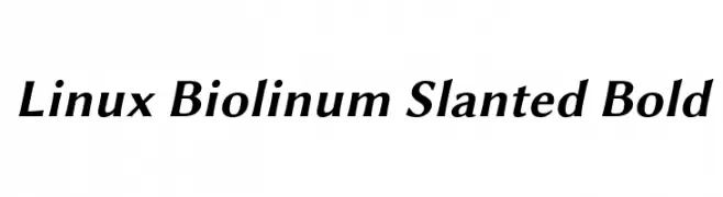
( Linux Libertine - www.linuxlibertine.org )
A bold, slanted, and modern font with elegant curves and strong presence.
![Linux Biolinum Slanted Bold font caratteri gratis]() Scaricare 528 Downloads@WebFont
Scaricare 528 Downloads@WebFont -
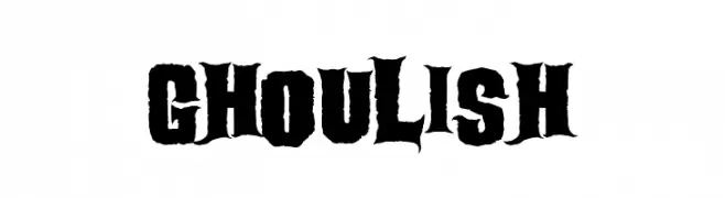
( Sinister Fonts - www.sinisterfonts.com )
A bold, jagged font with a spooky, horror-themed design.
![Ghoulish font caratteri gratis]() Scaricare 528 Downloads@WebFont
Scaricare 528 Downloads@WebFont -
![DJ Kitchen font caratteri gratis]() Scaricare 528 Downloads@WebFont
Scaricare 528 Downloads@WebFont -
( Fonts by Ahmed Camel - Personal-use only. For commercial use please contact owner. )
A bold, playful font with unique curves and strong presence.
![Iqbal Camel Regular font caratteri gratis]() Scaricare 528 Downloads@WebFont
Scaricare 528 Downloads@WebFont -
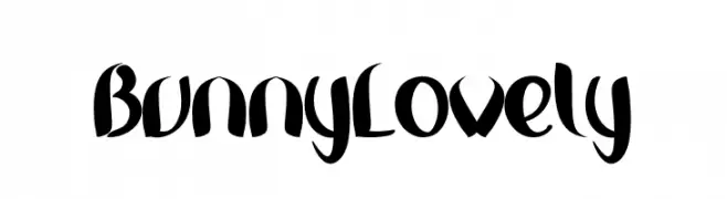
( Fonts by Inermedia Studio )
A playful, bold font with a whimsical, hand-drawn style.
![Bunny Lovely font caratteri gratis]() Scaricare 528 Downloads@WebFont
Scaricare 528 Downloads@WebFont -
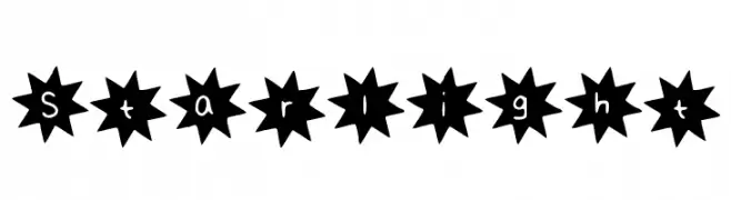
![Starlight font caratteri gratis]() Scaricare 528 Downloads@WebFont
Scaricare 528 Downloads@WebFont -
![HippoCritic font caratteri gratis]() Scaricare 528 Downloads@WebFont
Scaricare 528 Downloads@WebFont -
( ingoFonts - Ingo Zimmermann - www.ingofonts.com )
A bold, modern sans-serif font with clean lines and uniform strokes.
![AugustSansReduced-Bold font caratteri gratis]() Scaricare 528 Downloads@WebFont
Scaricare 528 Downloads@WebFont -
![TeXGyreBonum-Italic font caratteri gratis]() Scaricare 528 Downloads@WebFont
Scaricare 528 Downloads@WebFont -
( Fonts by ManekaDesign )
A hand-drawn, expressive font with irregular, organic lines.
![Ranting Regular font caratteri gratis]() Scaricare 528 Downloads@WebFont
Scaricare 528 Downloads@WebFont -
![RockArt font caratteri gratis]() Scaricare 528 Downloads@WebFont
Scaricare 528 Downloads@WebFont -
( Fonts by Lantype Studio )
A playful, handwritten font with smooth, rounded edges and a casual style.
![DawetAyu font caratteri gratis]() Scaricare 528 Downloads@WebFont
Scaricare 528 Downloads@WebFont -
( Fonts by yusukekamiyamane.com )
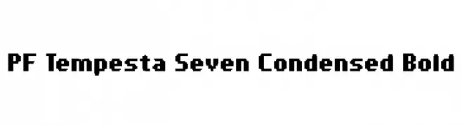
A bold, condensed, pixelated font with a retro digital style.
![PF Tempesta Seven Condensed Bold font caratteri gratis]() Scaricare 528 Downloads@WebFont
Scaricare 528 Downloads@WebFont -
( Font by Jayvee D. Enaguas - grandchaos9000.deviantart.com )
A pixelated, retro-style font with a blocky, geometric design.
![RetroVille NC font caratteri gratis]() Scaricare 528 Downloads@WebFont
Scaricare 528 Downloads@WebFont -
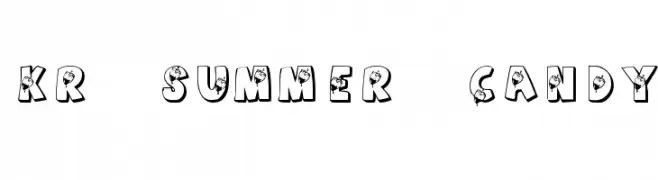
![KR Summer Candy font caratteri gratis]() Scaricare 528 Downloads@WebFont
Scaricare 528 Downloads@WebFont -
( Fonts by Khurasan )
A playful, bold font with rounded, hand-drawn characters.
![Handgoal font caratteri gratis]() Scaricare 528 Downloads@WebFont
Scaricare 528 Downloads@WebFont -
( Personal-use only. For commercial use please contact owner. )
A bold, rounded font with a playful, hand-drawn style.
![GiantTigersBack-Regular font caratteri gratis]() Scaricare 528 Downloads@WebFont
Scaricare 528 Downloads@WebFont -
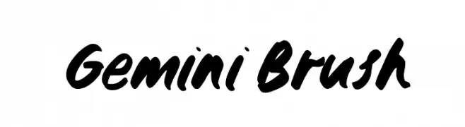
( Zansari - Zaffar Ansari - www.zansarifont.com )
A bold, dynamic brush-style font with fluid, expressive strokes.
![Gemini Brush font caratteri gratis]() Scaricare 528 Downloads@WebFont
Scaricare 528 Downloads@WebFont -
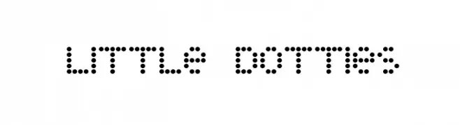
( THESE ARE SHAREWARE FONTS ! NOT FREEWARE ! PLEASE VISIT www.fuelfonts.com )
A dot matrix style font with a playful and modern aesthetic.
![Little Dotties font caratteri gratis]() Scaricare 528 Downloads@WebFont
Scaricare 528 Downloads@WebFont


Quali sono i font più popolari adesso?
Poppins, Roboto, Montserrat, Open Sans e Lato sono molto usati per le forme pulite e l'ampia applicabilità — dall'identità di marca alle landing page e ai poster.
Quali font si usano spesso nei loghi?
Le sans serif geometriche (es. Poppins, famiglie in stile Gotham) sono scelte comuni per un branding pulito e scalabile. Per un tocco personale restano valide script e stili manoscritti. Abbina un display deciso per i titoli a un corpo testo neutro per riconoscibilità ed equilibrio.
Ogni quanto si aggiorna la lista?
Con regolarità, in base ai download e all'attività reale. Torna spesso per scoprire in anticipo le nuove preferite.
💡 Consiglio: aggiungi ai preferiti — le tendenze cambiano in fretta e i font top di oggi possono ispirare il rebranding di domani.