Benvenuto nelle Font Più Popolari — dove popolarità e qualità si incontrano. Qui trovi i font più scaricati e usati dell'anno. Se cerchi scelte sicure per logo, web o social, inizia da qui.
Ogni font top si distingue per equilibrio, leggibilità e versatilità. Troverai sans serif moderne, script eleganti, serif vintage e display minimalisti.
-
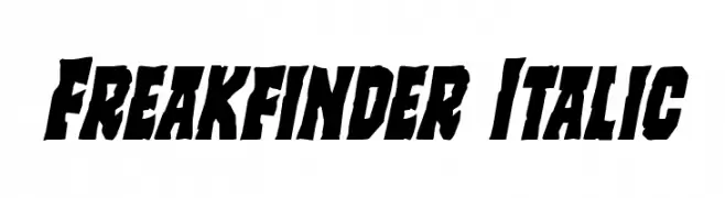
( Fonts by Daniel Zadorozny - www.iconian.com - Free for personal use )
A bold, italicized, and dynamic font with a rugged, edgy appearance.
 Scaricare 103 Downloads@WebFont
 -
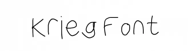
![Krieg Font font caratteri gratis]() Scaricare 103 Downloads@WebFont
Scaricare 103 Downloads@WebFont -
( Fonts by Gassstype )
A bold, playful font with chunky, uneven characters.
![Lazy Coffee font caratteri gratis]() Scaricare 103 Downloads@WebFont
Scaricare 103 Downloads@WebFont -
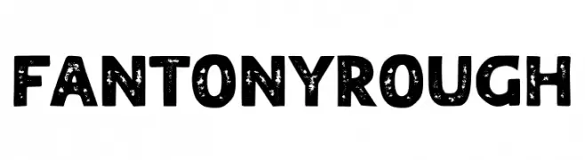
( Fonts by RBCS Studio )
A bold, distressed font with a vintage, handcrafted appearance.
![FANTONY ROUGH font caratteri gratis]() Scaricare 103 Downloads@WebFont
Scaricare 103 Downloads@WebFont -
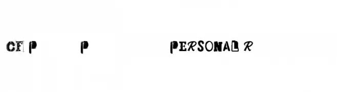
( Fonts by Cloutierfontes )
A bold, eclectic font with a punk rock aesthetic and distressed textures.
![CF Punk Posters PERSONAL Regular font caratteri gratis]() Scaricare 103 Downloads@WebFont
Scaricare 103 Downloads@WebFont -
-
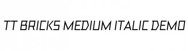
( Fonts by Jovanny Lemonad - typetype.ru - Personal-use only. For commercial use please contact owner. )
A geometric, italic font with sharp angles and a modern, technical style.
![TT Bricks Medium Italic DEMO font caratteri gratis]() Scaricare 103 Downloads@WebFont
Scaricare 103 Downloads@WebFont -
( Fonts by Manfred Klein. Free for private and charity use. Free for commercial with donation to organizations )
A whimsical, decorative font inspired by birds and fish, featuring intricate and playful designs.
![BirdsNFishes font caratteri gratis]() Scaricare 103 Downloads@WebFont
Scaricare 103 Downloads@WebFont -
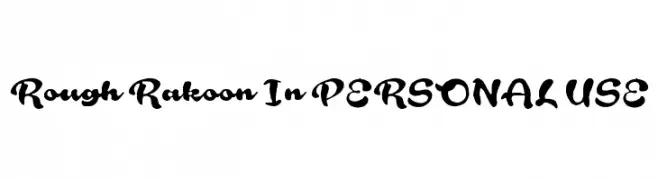
( Måns Grebäck - www.mansgreback.com )
A bold, playful handwritten font with fluid, brush-like strokes.
![Rough Rakoon In PERSONAL USE font caratteri gratis]() Scaricare 103 Downloads@WebFont
Scaricare 103 Downloads@WebFont -
( Noto is a trademark of Google Inc. Noto fonts are open source. All Noto fonts are published under the SIL Open Font License, Version 1.1 )
An elegant, thin serif font with a semi-condensed, italic style and high contrast.
![Noto Serif Display SemiCondensed Thin Italic font caratteri gratis]() Scaricare 103 Downloads@WebFont
Scaricare 103 Downloads@WebFont -
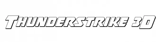
( Fonts by Iconian Fonts )
A bold, 3D geometric font with a modern and dynamic style.
![Thunderstrike 3D font caratteri gratis]() Scaricare 103 Downloads@WebFont
Scaricare 103 Downloads@WebFont


Quali sono i font più popolari adesso?
Poppins, Roboto, Montserrat, Open Sans e Lato sono molto usati per le forme pulite e l'ampia applicabilità — dall'identità di marca alle landing page e ai poster.
Quali font si usano spesso nei loghi?
Le sans serif geometriche (es. Poppins, famiglie in stile Gotham) sono scelte comuni per un branding pulito e scalabile. Per un tocco personale restano valide script e stili manoscritti. Abbina un display deciso per i titoli a un corpo testo neutro per riconoscibilità ed equilibrio.
Ogni quanto si aggiorna la lista?
Con regolarità, in base ai download e all'attività reale. Torna spesso per scoprire in anticipo le nuove preferite.
💡 Consiglio: aggiungi ai preferiti — le tendenze cambiano in fretta e i font top di oggi possono ispirare il rebranding di domani.