Benvenuto nelle Font Più Popolari — dove popolarità e qualità si incontrano. Qui trovi i font più scaricati e usati dell'anno. Se cerchi scelte sicure per logo, web o social, inizia da qui.
Ogni font top si distingue per equilibrio, leggibilità e versatilità. Troverai sans serif moderne, script eleganti, serif vintage e display minimalisti.
-
 Scaricare 103 Downloads@WebFont
 -
( Fonts by Mikrojihad Inc - www.behance.net/mikrojihad - Personal-use only. For commercial use please contact owner. )
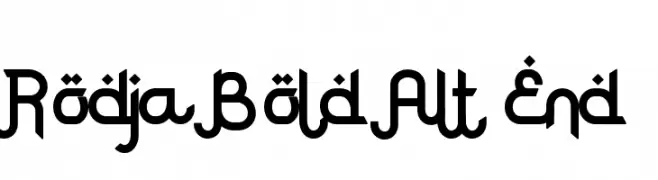
A bold, geometric font with modern and decorative elements, featuring high contrast and unique looped structures.
![Rodja Bold Alt End font caratteri gratis]() Scaricare 103 Downloads@WebFont
Scaricare 103 Downloads@WebFont -
![dog_csp font caratteri gratis]() Scaricare 103 Downloads@WebFont
Scaricare 103 Downloads@WebFont -
( Muhammad Muzammil - fontbundles.net/zoom37-creative )
An elegant script font with flowing, cursive style and intricate flourishes.
![Fayalong font caratteri gratis]() Scaricare 103 Downloads@WebFont
Scaricare 103 Downloads@WebFont -
( Fonts by backpacker.gr )
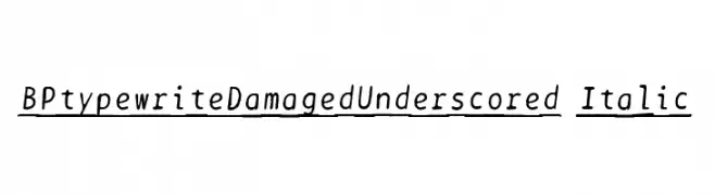
A vintage typewriter-style font with underscored, italic characters and a nostalgic feel.
![BPtypewriteDamagedUnderscored Italic font caratteri gratis]() Scaricare 103 Downloads@WebFont
Scaricare 103 Downloads@WebFont -
-
( weknow - Wino S Kadir - www.creativefabrica.com/designer/weknow/ )
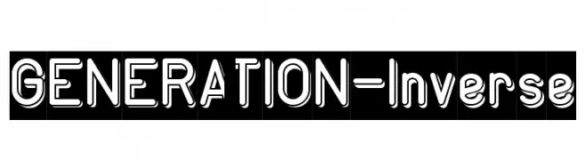
A bold, outlined font with a modern, playful aesthetic.
![GENERATION-Inverse font caratteri gratis]() Scaricare 103 Downloads@WebFont
Scaricare 103 Downloads@WebFont -
( Fonts by Woodcutter )
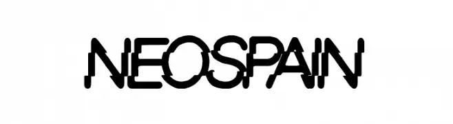
A bold, geometric font with a modern and dynamic style.
![Neo Spain font caratteri gratis]() Scaricare 103 Downloads@WebFont
Scaricare 103 Downloads@WebFont -
( Fonts by Mans Greback - Personal-use only. For commercial use please contact owner. )
An elegant and refined font with modern and classic elements, featuring subtle serifs and distinctive flourishes.
![Airium PERSONAL USE ONLY Regular font caratteri gratis]() Scaricare 103 Downloads@WebFont
Scaricare 103 Downloads@WebFont -
( Fonts by CannotIntoSpaceFonts - KineticPlasma Fonts - Personal-use only. For commercial use please contact owner. )
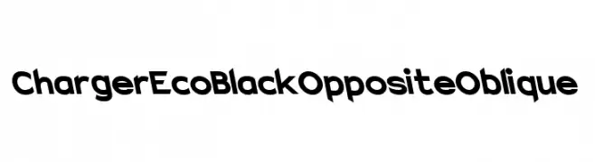
A bold, oblique font with a modern and dynamic style.
![Charger EcoBlack Opposite Oblique font caratteri gratis]() Scaricare 103 Downloads@WebFont
Scaricare 103 Downloads@WebFont -
( Fonts by Cannot Into Space Fonts )
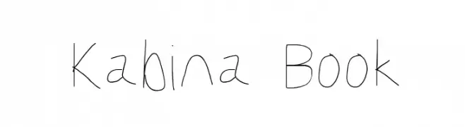
A thin, handwritten font with a casual and organic style.
![Kabina Book font caratteri gratis]() Scaricare 103 Downloads@WebFont
Scaricare 103 Downloads@WebFont


Quali sono i font più popolari adesso?
Poppins, Roboto, Montserrat, Open Sans e Lato sono molto usati per le forme pulite e l'ampia applicabilità — dall'identità di marca alle landing page e ai poster.
Quali font si usano spesso nei loghi?
Le sans serif geometriche (es. Poppins, famiglie in stile Gotham) sono scelte comuni per un branding pulito e scalabile. Per un tocco personale restano valide script e stili manoscritti. Abbina un display deciso per i titoli a un corpo testo neutro per riconoscibilità ed equilibrio.
Ogni quanto si aggiorna la lista?
Con regolarità, in base ai download e all'attività reale. Torna spesso per scoprire in anticipo le nuove preferite.
💡 Consiglio: aggiungi ai preferiti — le tendenze cambiano in fretta e i font top di oggi possono ispirare il rebranding di domani.