Benvenuto nelle Font Più Popolari — dove popolarità e qualità si incontrano. Qui trovi i font più scaricati e usati dell'anno. Se cerchi scelte sicure per logo, web o social, inizia da qui.
Ogni font top si distingue per equilibrio, leggibilità e versatilità. Troverai sans serif moderne, script eleganti, serif vintage e display minimalisti.
-
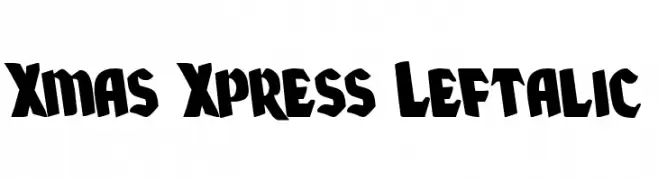
( Fonts by Daniel Zadorozny - www.iconian.com - Free for personal use )
A bold, left-slanted decorative font with a playful and dynamic style.
 Scaricare 102 Downloads@WebFont
 -
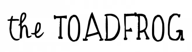
( Fonts by www.fontpanda.com. Personal-use only. For commercial use please contact owner. )
A playful, hand-drawn font with a whimsical and dynamic style.
![the TOADFROG font caratteri gratis]() Scaricare 102 Downloads@WebFont
Scaricare 102 Downloads@WebFont -
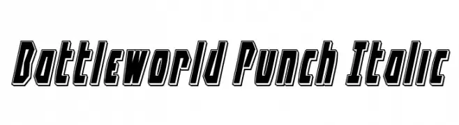
![Battleworld Punch Italic font caratteri gratis]() Scaricare 102 Downloads@WebFont
Scaricare 102 Downloads@WebFont -
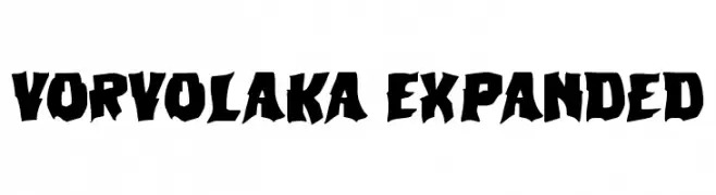
( Fonts by Daniel Zadorozny - www.iconian.com )
A bold, jagged font with an intense, dynamic style and expanded width.
![Vorvolaka Expanded font caratteri gratis]() Scaricare 102 Downloads@WebFont
Scaricare 102 Downloads@WebFont -
( Fonts by Letternun - Saeful Bahri - Personal-use only. For commercial use please contact owner. )
A flowing, cursive script font with an elegant, handwritten style.
![Agustina Signature font caratteri gratis]() Scaricare 102 Downloads@WebFont
Scaricare 102 Downloads@WebFont -
-
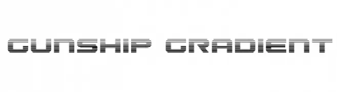
( Fonts by Daniel Zadorozny - www.iconian.com )
A futuristic, gradient-lined font with a bold, geometric style.
![Gunship Gradient font caratteri gratis]() Scaricare 102 Downloads@WebFont
Scaricare 102 Downloads@WebFont -
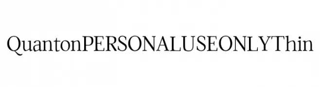
( Fonts by Mans Greback - Personal-use only. For commercial use please contact owner. )
A refined serif font with thin, elegant strokes and high contrast, perfect for sophisticated designs.
![Quanton PERSONAL USE ONLY Thin font caratteri gratis]() Scaricare 102 Downloads@WebFont
Scaricare 102 Downloads@WebFont -
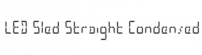
( Fonts by Iconian Fonts )
A digital, segmented font with a geometric, LED display style.
![LED Sled Straight Condensed font caratteri gratis]() Scaricare 102 Downloads@WebFont
Scaricare 102 Downloads@WebFont -
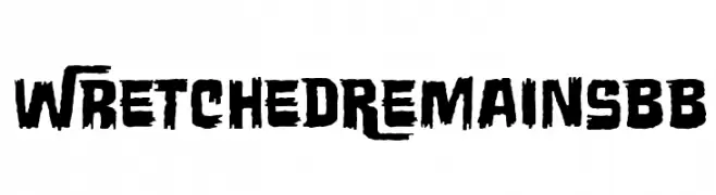
( Fonts by www.blambot.com )
A rugged, distressed font with jagged edges and bold strokes.
![WretchedRemainsBB font caratteri gratis]() Scaricare 102 Downloads@WebFont
Scaricare 102 Downloads@WebFont -
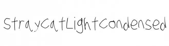
![Stray Cat Light Condensed font caratteri gratis]() Scaricare 102 Downloads@WebFont
Scaricare 102 Downloads@WebFont

Quali sono i font più popolari adesso?
Poppins, Roboto, Montserrat, Open Sans e Lato sono molto usati per le forme pulite e l'ampia applicabilità — dall'identità di marca alle landing page e ai poster.
Quali font si usano spesso nei loghi?
Le sans serif geometriche (es. Poppins, famiglie in stile Gotham) sono scelte comuni per un branding pulito e scalabile. Per un tocco personale restano valide script e stili manoscritti. Abbina un display deciso per i titoli a un corpo testo neutro per riconoscibilità ed equilibrio.
Ogni quanto si aggiorna la lista?
Con regolarità, in base ai download e all'attività reale. Torna spesso per scoprire in anticipo le nuove preferite.
💡 Consiglio: aggiungi ai preferiti — le tendenze cambiano in fretta e i font top di oggi possono ispirare il rebranding di domani.