Benvenuto nelle Font Più Popolari — dove popolarità e qualità si incontrano. Qui trovi i font più scaricati e usati dell'anno. Se cerchi scelte sicure per logo, web o social, inizia da qui.
Ogni font top si distingue per equilibrio, leggibilità e versatilità. Troverai sans serif moderne, script eleganti, serif vintage e display minimalisti.
-
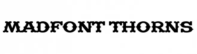
( Fonts by Harold Lohner - www.haroldsfonts.com )
A bold, decorative font with thorn-like embellishments for a unique, edgy look.
 Scaricare 5567 Downloads@WebFont
 -
![Flame font caratteri gratis]() Scaricare 5567 Downloads@WebFont
Scaricare 5567 Downloads@WebFont -
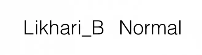
![Likhari_B Normal font caratteri gratis]() Scaricare 5566 Downloads@WebFont
Scaricare 5566 Downloads@WebFont -
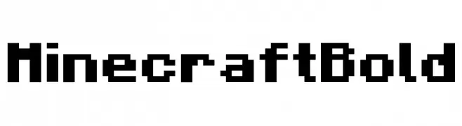
![Minecraft Bold font caratteri gratis]() Scaricare 5564 Downloads@WebFont
Scaricare 5564 Downloads@WebFont -
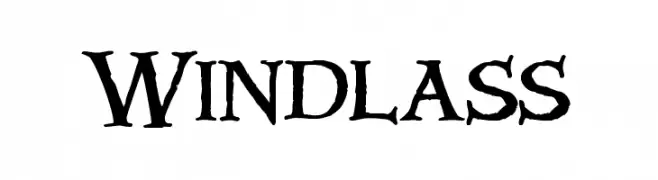
![Windlass font caratteri gratis]() Scaricare 5563 Downloads@WebFont
Scaricare 5563 Downloads@WebFont -
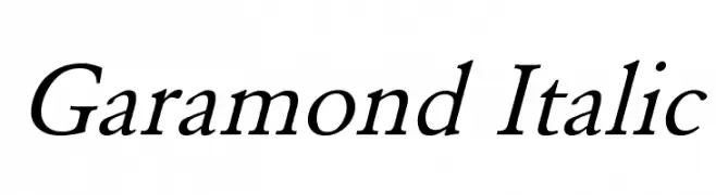
![Garamond Italic font caratteri gratis]() Scaricare 5561 Downloads@WebFont
Scaricare 5561 Downloads@WebFont -
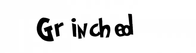
![Grinched font caratteri gratis]() Scaricare 5561 Downloads@WebFont
Scaricare 5561 Downloads@WebFont -
( [ )
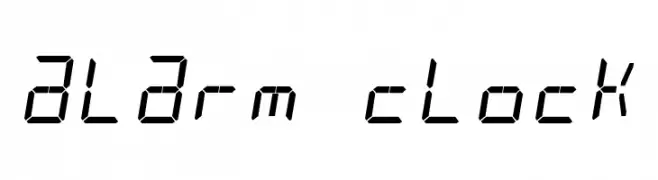
A digital-style font with segmented lines, ideal for tech-themed designs.
![alarm clock font caratteri gratis]() Scaricare 5560 Downloads@WebFont
Scaricare 5560 Downloads@WebFont -
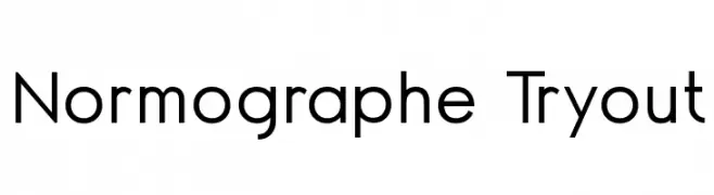
![Normographe Tryout font caratteri gratis]() Scaricare 5559 Downloads@WebFont
Scaricare 5559 Downloads@WebFont -
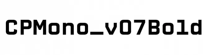
![CPMono_v07Bold font caratteri gratis]() Scaricare 5555 Downloads@WebFont
Scaricare 5555 Downloads@WebFont -
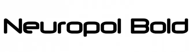
![Neuropol Bold font caratteri gratis]() Scaricare 5552 Downloads@WebFont
Scaricare 5552 Downloads@WebFont -
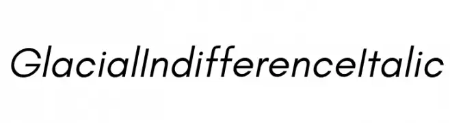
( Fonts by Hanken Design Co. )
A modern, italic sans-serif font with clean lines and balanced proportions.
![Glacial Indifference Italic font caratteri gratis]() Scaricare 5551 Downloads@WebFont
Scaricare 5551 Downloads@WebFont -
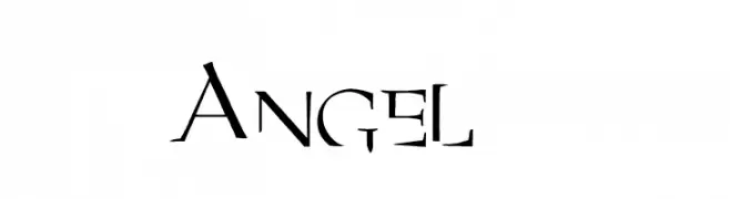
( Fonts by JuliaL - Personal-use only. For commercial use please contact owner. )
A bold, angular font with unique cutouts and an artistic, edgy style.
![Angel 1 font caratteri gratis]() Scaricare 5550 Downloads@WebFont
Scaricare 5550 Downloads@WebFont -
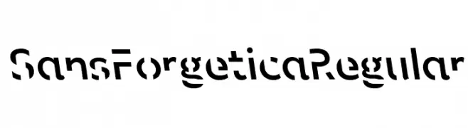
( Fonts by RMIT University - Sans Forgetica is designed for non-commercial use only. It is bound by a creative commons, non-commercial, attributed (CCBYNC) license. )
A bold, experimental sans-serif font with gaps and slants for enhanced memory retention.
![Sans Forgetica Regular font caratteri gratis]() Scaricare 5550 Downloads@WebFont
Scaricare 5550 Downloads@WebFont -
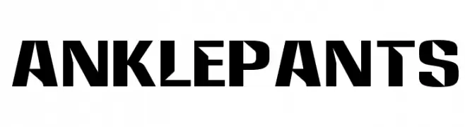
![Anklepants font caratteri gratis]() Scaricare 5550 Downloads@WebFont
Scaricare 5550 Downloads@WebFont -
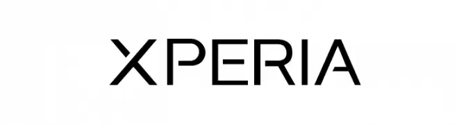
![Xperia font caratteri gratis]() Scaricare 5549 Downloads@WebFont
Scaricare 5549 Downloads@WebFont -
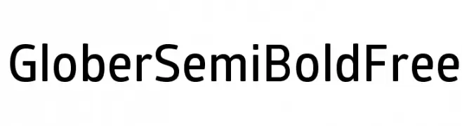
( Fonts by a www.fontfabric.com. Personal-use only. For commercial use please contact owner. )
A modern, semi-bold sans-serif font with excellent readability and balanced proportions.
![GloberSemiBoldFree font caratteri gratis]() Scaricare 5548 Downloads@WebFont
Scaricare 5548 Downloads@WebFont -
![Westminster font caratteri gratis]() Scaricare 5547 Downloads@WebFont
Scaricare 5547 Downloads@WebFont -
![Letter Gothic Line font caratteri gratis]() Scaricare 5547 Downloads@WebFont
Scaricare 5547 Downloads@WebFont -
( Fonts by Castcraft Software - opti.netii.net - check the website before use )
A bold, geometric font with tall, narrow characters and uniform stroke widths.
![OPTIAgency-Gothic font caratteri gratis]() Scaricare 5545 Downloads@WebFont
Scaricare 5545 Downloads@WebFont -
![NHL Edge Montreal font caratteri gratis]() Scaricare 5545 Downloads@WebFont
Scaricare 5545 Downloads@WebFont -
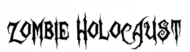
( Fonts by Sinister Visions - Chad Savage - www.sinisterfonts.com )
A bold, jagged font with a horror and gothic theme.
![Zombie Holocaust font caratteri gratis]() Scaricare 5545 Downloads@WebFont
Scaricare 5545 Downloads@WebFont -
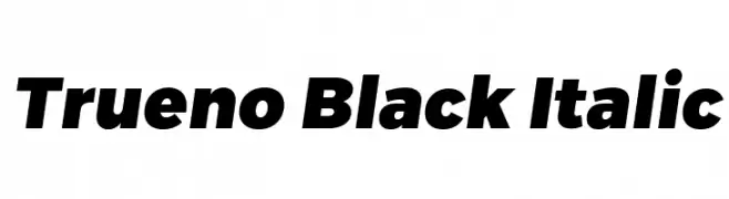
![Trueno Black Italic font caratteri gratis]() Scaricare 5541 Downloads@WebFont
Scaricare 5541 Downloads@WebFont -
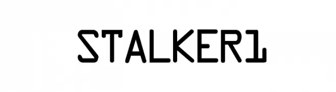
![STALKER1 font caratteri gratis]() Scaricare 5538 Downloads@WebFont
Scaricare 5538 Downloads@WebFont -
( Copyright (c) 2012, Brian J. Bonislawsky DBA Astigmatic (AOETI) (astigma@astigmatic.com), with Reserved Font Names "Oregano" )
A playful, handwritten font with smooth curves and a casual style.
![Oregano font caratteri gratis]() Scaricare 5537 Downloads@WebFont
Scaricare 5537 Downloads@WebFont -
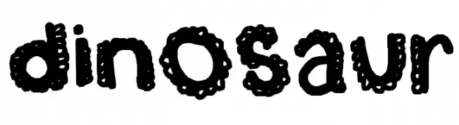
![dinosaur font caratteri gratis]() Scaricare 5537 Downloads@WebFont
Scaricare 5537 Downloads@WebFont -
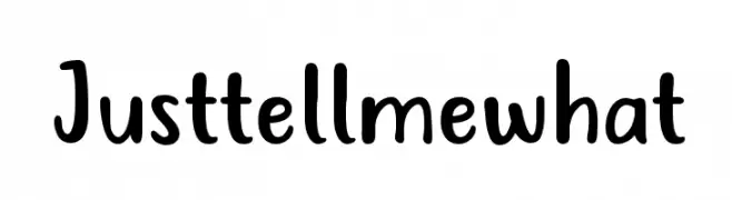
( Fonts by 7NTypes )
A playful, bold handwritten font with rounded characters.
![Just tell me what font caratteri gratis]() Scaricare 5533 Downloads@WebFont
Scaricare 5533 Downloads@WebFont -
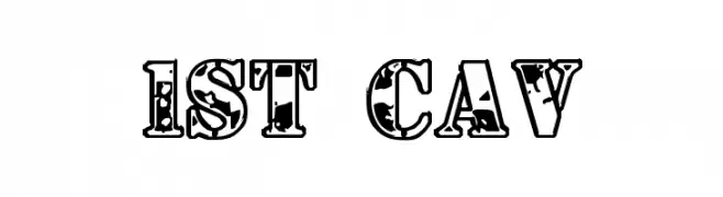
( Fonts by Daniel Zadorozny - www.iconian.com )
A bold, distressed decorative font with a vintage, grunge texture.
![1st Cav font caratteri gratis]() Scaricare 5533 Downloads@WebFont
Scaricare 5533 Downloads@WebFont -
![Ash font caratteri gratis]() Scaricare 5532 Downloads@WebFont
Scaricare 5532 Downloads@WebFont -
( Copyright 2015 Google Inc. All Rights Reserved. )
A casual, handwritten font with smooth, flowing strokes.
![Caveat font caratteri gratis]() Scaricare 5527 Downloads@WebFont
Scaricare 5527 Downloads@WebFont -
![Budmo Jiggler font caratteri gratis]() Scaricare 5526 Downloads@WebFont
Scaricare 5526 Downloads@WebFont -
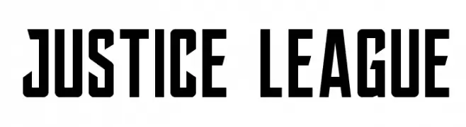
Caratteri di spideraysfonts. For commercial use please contact the owner.
![JUSTICE LEAGUE font caratteri gratis]() Scaricare 5523 Downloads@WebFont
Scaricare 5523 Downloads@WebFont -
( Copyright (c) 2014-2015, Sorkin Type Co (sorkintype.com | sorkintype@gmail.com) )
A clean and modern sans-serif font with excellent readability.
![Varta font caratteri gratis]() Scaricare 5522 Downloads@WebFont
Scaricare 5522 Downloads@WebFont -
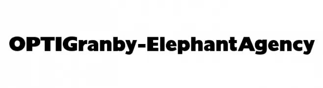
( Fonts by Castcraft Software - opti.netii.net - check the website before use )
A bold, modern font with thick, uniform strokes for strong visual impact.
![OPTIGranby-ElephantAgency font caratteri gratis]() Scaricare 5518 Downloads@WebFont
Scaricare 5518 Downloads@WebFont -
( Google Web Fonts )
A playful, bold font with rounded edges and a friendly style.
![Cherry Cream Soda font caratteri gratis]() Scaricare 5518 Downloads@WebFont
Scaricare 5518 Downloads@WebFont


Quali sono i font più popolari adesso?
Poppins, Roboto, Montserrat, Open Sans e Lato sono molto usati per le forme pulite e l'ampia applicabilità — dall'identità di marca alle landing page e ai poster.
Quali font si usano spesso nei loghi?
Le sans serif geometriche (es. Poppins, famiglie in stile Gotham) sono scelte comuni per un branding pulito e scalabile. Per un tocco personale restano valide script e stili manoscritti. Abbina un display deciso per i titoli a un corpo testo neutro per riconoscibilità ed equilibrio.
Ogni quanto si aggiorna la lista?
Con regolarità, in base ai download e all'attività reale. Torna spesso per scoprire in anticipo le nuove preferite.
💡 Consiglio: aggiungi ai preferiti — le tendenze cambiano in fretta e i font top di oggi possono ispirare il rebranding di domani.