Benvenuto nelle Font Più Popolari — dove popolarità e qualità si incontrano. Qui trovi i font più scaricati e usati dell'anno. Se cerchi scelte sicure per logo, web o social, inizia da qui.
Ogni font top si distingue per equilibrio, leggibilità e versatilità. Troverai sans serif moderne, script eleganti, serif vintage e display minimalisti.
-
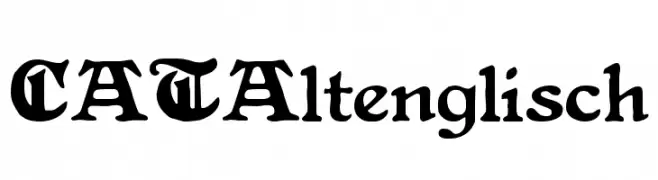
( Fonts by Peter Wiegel - www.peter-wiegel.de - Personal-use only. For commercial use please contact owner. )
A classic blackletter font with intricate, ornate letterforms and decorative flourishes.
 Scaricare 102 Downloads@WebFont
 -
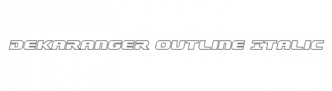
( Fonts by Daniel Zadorozny - www.iconian.com )
A bold, italicized outline font with a futuristic and modern design.
![Dekaranger Outline Italic font caratteri gratis]() Scaricare 102 Downloads@WebFont
Scaricare 102 Downloads@WebFont -
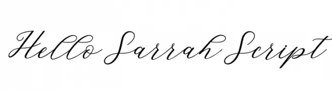
![HelloSarrahScript font caratteri gratis]() Scaricare 102 Downloads@WebFont
Scaricare 102 Downloads@WebFont -
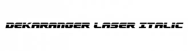
( Fonts by Daniel Zadorozny - www.iconian.com )
A bold, italic, futuristic font with sharp angles and geometric shapes.
![Dekaranger Laser Italic font caratteri gratis]() Scaricare 102 Downloads@WebFont
Scaricare 102 Downloads@WebFont -
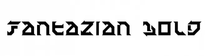
( Fonts by Daniel Zadorozny - www.iconian.com )
A bold, geometric font with sharp angles and a futuristic style.
![Fantazian Bold font caratteri gratis]() Scaricare 102 Downloads@WebFont
Scaricare 102 Downloads@WebFont -
-
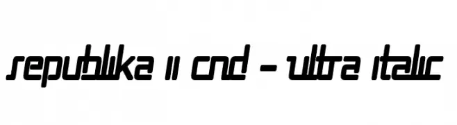
( Fonts by Apostrophic Lab )
A bold, ultra-italic, condensed font with high contrast and a modern, dynamic style.
![Republika II Cnd - Ultra Italic font caratteri gratis]() Scaricare 102 Downloads@WebFont
Scaricare 102 Downloads@WebFont -
![Smithesyzer font caratteri gratis]() Scaricare 102 Downloads@WebFont
Scaricare 102 Downloads@WebFont -
![Congruency 3D font caratteri gratis]() Scaricare 102 Downloads@WebFont
Scaricare 102 Downloads@WebFont -
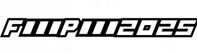
( Fonts by imagex - Personal-use only. For commercial use please contact owner. )
A bold, angular font with a futuristic and dynamic style.
![Full Pack 2025 font caratteri gratis]() Scaricare 102 Downloads@WebFont
Scaricare 102 Downloads@WebFont -
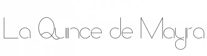
( Fonts by Michael Muranaka - muraknockout.com - Personal-use only. For commercial use please contact owner. )
A modern, minimalist font with thin, clean lines and a geometric influence.
![La Quince de Mayra font caratteri gratis]() Scaricare 102 Downloads@WebFont
Scaricare 102 Downloads@WebFont
Quali sono i font più popolari adesso?
Poppins, Roboto, Montserrat, Open Sans e Lato sono molto usati per le forme pulite e l'ampia applicabilità — dall'identità di marca alle landing page e ai poster.
Quali font si usano spesso nei loghi?
Le sans serif geometriche (es. Poppins, famiglie in stile Gotham) sono scelte comuni per un branding pulito e scalabile. Per un tocco personale restano valide script e stili manoscritti. Abbina un display deciso per i titoli a un corpo testo neutro per riconoscibilità ed equilibrio.
Ogni quanto si aggiorna la lista?
Con regolarità, in base ai download e all'attività reale. Torna spesso per scoprire in anticipo le nuove preferite.
💡 Consiglio: aggiungi ai preferiti — le tendenze cambiano in fretta e i font top di oggi possono ispirare il rebranding di domani.