Benvenuto nelle Font Più Popolari — dove popolarità e qualità si incontrano. Qui trovi i font più scaricati e usati dell'anno. Se cerchi scelte sicure per logo, web o social, inizia da qui.
Ogni font top si distingue per equilibrio, leggibilità e versatilità. Troverai sans serif moderne, script eleganti, serif vintage e display minimalisti.
-
( Fonts by Quiccs )
A bold, geometric font with a modern, industrial style.
![Betlog_Square[Quikijiki] font caratteri gratis](https://d144mzi0q5mijx.cloudfront.net/img/B/E/Betlog_Square-Quikijiki.webp) Scaricare 101 Downloads@WebFont
Scaricare 101 Downloads@WebFont -
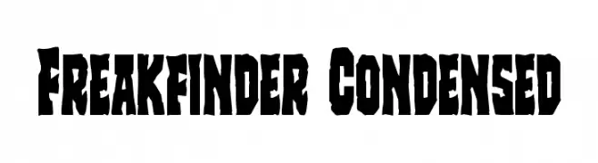
( Fonts by Daniel Zadorozny - www.iconian.com - Free for personal use )
A bold, condensed font with a rugged, distressed style.
![Freakfinder Condensed font caratteri gratis]() Scaricare 101 Downloads@WebFont
Scaricare 101 Downloads@WebFont -
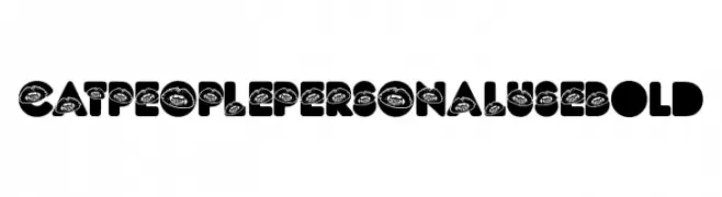
( Fonts by Billy Argel Fonts ® )
A bold, decorative font with lip graphics integrated into each letter.
![CAT PEOPLE PERSONAL USE Bold font caratteri gratis]() Scaricare 101 Downloads@WebFont
Scaricare 101 Downloads@WebFont -
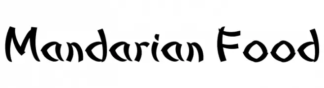
( Fonts by Dan P. Lyons - Personal-use only. For commercial use please contact owner. )
A bold, brush-like font with dynamic strokes and artistic flair.
![Mandarian Food font caratteri gratis]() Scaricare 101 Downloads@WebFont
Scaricare 101 Downloads@WebFont -
![SKBlondeCurls font caratteri gratis]() Scaricare 101 Downloads@WebFont
Scaricare 101 Downloads@WebFont -
-
( گالری فانت فارسی پژوهش آريانا - only compatible with Farsi and Arabic )
Not a valid Latin font; contains placeholders and partial script numerals.
![Gerd I font caratteri gratis]() Scaricare 101 Downloads@WebFont
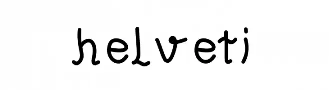
Scaricare 101 Downloads@WebFont -
![helveti font caratteri gratis]() Scaricare 101 Downloads@WebFont
Scaricare 101 Downloads@WebFont -
( Fonts by Manfred Klein. Free for private and charity use. Free for commercial with donation to organizations )
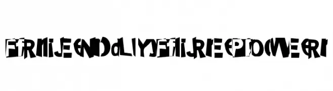
A bold, dynamic font with a graffiti-inspired, energetic style.
![FriendlyFirePower font caratteri gratis]() Scaricare 101 Downloads@WebFont
Scaricare 101 Downloads@WebFont -
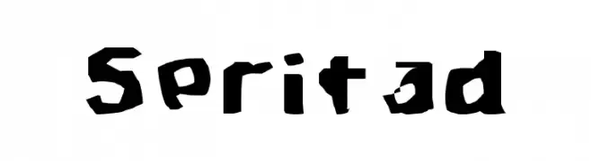
( Fonts by TarmSaft Font Factory - http://www.aska.nu/tarmsaft/ )
A bold, rugged font with jagged edges and a hand-cut appearance.
![Spritad font caratteri gratis]() Scaricare 101 Downloads@WebFont
Scaricare 101 Downloads@WebFont -
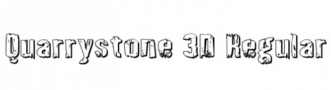
( Fonts by Daniel Zadorozny - www.iconian.com - Free for personal use )
A rugged, distressed 3D font with a bold, textured appearance.
![Quarrystone 3D Regular font caratteri gratis]() Scaricare 101 Downloads@WebFont
Scaricare 101 Downloads@WebFont


Quali sono i font più popolari adesso?
Poppins, Roboto, Montserrat, Open Sans e Lato sono molto usati per le forme pulite e l'ampia applicabilità — dall'identità di marca alle landing page e ai poster.
Quali font si usano spesso nei loghi?
Le sans serif geometriche (es. Poppins, famiglie in stile Gotham) sono scelte comuni per un branding pulito e scalabile. Per un tocco personale restano valide script e stili manoscritti. Abbina un display deciso per i titoli a un corpo testo neutro per riconoscibilità ed equilibrio.
Ogni quanto si aggiorna la lista?
Con regolarità, in base ai download e all'attività reale. Torna spesso per scoprire in anticipo le nuove preferite.
💡 Consiglio: aggiungi ai preferiti — le tendenze cambiano in fretta e i font top di oggi possono ispirare il rebranding di domani.