Benvenuto nelle Font Più Popolari — dove popolarità e qualità si incontrano. Qui trovi i font più scaricati e usati dell'anno. Se cerchi scelte sicure per logo, web o social, inizia da qui.
Ogni font top si distingue per equilibrio, leggibilità e versatilità. Troverai sans serif moderne, script eleganti, serif vintage e display minimalisti.
-
 Scaricare 791 Downloads@WebFont
 -
( These fonts are free to use in any private, recreational manner.For commercial go to www.flopdesign.com/fordesign/font.html )
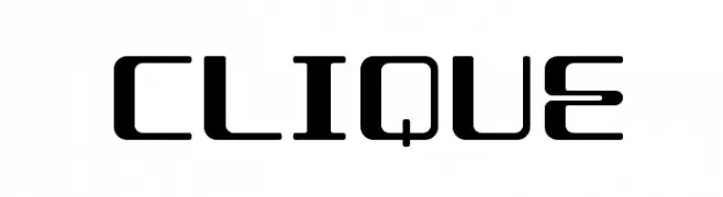
A modern, tech-inspired font with geometric shapes and clean lines.
![CLIQUE font caratteri gratis]() Scaricare 791 Downloads@WebFont
Scaricare 791 Downloads@WebFont -
( Fonts by Have Fun with Fonts )
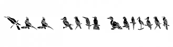
Bird-themed stencil display font with unique illustrated glyphs.
![HFF Bird Stencil font caratteri gratis]() Scaricare 791 Downloads@WebFont
Scaricare 791 Downloads@WebFont -
![ObelisqueRegular font caratteri gratis]() Scaricare 791 Downloads@WebFont
Scaricare 791 Downloads@WebFont -
( Fonts by David Rakowski )
A rugged, textured font with a handcrafted, wooden appearance.
![Logger [Plain]:001.001 font caratteri gratis]() Scaricare 791 Downloads@WebFont
Scaricare 791 Downloads@WebFont -
( Fonts by David Rakowski )
A bold, textured font with a rugged, hand-crafted appearance.
![Lemiesz Regular font caratteri gratis]() Scaricare 791 Downloads@WebFont
Scaricare 791 Downloads@WebFont -
( Fonts by Graham Meade - GemFonts )
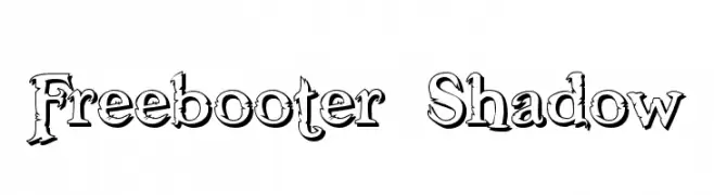
A bold, decorative font with a shadow effect and intricate details.
![Freebooter Shadow font caratteri gratis]() Scaricare 791 Downloads@WebFont
Scaricare 791 Downloads@WebFont -
( Fonts by Paul Lloyd )
A bold, condensed serif font with a classic yet modern appeal.
![GranthamCondensed Bold font caratteri gratis]() Scaricare 791 Downloads
Scaricare 791 Downloads -
( Fonts by www.kiwi-media.com )
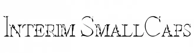
A distressed, artistic font with a unique, weathered appearance.
![Interim SmallCaps font caratteri gratis]() Scaricare 791 Downloads@WebFont
Scaricare 791 Downloads@WebFont -
( Fonts by www.DigitalDreamDesign.net )
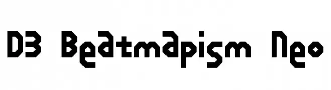
A bold, geometric font with a futuristic, digital aesthetic.
![D3 Beatmapism Neo font caratteri gratis]() Scaricare 791 Downloads@WebFont
Scaricare 791 Downloads@WebFont -
![Decaying font caratteri gratis]() Scaricare 791 Downloads@WebFont
Scaricare 791 Downloads@WebFont -
( Fonts by ShyFonts )
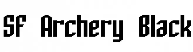
A bold, geometric font with sharp angles and a modern, industrial aesthetic.
![SF Archery Black font caratteri gratis]() Scaricare 791 Downloads@WebFont
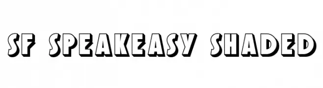
Scaricare 791 Downloads@WebFont -
![SF Speakeasy Shaded font caratteri gratis]() Scaricare 791 Downloads@WebFont
Scaricare 791 Downloads@WebFont -
( Fonts by Ramli Setiadi - Personal-use only. For commercial use please contact owner. )
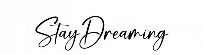
A fluid, handwritten font with elegant curves and a personal touch.
![Stay Dreaming font caratteri gratis]() Scaricare 790 Downloads@WebFont
Scaricare 790 Downloads@WebFont -
( Fonts by Aluyeah Studio - Personal-use only. For commercial use please contact owner. )
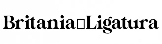
A classic serif font with elegant serifs and medium contrast, suitable for traditional and modern applications.
![Britania_Ligatura font caratteri gratis]() Scaricare 790 Downloads@WebFont
Scaricare 790 Downloads@WebFont -
( Fonts by Khurasan )
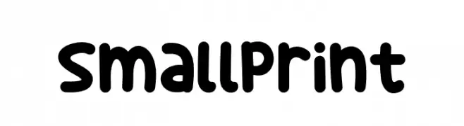
A playful, rounded font with bold, bubbly letters and a friendly vibe.
![Small Print font caratteri gratis]() Scaricare 790 Downloads@WebFont
Scaricare 790 Downloads@WebFont -
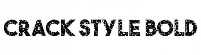
![Crack Style Bold font caratteri gratis]() Scaricare 790 Downloads@WebFont
Scaricare 790 Downloads@WebFont -
( imagex - www.imagex-fonts.com )
A bold, halftone-patterned font with a vintage, retro feel.
![Halftoned Backup font caratteri gratis]() Scaricare 790 Downloads@WebFont
Scaricare 790 Downloads@WebFont -
( Fonts by Lazy Poony )
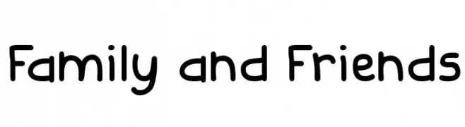
A playful, rounded font with a casual, handwritten style.
![Family and Friends font caratteri gratis]() Scaricare 790 Downloads@WebFont
Scaricare 790 Downloads@WebFont -
( Fonts by deFharo )
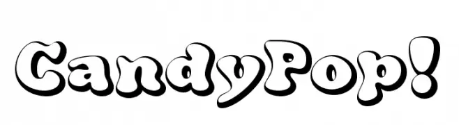
A playful, candy-inspired font with bold, rounded characters and a three-dimensional effect.
![CandyPop! font caratteri gratis]() Scaricare 790 Downloads@WebFont
Scaricare 790 Downloads@WebFont -
![DJB Friday Night Lights font caratteri gratis]() Scaricare 790 Downloads@WebFont
Scaricare 790 Downloads@WebFont -
( Fonts by a Neale Davidson - www.pixelsagas.com. Personal-use only. For commercial use please contact owner. )
A bold, italicized font with a playful, comic book style.
![Comic Book Italic font caratteri gratis]() Scaricare 790 Downloads@WebFont
Scaricare 790 Downloads@WebFont -
( Fonts by Adien Gunarta - fontasticindonesia.blogspot.com )
An artistic and elegant font with intricate curves and sharp edges, perfect for creative projects.
![Jawadwipa Adisastra font caratteri gratis]() Scaricare 790 Downloads@WebFont
Scaricare 790 Downloads@WebFont -
![YoungandBeautiful font caratteri gratis]() Scaricare 790 Downloads@WebFont
Scaricare 790 Downloads@WebFont -
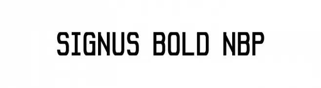
![Signus Bold NBP font caratteri gratis]() Scaricare 790 Downloads@WebFont
Scaricare 790 Downloads@WebFont -
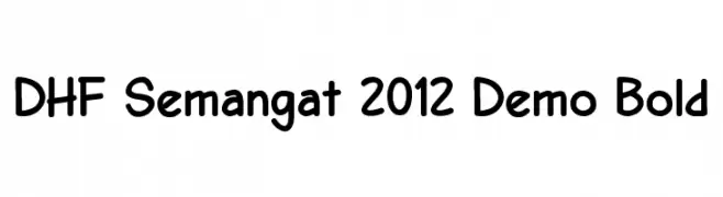
![DHF Semangat 2012 Demo Bold font caratteri gratis]() Scaricare 790 Downloads@WebFont
Scaricare 790 Downloads@WebFont -
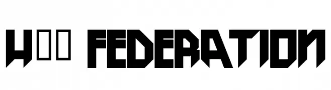
![H74 Federation font caratteri gratis]() Scaricare 790 Downloads@WebFont
Scaricare 790 Downloads@WebFont -
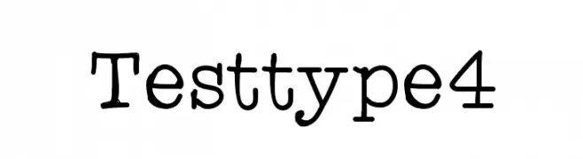
![Testtype4 font caratteri gratis]() Scaricare 790 Downloads@WebFont
Scaricare 790 Downloads@WebFont -
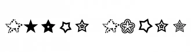
![Moon font caratteri gratis]() Scaricare 790 Downloads@WebFont
Scaricare 790 Downloads@WebFont -
![Super Stars font caratteri gratis]() Scaricare 790 Downloads@WebFont
Scaricare 790 Downloads@WebFont -
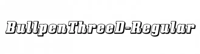
( Fonts by www.typodermicfonts.com - Ray Larabie )
A bold, three-dimensional font with a dynamic, shadowed style.
![BullpenThreeD-Regular font caratteri gratis]() Scaricare 790 Downloads@WebFont
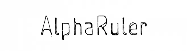
Scaricare 790 Downloads@WebFont -
![AlphaRuler font caratteri gratis]() Scaricare 790 Downloads@WebFont
Scaricare 790 Downloads@WebFont -
![Schooldays font caratteri gratis]() Scaricare 790 Downloads@WebFont
Scaricare 790 Downloads@WebFont -
![New Gothic Style font caratteri gratis]() Scaricare 790 Downloads@WebFont
Scaricare 790 Downloads@WebFont -
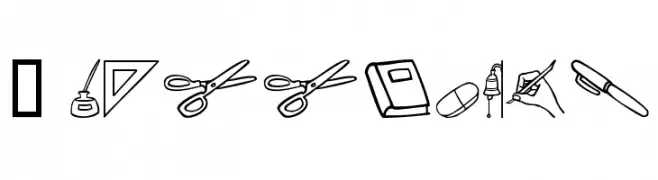
![Voya Nui font caratteri gratis]() Scaricare 790 Downloads@WebFont
Scaricare 790 Downloads@WebFont
![Logger [Plain]:001.001 font caratteri gratis](https://d144mzi0q5mijx.cloudfront.net/img/L/O/Logger-Plain-001001.webp)


Quali sono i font più popolari adesso?
Poppins, Roboto, Montserrat, Open Sans e Lato sono molto usati per le forme pulite e l'ampia applicabilità — dall'identità di marca alle landing page e ai poster.
Quali font si usano spesso nei loghi?
Le sans serif geometriche (es. Poppins, famiglie in stile Gotham) sono scelte comuni per un branding pulito e scalabile. Per un tocco personale restano valide script e stili manoscritti. Abbina un display deciso per i titoli a un corpo testo neutro per riconoscibilità ed equilibrio.
Ogni quanto si aggiorna la lista?
Con regolarità, in base ai download e all'attività reale. Torna spesso per scoprire in anticipo le nuove preferite.
💡 Consiglio: aggiungi ai preferiti — le tendenze cambiano in fretta e i font top di oggi possono ispirare il rebranding di domani.