Benvenuto nelle Font Più Popolari — dove popolarità e qualità si incontrano. Qui trovi i font più scaricati e usati dell'anno. Se cerchi scelte sicure per logo, web o social, inizia da qui.
Ogni font top si distingue per equilibrio, leggibilità e versatilità. Troverai sans serif moderne, script eleganti, serif vintage e display minimalisti.
-
( Fonts by Vanessa Bays - bythebutterfly.com )
A playful, hand-drawn font with tall, narrow letters and a whimsical style.
 Scaricare 506 Downloads@WebFont
 -
( - www.norwegianink.com )
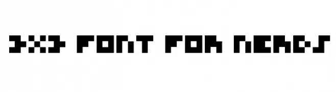
A pixelated, retro-style font with a blocky, geometric design.
![3x3 Font for Nerds font caratteri gratis]() Scaricare 506 Downloads@WebFont
Scaricare 506 Downloads@WebFont -
( Fonts by Daniel Gauthier )
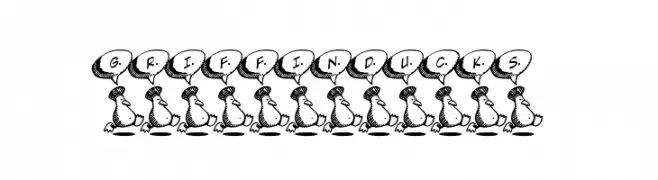
A playful, cartoonish font with characters in speech bubbles held by ducks.
![GriffinDucks font caratteri gratis]() Scaricare 506 Downloads@WebFont
Scaricare 506 Downloads@WebFont -
( Fonts by Vladimir Nikolic - www.creativefabrica.com/designer/vladimirnikolic/ - Personal-use only. For commercial use please contact owner. )
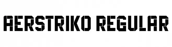
A bold, geometric font with a futuristic and industrial design.
![Aerstriko Regular font caratteri gratis]() Scaricare 506 Downloads@WebFont
Scaricare 506 Downloads@WebFont -
( Fonts by www.stimuleyefonts.com )
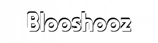
A bold, modern outline font with a three-dimensional effect.
![Blooshooz font caratteri gratis]() Scaricare 506 Downloads@WebFont
Scaricare 506 Downloads@WebFont -
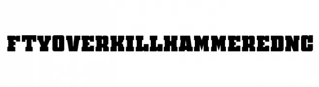
-
![FTYOverKillHammeredNC font caratteri gratis]() Scaricare 506 Downloads@WebFont
Scaricare 506 Downloads@WebFont -
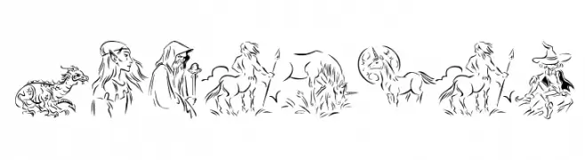
( Fonts by Manfred Klein - manfred-klein.ina-mar.com )
Ornate fantasy-themed pictorial font with mythical creatures.
![Fabulous font caratteri gratis]() Scaricare 506 Downloads@WebFont
Scaricare 506 Downloads@WebFont -
( Fonts by a Neale Davidson - www.pixelsagas.com. Personal-use only. For commercial use please contact owner. )
A decorative, runic-inspired font with sharp, angular lines and a mysterious, ancient feel.
![Moria font caratteri gratis]() Scaricare 506 Downloads@WebFont
Scaricare 506 Downloads@WebFont -
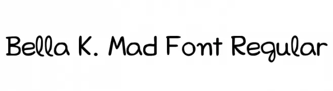
( Fonts by Izabela de Lima - elfadophotoscape.blogspot.com.br )
A playful, hand-drawn font with rounded edges and a whimsical style.
![Bella K. Mad Font Regular font caratteri gratis]() Scaricare 506 Downloads@WebFont
Scaricare 506 Downloads@WebFont -
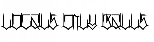
( Fonts by Pennyzine - www.thedevilinjasonramirez.com - Free for personal use )
A decorative font with sharp, angular lines and a gothic-modern fusion.
![Locals Only Balls font caratteri gratis]() Scaricare 506 Downloads@WebFont
Scaricare 506 Downloads@WebFont -
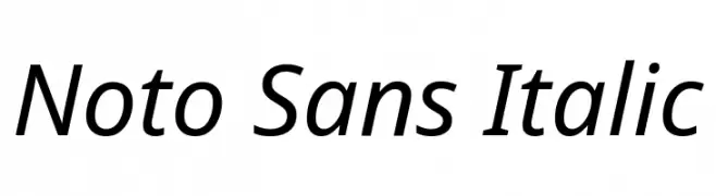
( Fonts by Google )
A modern, italic sans-serif font with clean lines and balanced proportions.
![Noto Sans Italic font caratteri gratis]() Scaricare 506 Downloads@WebFont
Scaricare 506 Downloads@WebFont -
Caratteri di defharo. For commercial use please contact the owner.
![Cienfuegos font caratteri gratis]() Scaricare 506 Downloads@WebFont
Scaricare 506 Downloads@WebFont -
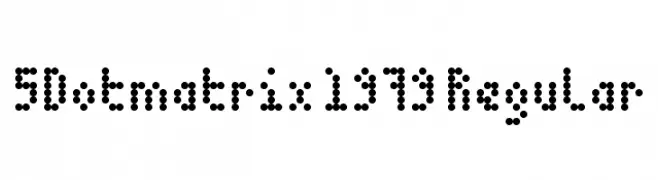
![5Dotmatrix 1979 Regular font caratteri gratis]() Scaricare 506 Downloads@WebFont
Scaricare 506 Downloads@WebFont -
( Fonts by www.empire-of-the-claw.com )
A dripping, horror-themed font with a melting appearance.
![Grossout Shadow font caratteri gratis]() Scaricare 506 Downloads@WebFont
Scaricare 506 Downloads@WebFont -
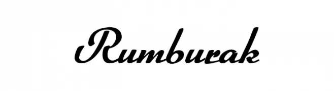
( Fonts by www.peter-wiegel.de. Personal-use only. For commercial use please contact owner. )
An elegant, flowing script font with connected strokes and a classic style.
![Rumburak font caratteri gratis]() Scaricare 506 Downloads@WebFont
Scaricare 506 Downloads@WebFont -
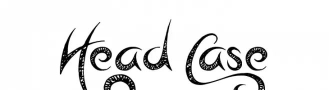
![Head Case font caratteri gratis]() Scaricare 506 Downloads@WebFont
Scaricare 506 Downloads@WebFont -
![TypographerGotisch Schmal font caratteri gratis]() Scaricare 506 Downloads@WebFont
Scaricare 506 Downloads@WebFont -
![Christopher Robin font caratteri gratis]() Scaricare 506 Downloads@WebFont
Scaricare 506 Downloads@WebFont -
( Fonts by DM Studio )
A playful, bold font with rounded, whimsical characters.
![Monas font caratteri gratis]() Scaricare 506 Downloads@WebFont
Scaricare 506 Downloads@WebFont -
Caratteri di Pabasar. For commercial use please contact the owner.
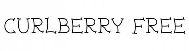
( Curlberry Free )
A whimsical font with playful curls and consistent stroke width.
![Curlberry Free font caratteri gratis]() Scaricare 506 Downloads@WebFont
Scaricare 506 Downloads@WebFont -
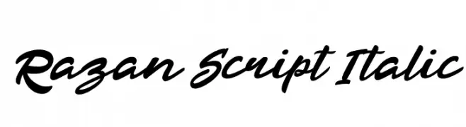
( Khurasan - Syaf Rizal - creativemarket.com/khurasan?u=khurasan )
A bold, italic script font with a flowing, handwritten style.
![Razan Script Italic font caratteri gratis]() Scaricare 506 Downloads@WebFont
Scaricare 506 Downloads@WebFont -
( Fonts by www.Fontfabric.com )
A bold, rounded font with a playful and modern style.
![OvalSingle font caratteri gratis]() Scaricare 506 Downloads@WebFont
Scaricare 506 Downloads@WebFont -
( Fonts by Bud White. Personal-use only. For commercial use please contact owner. )
A playful, bold font with a 3D shadow effect and rounded, irregular characters.
![Cobac font caratteri gratis]() Scaricare 506 Downloads@WebFont
Scaricare 506 Downloads@WebFont -
( Fonts by Typhoon Type - Suthi Srisopha - www.typhoontype.net - Personal-use only. For commercial use please contact owner. )
A playful, handwritten font with smooth, flowing lines and decorative elements.
![Sweet Hipster font caratteri gratis]() Scaricare 506 Downloads@WebFont
Scaricare 506 Downloads@WebFont -
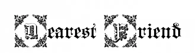
![Dearest Friend font caratteri gratis]() Scaricare 506 Downloads@WebFont
Scaricare 506 Downloads@WebFont -
( Fonts by Adrien Coquet - Personal-use only. For commercial use please contact owner. )
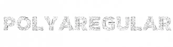
A geometric, decorative font with intricate line patterns forming each character.
![POLYA Regular font caratteri gratis]() Scaricare 506 Downloads@WebFont
Scaricare 506 Downloads@WebFont -
( Fonts by www.selawetype.com - Personal-use only. FOR DONATION https://www.paypal.me/selawe . For commercial use please contact owner. )
A bold, playful handwritten font with thick, rounded strokes.
![FREETAPE font caratteri gratis]() Scaricare 505 Downloads@WebFont
Scaricare 505 Downloads@WebFont -
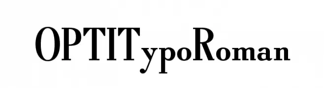
( Fonts by Castcraft Software - OPTI Fonts Archive - opti.netii.net - Personal-use only. For commercial use please contact owner. )
A classic serif font with elegant strokes and refined details.
![OPTITypoRoman font caratteri gratis]() Scaricare 505 Downloads@WebFont
Scaricare 505 Downloads@WebFont -
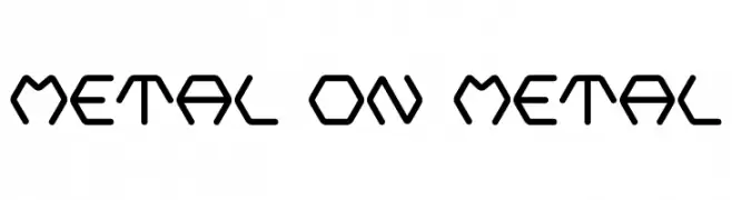
( Fonts by Blue Vinyl - Jess Latham - www.bvfonts.com )
A bold, geometric font with a futuristic, industrial design.
![Metal On Metal font caratteri gratis]() Scaricare 505 Downloads@WebFont
Scaricare 505 Downloads@WebFont -
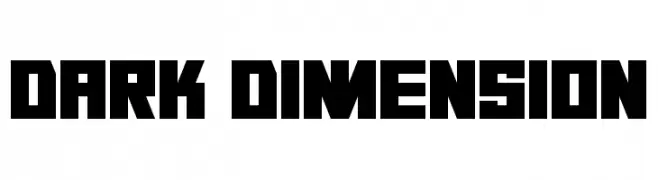
( Darrell Flood )
A bold, geometric font with sharp edges and a modern style.
![Dark Dimension font caratteri gratis]() Scaricare 505 Downloads@WebFont
Scaricare 505 Downloads@WebFont -
![Inceptia font caratteri gratis]() Scaricare 505 Downloads@WebFont
Scaricare 505 Downloads@WebFont -
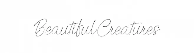
( Fonts by Octotype - www.foundmyfont.com - Personal-use only. For commercial use please contact owner. )
An elegant, flowing script font with a handwritten feel.
![Beautiful Creatures font caratteri gratis]() Scaricare 505 Downloads@WebFont
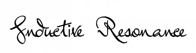
Scaricare 505 Downloads@WebFont -
![Inductive Resonance font caratteri gratis]() Scaricare 505 Downloads@WebFont
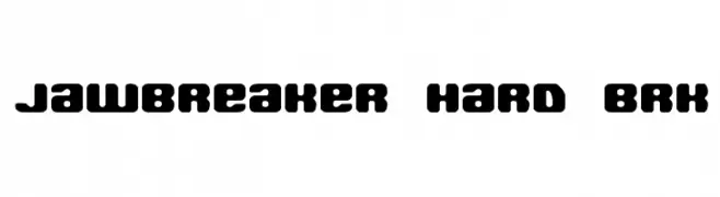
Scaricare 505 Downloads@WebFont -
( Fonts by www.aenigmafonts.com )
A bold, rounded font with a strong, impactful design.
![Jawbreaker Hard BRK font caratteri gratis]() Scaricare 505 Downloads@WebFont
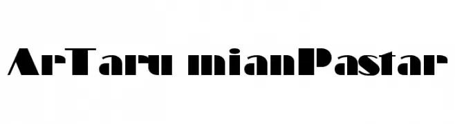
Scaricare 505 Downloads@WebFont -
![ArTarumianPastar font caratteri gratis]() Scaricare 505 Downloads@WebFont
Scaricare 505 Downloads@WebFont


Quali sono i font più popolari adesso?
Poppins, Roboto, Montserrat, Open Sans e Lato sono molto usati per le forme pulite e l'ampia applicabilità — dall'identità di marca alle landing page e ai poster.
Quali font si usano spesso nei loghi?
Le sans serif geometriche (es. Poppins, famiglie in stile Gotham) sono scelte comuni per un branding pulito e scalabile. Per un tocco personale restano valide script e stili manoscritti. Abbina un display deciso per i titoli a un corpo testo neutro per riconoscibilità ed equilibrio.
Ogni quanto si aggiorna la lista?
Con regolarità, in base ai download e all'attività reale. Torna spesso per scoprire in anticipo le nuove preferite.
💡 Consiglio: aggiungi ai preferiti — le tendenze cambiano in fretta e i font top di oggi possono ispirare il rebranding di domani.