Benvenuto nelle Font Più Popolari — dove popolarità e qualità si incontrano. Qui trovi i font più scaricati e usati dell'anno. Se cerchi scelte sicure per logo, web o social, inizia da qui.
Ogni font top si distingue per equilibrio, leggibilità e versatilità. Troverai sans serif moderne, script eleganti, serif vintage e display minimalisti.
-
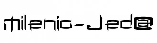
( Fonts by jedalias mendez - jeda - Personal-use only. For commercial use please contact owner. )
A futuristic, angular font with sharp edges and geometric forms.
 Scaricare 507 Downloads@WebFont
 -
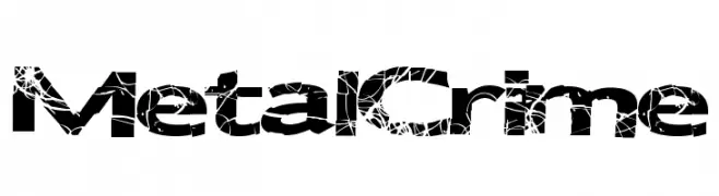
( Fonts by a Max Infeld - XEROGRAPHER FONTS - xerographer.blogspot.com . Personal-use only. For commercial use please contact owner. )
A bold, distressed font with a cracked texture for a rebellious look.
![MetalCrime font caratteri gratis]() Scaricare 507 Downloads@WebFont
Scaricare 507 Downloads@WebFont -
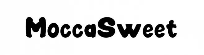
( Fonts by Display Studio )
A bold, playful font with rounded, whimsical characters.
![MoccaSweet font caratteri gratis]() Scaricare 507 Downloads@WebFont
Scaricare 507 Downloads@WebFont -
( Fonts by Dankin Don - Personal-use only. For commercial use please contact owner. )
A lively, expressive script font with fluid, cursive strokes and playful loops.
![Jendra font caratteri gratis]() Scaricare 507 Downloads@WebFont
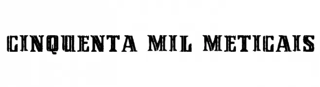
Scaricare 507 Downloads@WebFont -
![Cinquenta Mil Meticais font caratteri gratis]() Scaricare 507 Downloads@WebFont
Scaricare 507 Downloads@WebFont -
-
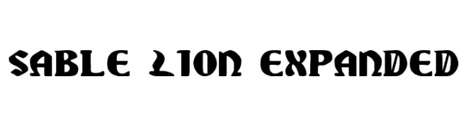
( Fonts by Daniel Zadorozny - www.iconian.com )
A bold, dramatic font with gothic influences and strong, angular strokes.
![Sable Lion Expanded font caratteri gratis]() Scaricare 507 Downloads@WebFont
Scaricare 507 Downloads@WebFont -
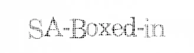
![SA-Boxed-in font caratteri gratis]() Scaricare 507 Downloads@WebFont
Scaricare 507 Downloads@WebFont -
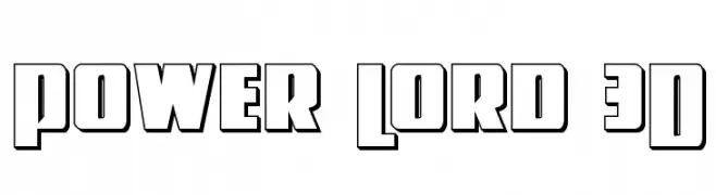
( Fonts by Daniel Zadorozny - www.iconian.com - Free for personal use )
A bold, 3D outlined font with a retro, impactful style.
![Power Lord 3D font caratteri gratis]() Scaricare 507 Downloads@WebFont
Scaricare 507 Downloads@WebFont -
( Fonts by Geronimo Fonts - Personal-use only. For commercial use please contact owner. )
A bold, geometric font with a modern, industrial style.
![Mandarin Regular font caratteri gratis]() Scaricare 507 Downloads@WebFont
Scaricare 507 Downloads@WebFont -
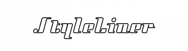
( Fonts by Sacred Nipple - Brode Vosloo )
A bold, outlined font with a modern, dynamic slant.
![StyleLiner font caratteri gratis]() Scaricare 507 Downloads@WebFont
Scaricare 507 Downloads@WebFont -
( Fonts by Dieter Steffmann )
A classic blackletter font with ornate, gothic letterforms.
![Durwent font caratteri gratis]() Scaricare 507 Downloads@WebFont
Scaricare 507 Downloads@WebFont -
![Nirvana Roman font caratteri gratis]() Scaricare 507 Downloads@WebFont
Scaricare 507 Downloads@WebFont -
( Sronstudio - Yusron Billah )
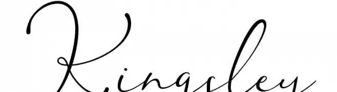
A graceful and sophisticated script font with flowing, interconnected letters.
![Kingsley font caratteri gratis]() Scaricare 507 Downloads@WebFont
Scaricare 507 Downloads@WebFont -
( Fonts by Inermedia Studio )
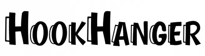
A bold, playful font with a three-dimensional, cartoonish style.
![Hook Hanger font caratteri gratis]() Scaricare 507 Downloads@WebFont
Scaricare 507 Downloads@WebFont -
( Fonts by Nick Curtis - www.nicksfonts.com )
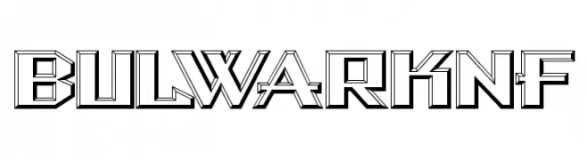
A bold, geometric font with a three-dimensional, architectural style.
![BulwarkNF font caratteri gratis]() Scaricare 507 Downloads@WebFont
Scaricare 507 Downloads@WebFont -
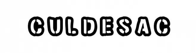
( Fonts by David Kerkhoff - www.hanodedphotography.com )
A bold, outlined font with a playful, retro comic book style.
![Cul de sac font caratteri gratis]() Scaricare 507 Downloads@WebFont
Scaricare 507 Downloads@WebFont -
Caratteri di HeroglyphsStudio. For commercial use please contact the owner.
( Thank you for downloading this font This font is free for PERSONAL USE ONLY! Commercial license for this font can be purchased at: http://bit.ly/2gWZJQM )
A fluid and elegant script font with a modern yet classic appeal.
![Ranania Regular font caratteri gratis]() Scaricare 507 Downloads@WebFont
Scaricare 507 Downloads@WebFont -
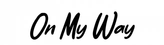
( Fonts by Typefactoryco )
Bold, casual handwritten script font.
![On My Way font caratteri gratis]() Scaricare 507 Downloads@WebFont
Scaricare 507 Downloads@WebFont -
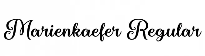
( Fonts by Misti Hammers - mistifonts.com - Personal-use only. For commercial use please contact owner. )
A playful and elegant script font with decorative loops and swirls.
![Marienkaefer Regular font caratteri gratis]() Scaricare 507 Downloads@WebFont
Scaricare 507 Downloads@WebFont -
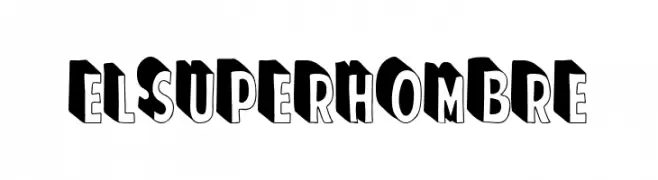
( Fonts by Woodcutter )
A bold, 3D shadowed decorative font with a playful and dynamic style.
![El Super Hombre font caratteri gratis]() Scaricare 507 Downloads@WebFont
Scaricare 507 Downloads@WebFont -
![Villagers-Rough font caratteri gratis]() Scaricare 507 Downloads@WebFont
Scaricare 507 Downloads@WebFont -
( Debut Studio - Ari Fadli - creativemarket.com/debutstudio )
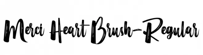
A bold, brush-style font with dynamic, hand-painted strokes.
![Merci Heart Brush-Regular font caratteri gratis]() Scaricare 507 Downloads@WebFont
Scaricare 507 Downloads@WebFont -
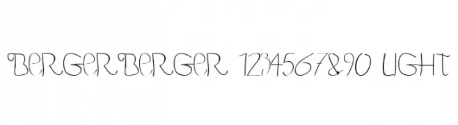
![BERGERBERGER 1234567890 Light font caratteri gratis]() Scaricare 507 Downloads@WebFont
Scaricare 507 Downloads@WebFont -
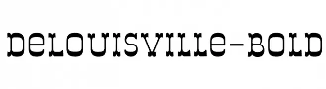
( Fonts by Sentinel Type - James Arboghast )
A bold, decorative slab serif font with strong, impactful characters.
![DeLouisville-Bold font caratteri gratis]() Scaricare 507 Downloads@WebFont
Scaricare 507 Downloads@WebFont -
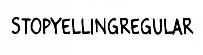
![Stop Yelling Regular font caratteri gratis]() Scaricare 507 Downloads@WebFont
Scaricare 507 Downloads@WebFont -
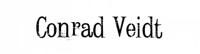
![Conrad Veidt font caratteri gratis]() Scaricare 507 Downloads@WebFont
Scaricare 507 Downloads@WebFont -
( Fonts by Graham Meade - GemFonts )
A modern, geometric font with rounded edges and narrow width.
![Brave New Era [narrow] G98 font caratteri gratis]() Scaricare 507 Downloads@WebFont
Scaricare 507 Downloads@WebFont -
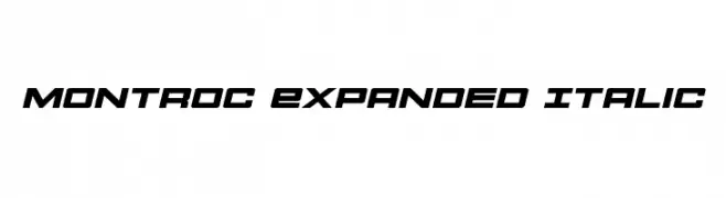
( Fonts by Daniel Zadorozny - www.iconian.com - Free for personal use )
A bold, expanded, and italicized font with a modern and dynamic style.
![Montroc Expanded Italic font caratteri gratis]() Scaricare 507 Downloads@WebFont
Scaricare 507 Downloads@WebFont -
![take font caratteri gratis]() Scaricare 507 Downloads@WebFont
Scaricare 507 Downloads@WebFont -
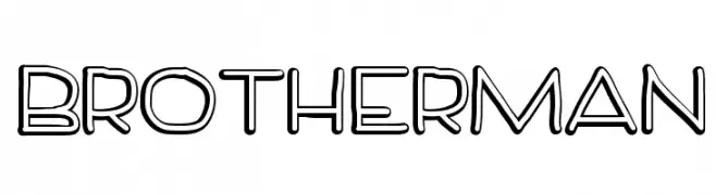
![BrotherMan font caratteri gratis]() Scaricare 507 Downloads@WebFont
Scaricare 507 Downloads@WebFont -
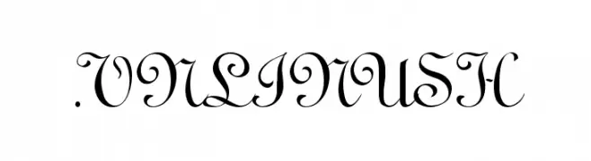
![.VnLinusH font caratteri gratis]() Scaricare 507 Downloads
Scaricare 507 Downloads -
( گالری فانت فارسی پژوهش آريانا - only compatible with Farsi and Arabic )
A bold and artistic font with dynamic, stylized characters.
![Lebanon font caratteri gratis]() Scaricare 507 Downloads@WebFont
Scaricare 507 Downloads@WebFont -
( javierugarte.nixiweb.com/index.html )
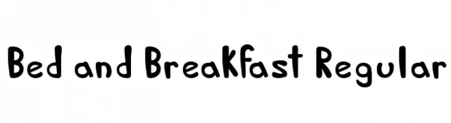
A playful, hand-drawn font with bold, rounded characters and a whimsical style.
![Bed and Breakfast Regular font caratteri gratis]() Scaricare 507 Downloads@WebFont
Scaricare 507 Downloads@WebFont -
Caratteri di lalaurentiu. For commercial use please contact the owner.
( This is a duplicate )
A tall, narrow font with a modern, geometric style.
![a-sogra_Ruth font caratteri gratis]() Scaricare 507 Downloads@WebFont
Scaricare 507 Downloads@WebFont -
( Fonts by Typhoon Type - Suthi Srisopha - www.typhoontype.net - Personal-use only. For commercial use please contact owner. )
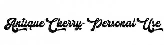
A vintage, ornate script font with elegant loops and flourishes.
![Antique Cherry - Personal Use font caratteri gratis]() Scaricare 507 Downloads@WebFont
Scaricare 507 Downloads@WebFont


![Brave New Era [narrow] G98 font caratteri gratis](https://d144mzi0q5mijx.cloudfront.net/img/B/R/Brave-New-Era-narrow-G98.webp)


Quali sono i font più popolari adesso?
Poppins, Roboto, Montserrat, Open Sans e Lato sono molto usati per le forme pulite e l'ampia applicabilità — dall'identità di marca alle landing page e ai poster.
Quali font si usano spesso nei loghi?
Le sans serif geometriche (es. Poppins, famiglie in stile Gotham) sono scelte comuni per un branding pulito e scalabile. Per un tocco personale restano valide script e stili manoscritti. Abbina un display deciso per i titoli a un corpo testo neutro per riconoscibilità ed equilibrio.
Ogni quanto si aggiorna la lista?
Con regolarità, in base ai download e all'attività reale. Torna spesso per scoprire in anticipo le nuove preferite.
💡 Consiglio: aggiungi ai preferiti — le tendenze cambiano in fretta e i font top di oggi possono ispirare il rebranding di domani.