Benvenuto nelle Font Più Popolari — dove popolarità e qualità si incontrano. Qui trovi i font più scaricati e usati dell'anno. Se cerchi scelte sicure per logo, web o social, inizia da qui.
Ogni font top si distingue per equilibrio, leggibilità e versatilità. Troverai sans serif moderne, script eleganti, serif vintage e display minimalisti.
-
 Scaricare 498 Downloads@WebFont
 -
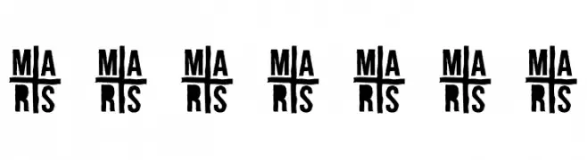
( Fonts by Ariq Sya - marsnev.com )
A bold, stencil-like font with a modern, industrial feel.
![A-FOR-A font caratteri gratis]() Scaricare 498 Downloads@WebFont
Scaricare 498 Downloads@WebFont -
( Personal-use only. For commercial use please contact owner. )
A clean and modern sans-serif font with consistent stroke width and excellent readability.
![Vazir Light FD font caratteri gratis]() Scaricare 498 Downloads@WebFont
Scaricare 498 Downloads@WebFont -
( Fonts by Des Gomez )
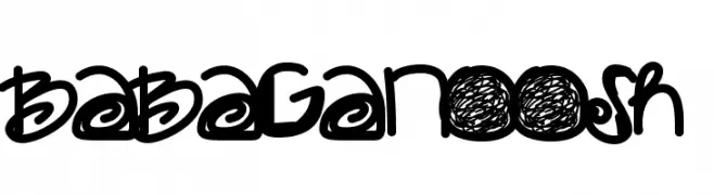
A bold, playful handwritten font with thick strokes and whimsical curves.
![Babaganoosh font caratteri gratis]() Scaricare 498 Downloads@WebFont
Scaricare 498 Downloads@WebFont -
( Fonts by www.blambot.com )
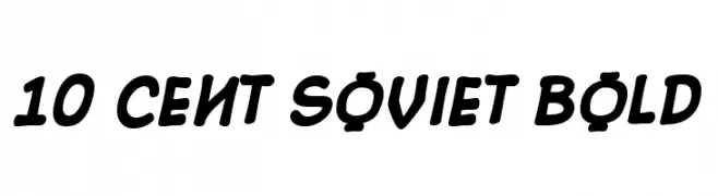
A bold, retro-style font with rounded, slanted characters.
![10 Cent Soviet Bold font caratteri gratis]() Scaricare 498 Downloads@WebFont
Scaricare 498 Downloads@WebFont -
-
( Fonts by Attype Studio )
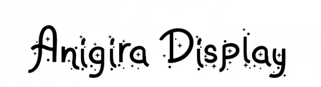
A playful, decorative font with star-like embellishments and flowing letterforms.
![Anigira Display font caratteri gratis]() Scaricare 498 Downloads@WebFont
Scaricare 498 Downloads@WebFont -
( Fonts by Ingo Zimmermann - www.ingofonts.com )
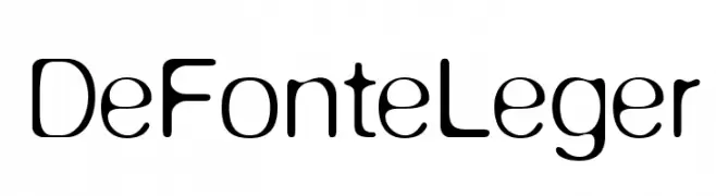
A modern, rounded sans-serif font with a sleek and minimalist design.
![DeFonteLeger font caratteri gratis]() Scaricare 498 Downloads@WebFont
Scaricare 498 Downloads@WebFont -
( Public domain / GPL / OFL - jlhfonts.blogspot.com/ )
A playful, handwritten font with rounded, informal letterforms.
![Bromine font caratteri gratis]() Scaricare 498 Downloads@WebFont
Scaricare 498 Downloads@WebFont -
( Fonts by Small Voice Studio - smallvoice.studio/typefaces - Personal-use only. For commercial use please contact owner. )
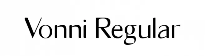
A modern, elegant font with clean lines and medium contrast.
![Vonni Regular font caratteri gratis]() Scaricare 498 Downloads@WebFont
Scaricare 498 Downloads@WebFont -
![Dinamika Bold font caratteri gratis]() Scaricare 498 Downloads@WebFont
Scaricare 498 Downloads@WebFont -
( Fonts by Fie Clarke - bonezdesignz.com - check the website before use the fonts! Personal-use only. )
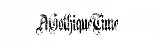
A gothic, distressed font with ornate and intricate letterforms.
![A Gothique Time font caratteri gratis]() Scaricare 498 Downloads@WebFont
Scaricare 498 Downloads@WebFont -
( Fonts by Barland )
An elegant script font with flowing, ornate swashes and flourishes.
![SadhiraDemo font caratteri gratis]() Scaricare 498 Downloads@WebFont
Scaricare 498 Downloads@WebFont -
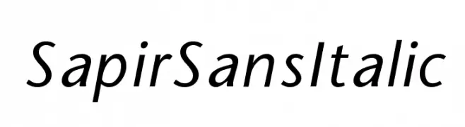
![SapirSansItalic font caratteri gratis]() Scaricare 498 Downloads
Scaricare 498 Downloads -
( www.chrisvile.com/ )
A bold, distressed font with a rugged, vintage appearance.
![Cook County Jailhouse Regular font caratteri gratis]() Scaricare 498 Downloads@WebFont
Scaricare 498 Downloads@WebFont -
( Fonts by Atsushi Aoki - aDD )
A pixelated, retro-style font with a blocky, digital appearance.
![AddWBitmap09 font caratteri gratis]() Scaricare 498 Downloads@WebFont
Scaricare 498 Downloads@WebFont -
( Fonts by Manfred Klein. Free for private and charity use. Free for commercial with donation to organizations )
A whimsical and artistic font with abstract, doodle-like characters.
![SurReal font caratteri gratis]() Scaricare 498 Downloads@WebFont
Scaricare 498 Downloads@WebFont -
( Fonts by Andi Moz )
A decorative script font with elegant, flowing strokes and artistic loops.
![Chart font caratteri gratis]() Scaricare 498 Downloads@WebFont
Scaricare 498 Downloads@WebFont -
![Tarpino Normal font caratteri gratis]() Scaricare 498 Downloads@WebFont
Scaricare 498 Downloads@WebFont -
( Edelweiss - www.lehrerweb.at/index.php?page=schulschriften )
A cursive, handwritten font with smooth, connected letters and a classic school script style.
![Schulschrift95 Normal font caratteri gratis]() Scaricare 498 Downloads@WebFont
Scaricare 498 Downloads@WebFont -
( Fonts by junkohanhero )
A bold, distressed font with a rugged, vintage aesthetic.
![Dark Dream font caratteri gratis]() Scaricare 498 Downloads@WebFont
Scaricare 498 Downloads@WebFont -
( Fonts by softerviews.org )
A bold, italic serif font with a classic and elegant style.
![Verajja Serif Bold Italic font caratteri gratis]() Scaricare 497 Downloads@WebFont
Scaricare 497 Downloads@WebFont -
( Fonts by www.fontalicious.com )
A bold, geometric font with a futuristic and modern aesthetic.
![Rocket font caratteri gratis]() Scaricare 497 Downloads@WebFont
Scaricare 497 Downloads@WebFont -
( Fonts by Arterfak Project )
A bold, playful font with a hand-drawn, energetic style.
![Burgery font caratteri gratis]() Scaricare 497 Downloads@WebFont
Scaricare 497 Downloads@WebFont -
( Fonts by www.kimberlygeswein.com - Kimberly Geswein )
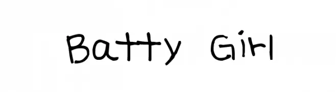
A playful, casual handwritten font with uneven strokes and a whimsical style.
![Batty Girl font caratteri gratis]() Scaricare 497 Downloads@WebFont
Scaricare 497 Downloads@WebFont -
( Fonts by twinletter )
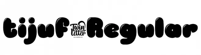
A bold, playful font with rounded, bubble-like characters for a fun, modern look.
![tijuf-Regular font caratteri gratis]() Scaricare 497 Downloads@WebFont
Scaricare 497 Downloads@WebFont -
![Wacky Spankers font caratteri gratis]() Scaricare 497 Downloads@WebFont
Scaricare 497 Downloads@WebFont -
( Fonts by Display Studio )
A playful, hand-drawn font with a whimsical and informal style.
![Little Fish Thin font caratteri gratis]() Scaricare 497 Downloads@WebFont
Scaricare 497 Downloads@WebFont -
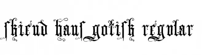
![Skjend Hans Gotisk Regular font caratteri gratis]() Scaricare 497 Downloads@WebFont
Scaricare 497 Downloads@WebFont -
( Free for personal use - )
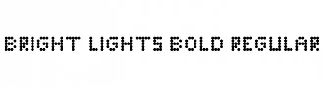
A dot-based font with a modern, digital display style.
![Bright Lights Bold Regular font caratteri gratis]() Scaricare 497 Downloads@WebFont
Scaricare 497 Downloads@WebFont -
( Fonts by Gassstype )
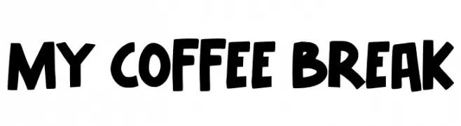
A bold, playful font with a hand-drawn, casual style.
![My Coffee Break font caratteri gratis]() Scaricare 497 Downloads@WebFont
Scaricare 497 Downloads@WebFont -
Caratteri di SvNProd. For commercial use please contact the owner.
( Tequila Sunset by SvNProd - Free for personal use only. )
A whimsical, playful font with decorative, flowing curves and a handwritten feel.
![Tequila Sunset font caratteri gratis]() Scaricare 497 Downloads@WebFont
Scaricare 497 Downloads@WebFont -
![hardcore_pen font caratteri gratis]() Scaricare 497 Downloads@WebFont
Scaricare 497 Downloads@WebFont -
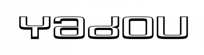
![Yadou font caratteri gratis]() Scaricare 497 Downloads@WebFont
Scaricare 497 Downloads@WebFont -
( David Luscombe - www.davidluscombe.com/ )
A bold, geometric font with a modern and impactful design.
![Mutagen Normal font caratteri gratis]() Scaricare 497 Downloads@WebFont
Scaricare 497 Downloads@WebFont -
( Fonts by www.floodfonts.com )
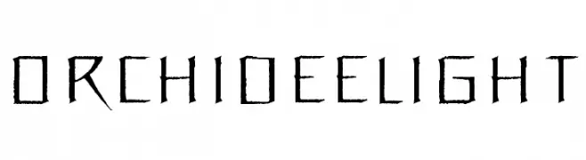
A modern, edgy font with sharp, angular strokes and a bold appearance.
![OrchideeLight font caratteri gratis]() Scaricare 497 Downloads@WebFont
Scaricare 497 Downloads@WebFont


Quali sono i font più popolari adesso?
Poppins, Roboto, Montserrat, Open Sans e Lato sono molto usati per le forme pulite e l'ampia applicabilità — dall'identità di marca alle landing page e ai poster.
Quali font si usano spesso nei loghi?
Le sans serif geometriche (es. Poppins, famiglie in stile Gotham) sono scelte comuni per un branding pulito e scalabile. Per un tocco personale restano valide script e stili manoscritti. Abbina un display deciso per i titoli a un corpo testo neutro per riconoscibilità ed equilibrio.
Ogni quanto si aggiorna la lista?
Con regolarità, in base ai download e all'attività reale. Torna spesso per scoprire in anticipo le nuove preferite.
💡 Consiglio: aggiungi ai preferiti — le tendenze cambiano in fretta e i font top di oggi possono ispirare il rebranding di domani.