Benvenuto nelle Font Più Popolari — dove popolarità e qualità si incontrano. Qui trovi i font più scaricati e usati dell'anno. Se cerchi scelte sicure per logo, web o social, inizia da qui.
Ogni font top si distingue per equilibrio, leggibilità e versatilità. Troverai sans serif moderne, script eleganti, serif vintage e display minimalisti.
-
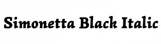
( Copyright (c) 2011, BrownFox (www.brownfox.org) )
A bold, italic font with a dynamic and elegant style.
 Scaricare 495 Downloads@WebFont
 -
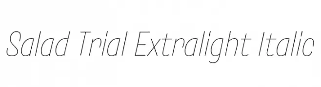
( Fonts by Zetafonts )
A sleek, extra-light italic font with a modern and elegant style.
![Salad Trial Extralight Italic font caratteri gratis]() Scaricare 495 Downloads@WebFont
Scaricare 495 Downloads@WebFont -
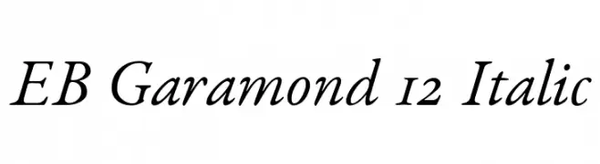
( Fonts by Georg Duffner - Personal-use only. For commercial use please contact owner. )
A classic, elegant serif font with a graceful italic style.
![EB Garamond 12 Italic font caratteri gratis]() Scaricare 495 Downloads@WebFont
Scaricare 495 Downloads@WebFont -
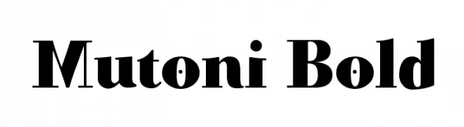
( Fonts by Manfred Klein. Free for private and charity use. Free for commercial with donation to organizations )
A bold, dynamic serif font with strong strokes and a modern twist.
![Mutoni Bold font caratteri gratis]() Scaricare 495 Downloads@WebFont
Scaricare 495 Downloads@WebFont -
( Fonts by Apostrophic Lab )
A bold, narrow serif font with strong vertical emphasis and consistent stroke width.
![Lady Copra Narrow font caratteri gratis]() Scaricare 495 Downloads@WebFont
Scaricare 495 Downloads@WebFont -
-
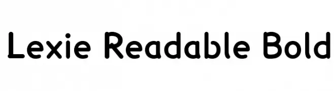
![Lexie Readable Bold font caratteri gratis]() Scaricare 495 Downloads@WebFont
Scaricare 495 Downloads@WebFont -
( Fonts by Manfred Klein. Free for private and charity use. Free for commercial with donation to organizations )
A decorative font featuring intricate tribal-inspired symbols and figures.
![Idols font caratteri gratis]() Scaricare 495 Downloads@WebFont
Scaricare 495 Downloads@WebFont -
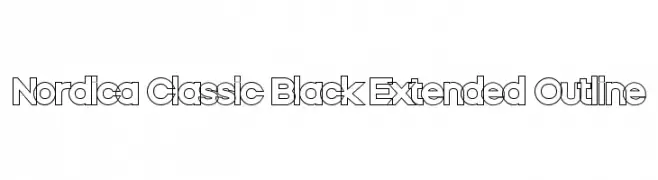
![Nordica Classic Black Extended Outline font caratteri gratis]() Scaricare 495 Downloads@WebFont
Scaricare 495 Downloads@WebFont -
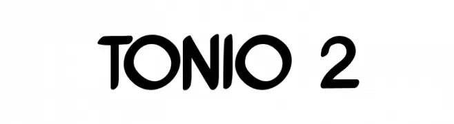
( Fonts by Antonio Bucu - AdamAnt Designs )
A bold, playful font with rounded edges and a hand-drawn look.
![TONIO 2 font caratteri gratis]() Scaricare 495 Downloads@WebFont
Scaricare 495 Downloads@WebFont -
( Fonts by Khurasan )
A playful, bold font with rounded edges and a cartoonish style.
![Avocado Days font caratteri gratis]() Scaricare 495 Downloads@WebFont
Scaricare 495 Downloads@WebFont -
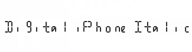
![Digital iPhone Italic font caratteri gratis]() Scaricare 495 Downloads@WebFont
Scaricare 495 Downloads@WebFont -
( Fonts by www.DigitalDreamDesign.net )
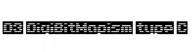
A pixelated, digital-style font with a structured, grid-like appearance.
![D3 DigiBitMapism type C font caratteri gratis]() Scaricare 495 Downloads@WebFont
Scaricare 495 Downloads@WebFont -
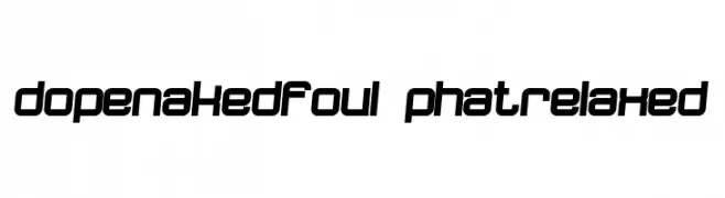
![dopenakedfoul phatrelaxed font caratteri gratis]() Scaricare 495 Downloads@WebFont
Scaricare 495 Downloads@WebFont -
( Fonts by Daniel Zadorozny - www.iconian.com - Free for personal use )
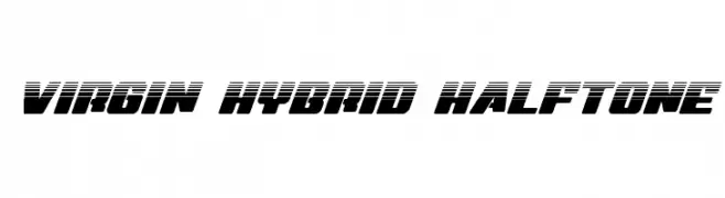
A bold, dynamic font with a halftone effect and modern, futuristic style.
![Virgin Hybrid Halftone font caratteri gratis]() Scaricare 495 Downloads@WebFont
Scaricare 495 Downloads@WebFont -
( Fonts by zanfonts - ari budi setiawan - Personal-use only. For commercial use please contact owner. )
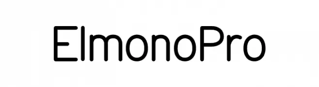
A modern, clean sans-serif font with uniform strokes and rounded edges.
![Elmono Pro font caratteri gratis]() Scaricare 495 Downloads@WebFont
Scaricare 495 Downloads@WebFont -
( Fonts by a Situjuh Nazara - c7n1.wordpress.com. Personal-use only. For commercial use please contact owner. )
A playful and whimsical script font with ornate uppercase and flowing lowercase letters.
![Theodista Decally font caratteri gratis]() Scaricare 495 Downloads@WebFont
Scaricare 495 Downloads@WebFont -
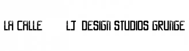
![LA CALLE 6 - LJ-Design Studios Grunge font caratteri gratis]() Scaricare 495 Downloads@WebFont
Scaricare 495 Downloads@WebFont -
( Fonts by Rika Kawamoto - http://home.alfasystem.co.jp/~kawamoto/ )
A decorative font with floral elements integrated into each character.
![flower3 font caratteri gratis]() Scaricare 495 Downloads@WebFont
Scaricare 495 Downloads@WebFont -
( Fonts by Gustavo Dipré )
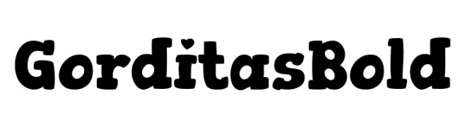
A bold, playful font with rounded strokes and a whimsical touch.
![Gorditas Bold font caratteri gratis]() Scaricare 495 Downloads@WebFont
Scaricare 495 Downloads@WebFont -
( Fonts by Billy Argel Fonts ® )
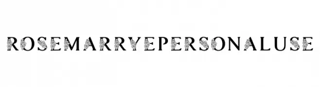
A decorative serif font with floral embellishments on select uppercase letters.
![ROSEMARRYE PERSONAL USE font caratteri gratis]() Scaricare 495 Downloads@WebFont
Scaricare 495 Downloads@WebFont -
![Manualito-Flo font caratteri gratis]() Scaricare 495 Downloads@WebFont
Scaricare 495 Downloads@WebFont -
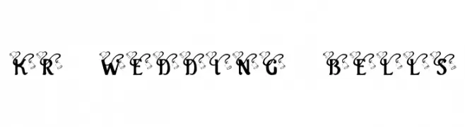
![KR Wedding Bells font caratteri gratis]() Scaricare 495 Downloads@WebFont
Scaricare 495 Downloads@WebFont -
( Fonts by Vigilante Typeface Corporation Larry Yerkes. Personal-use only. For commercial use please contact owner. )
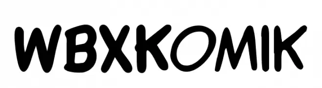
A bold, comic-style font with a playful, hand-drawn appearance.
![WBXKomik font caratteri gratis]() Scaricare 495 Downloads@WebFont
Scaricare 495 Downloads@WebFont -
( Fonts by Roland Huse - rolandhuse.com )
A bold, industrial-inspired font with a multi-line geometric design.
![Constrocktion font caratteri gratis]() Scaricare 495 Downloads@WebFont
Scaricare 495 Downloads@WebFont -
( Fonts by www.kimberlygeswein.com - Kimberly Geswein )
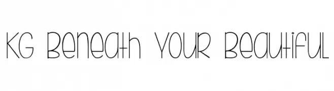
A playful, monoline font with tall, narrow characters and a hand-drawn feel.
![KG Beneath Your Beautiful font caratteri gratis]() Scaricare 495 Downloads@WebFont
Scaricare 495 Downloads@WebFont -
( Fonts by Altsys Metamorphosis )
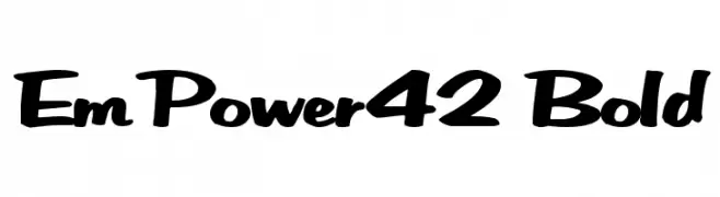
A bold, playful handwritten font with rounded, dynamic characters.
![EmPower42 Bold font caratteri gratis]() Scaricare 495 Downloads@WebFont
Scaricare 495 Downloads@WebFont -
( Fonts by RaisProject )
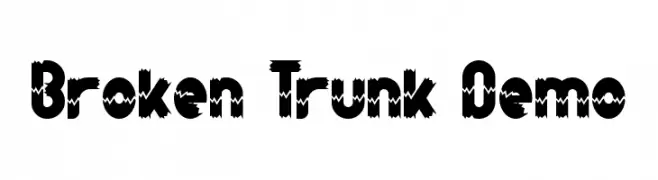
A bold, jagged font with a unique, edgy appearance.
![Broken Trunk Demo font caratteri gratis]() Scaricare 495 Downloads@WebFont
Scaricare 495 Downloads@WebFont -
( Fonts by mxnsi )
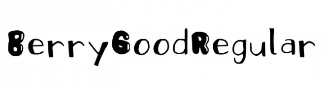
A playful, bold, and hand-drawn font with a whimsical style.
![Berry Good Regular font caratteri gratis]() Scaricare 495 Downloads@WebFont
Scaricare 495 Downloads@WebFont -
( Copyright (c) 2009, 2010, 2011 Daniel Johnson (
A modern, geometric sans-serif font with low contrast and high legibility.
![JuraLight font caratteri gratis]() Scaricare 495 Downloads@WebFont
Scaricare 495 Downloads@WebFont -
( Fonts by Denise Bentulan - douxiegirl.com. Personal-use only. For commercial use please contact owner. )
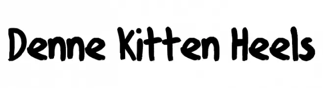
A bold, playful handwritten font with thick strokes and a casual feel.
![Denne Kitten Heels font caratteri gratis]() Scaricare 495 Downloads@WebFont
Scaricare 495 Downloads@WebFont -
![Kennon Regular font caratteri gratis]() Scaricare 495 Downloads@WebFont
Scaricare 495 Downloads@WebFont -
( Fonts by dustBUST - Andreas Nylin )
A modern, geometric font with a futuristic and minimalist design.
![Life Support font caratteri gratis]() Scaricare 495 Downloads@WebFont
Scaricare 495 Downloads@WebFont -
( Fonts by Des Gomez )
A playful, handwritten font with a whimsical and casual style.
![SafariColorway font caratteri gratis]() Scaricare 495 Downloads@WebFont
Scaricare 495 Downloads@WebFont -
( Fonts by a Max Infeld - XEROGRAPHER FONTS - xerographer.blogspot.com . Personal-use only. For commercial use please contact owner. )
A scratchy, hand-drawn font with dynamic texture and bold style.
![BasicScratch font caratteri gratis]() Scaricare 495 Downloads@WebFont
Scaricare 495 Downloads@WebFont -
( Fonts by www.blambot.com )
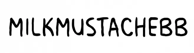
A playful, handwritten font with rounded, consistent strokes and a whimsical style.
![MilkMustacheBB font caratteri gratis]() Scaricare 495 Downloads@WebFont
Scaricare 495 Downloads@WebFont


Quali sono i font più popolari adesso?
Poppins, Roboto, Montserrat, Open Sans e Lato sono molto usati per le forme pulite e l'ampia applicabilità — dall'identità di marca alle landing page e ai poster.
Quali font si usano spesso nei loghi?
Le sans serif geometriche (es. Poppins, famiglie in stile Gotham) sono scelte comuni per un branding pulito e scalabile. Per un tocco personale restano valide script e stili manoscritti. Abbina un display deciso per i titoli a un corpo testo neutro per riconoscibilità ed equilibrio.
Ogni quanto si aggiorna la lista?
Con regolarità, in base ai download e all'attività reale. Torna spesso per scoprire in anticipo le nuove preferite.
💡 Consiglio: aggiungi ai preferiti — le tendenze cambiano in fretta e i font top di oggi possono ispirare il rebranding di domani.