Benvenuto nelle Font Più Popolari — dove popolarità e qualità si incontrano. Qui trovi i font più scaricati e usati dell'anno. Se cerchi scelte sicure per logo, web o social, inizia da qui.
Ogni font top si distingue per equilibrio, leggibilità e versatilità. Troverai sans serif moderne, script eleganti, serif vintage e display minimalisti.
-
( Fonts by Apostrophic Lab )
A modern, geometric font with a futuristic and tech-inspired design.
 Scaricare 101 Downloads@WebFont
 -
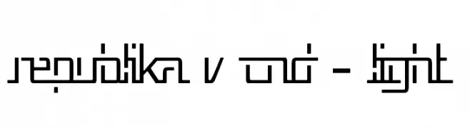
( Fonts by Mofr24 - Mohamad Farhan Ramadhan - Personal-use only. For commercial use please contact owner. )
A bold, angular font with a futuristic and sporty aesthetic.
![Xavier font caratteri gratis]() Scaricare 101 Downloads@WebFont
Scaricare 101 Downloads@WebFont -
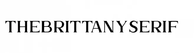
( Fonts by sronstudio - Yusron Billah - Personal-use only. For commercial use please contact owner. )
A classic serif font with elegant, sharp serifs and slight stroke contrast.
![TheBrittanySerif2 font caratteri gratis]() Scaricare 101 Downloads@WebFont
Scaricare 101 Downloads@WebFont -
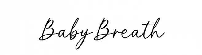
( Fonts by Graphix Line Studio - Personal-use only. For commercial use please contact owner. )
A graceful, cursive script font with smooth, flowing lines.
![Baby Breath font caratteri gratis]() Scaricare 101 Downloads@WebFont
Scaricare 101 Downloads@WebFont -
( Fonts by Billy Argel )
A playful, dynamic font with bold, hand-drawn letterforms and exaggerated serifs.
![MOSKITOES font caratteri gratis]() Scaricare 101 Downloads@WebFont
Scaricare 101 Downloads@WebFont -
-
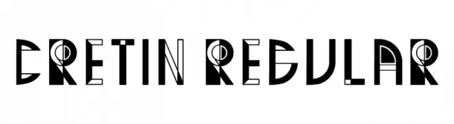
( Fonts by Vladimir Nikolic )
A bold, geometric font with Art Deco influences and modern flair.
![Cretin Regular font caratteri gratis]() Scaricare 101 Downloads@WebFont
Scaricare 101 Downloads@WebFont -
( Blambot - www.blambot.com )
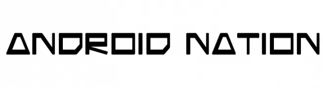
A futuristic, geometric font with sharp angles and a digital aesthetic.
![Android Nation font caratteri gratis]() Scaricare 101 Downloads@WebFont
Scaricare 101 Downloads@WebFont -
( Fonts by Ditya Ananto )
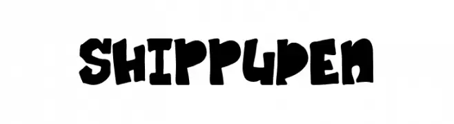
A bold, dynamic font with a playful, hand-drawn style.
![SHIPPUDEN font caratteri gratis]() Scaricare 101 Downloads@WebFont
Scaricare 101 Downloads@WebFont -
( Fonts by Iconian Fonts )
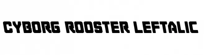
A bold, futuristic font with a geometric and angular design.
![Cyborg Rooster Leftalic font caratteri gratis]() Scaricare 101 Downloads@WebFont
Scaricare 101 Downloads@WebFont -
( Fonts by Iconian Fonts )
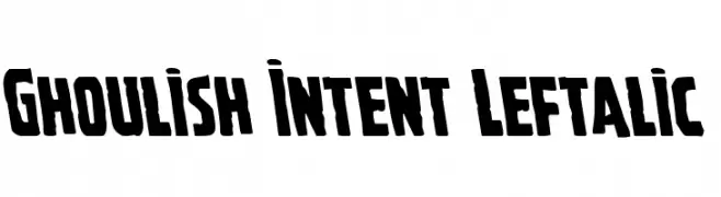
A bold, left-slanted font with a quirky and dynamic style.
![Ghoulish Intent Leftalic font caratteri gratis]() Scaricare 101 Downloads@WebFont
Scaricare 101 Downloads@WebFont


Quali sono i font più popolari adesso?
Poppins, Roboto, Montserrat, Open Sans e Lato sono molto usati per le forme pulite e l'ampia applicabilità — dall'identità di marca alle landing page e ai poster.
Quali font si usano spesso nei loghi?
Le sans serif geometriche (es. Poppins, famiglie in stile Gotham) sono scelte comuni per un branding pulito e scalabile. Per un tocco personale restano valide script e stili manoscritti. Abbina un display deciso per i titoli a un corpo testo neutro per riconoscibilità ed equilibrio.
Ogni quanto si aggiorna la lista?
Con regolarità, in base ai download e all'attività reale. Torna spesso per scoprire in anticipo le nuove preferite.
💡 Consiglio: aggiungi ai preferiti — le tendenze cambiano in fretta e i font top di oggi possono ispirare il rebranding di domani.