Benvenuto nelle Font Più Popolari — dove popolarità e qualità si incontrano. Qui trovi i font più scaricati e usati dell'anno. Se cerchi scelte sicure per logo, web o social, inizia da qui.
Ogni font top si distingue per equilibrio, leggibilità e versatilità. Troverai sans serif moderne, script eleganti, serif vintage e display minimalisti.
-
( Fonts by typeformerstudio.com - Personal-use only. For commercial use please contact owner. )
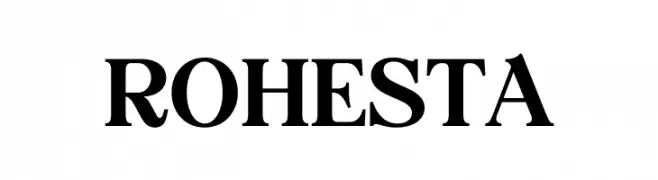
A bold, classic serif font with strong strokes and elegant serifs.
 Scaricare 97 Downloads@WebFont
 -
( Fonts by Beautypes - Bhakti Al Akbar Pasaribu - Personal-use only. For commercial use please contact owner. )
A dynamic, brush-style font with expressive strokes and artistic flair.
![brushnyoe font caratteri gratis]() Scaricare 97 Downloads@WebFont
Scaricare 97 Downloads@WebFont -
( Fonts by a Max Infeld - XEROGRAPHER FONTS - xerographer.blogspot.com . Personal-use only. For commercial use please contact owner. )
A playful, handwritten font with dynamic strokes and a casual feel.
![LiteHand font caratteri gratis]() Scaricare 97 Downloads@WebFont
Scaricare 97 Downloads@WebFont -
( Fonts by Castcraft Software - OPTI Fonts Archive - opti.netii.net - Personal-use only. For commercial use please contact owner. )
A whimsical and artistic font with elongated, playful characters.
![OPTISin-Bold font caratteri gratis]() Scaricare 97 Downloads@WebFont
Scaricare 97 Downloads@WebFont -
( Fonts by Manfred Klein. Free for private and charity use. Free for commercial with donation to organizations )
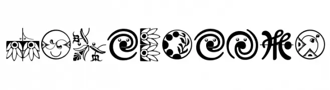
Ornamental dingbat font with floral, abstract, and whimsical motifs.
![OrnaMFaces font caratteri gratis]() Scaricare 97 Downloads@WebFont
Scaricare 97 Downloads@WebFont -
-
( Fonts by Tokopress )
A bold, playful font with rounded edges and a whimsical style.
![Makeba font caratteri gratis]() Scaricare 97 Downloads@WebFont
Scaricare 97 Downloads@WebFont -
( Fonts by Daniel Zadorozny - www.iconian.com )
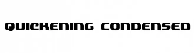
A bold, condensed font with a geometric and modern style.
![Quickening Condensed font caratteri gratis]() Scaricare 97 Downloads@WebFont
Scaricare 97 Downloads@WebFont -
( www.junkohanhero.com )
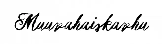
A bold, expressive script font with a hand-drawn, artistic style.
![Muurahaiskarhu font caratteri gratis]() Scaricare 97 Downloads@WebFont
Scaricare 97 Downloads@WebFont -
( Eutypoce - www.eutypoce.com/ )
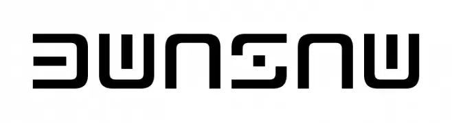
A futuristic, geometric font with bold, angular letterforms and consistent stroke width.
![Bwnsnw font caratteri gratis]() Scaricare 97 Downloads@WebFont
Scaricare 97 Downloads@WebFont -
( Fonts by Manuel Viergutz - Typo Graphic Design - www.typographicdesign.de )
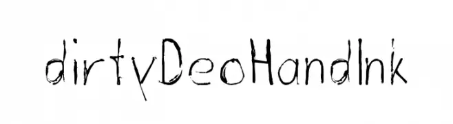
A hand-drawn, ink-like font with a raw and organic feel.
![dirtyDeoHandInk font caratteri gratis]() Scaricare 97 Downloads@WebFont
Scaricare 97 Downloads@WebFont


Quali sono i font più popolari adesso?
Poppins, Roboto, Montserrat, Open Sans e Lato sono molto usati per le forme pulite e l'ampia applicabilità — dall'identità di marca alle landing page e ai poster.
Quali font si usano spesso nei loghi?
Le sans serif geometriche (es. Poppins, famiglie in stile Gotham) sono scelte comuni per un branding pulito e scalabile. Per un tocco personale restano valide script e stili manoscritti. Abbina un display deciso per i titoli a un corpo testo neutro per riconoscibilità ed equilibrio.
Ogni quanto si aggiorna la lista?
Con regolarità, in base ai download e all'attività reale. Torna spesso per scoprire in anticipo le nuove preferite.
💡 Consiglio: aggiungi ai preferiti — le tendenze cambiano in fretta e i font top di oggi possono ispirare il rebranding di domani.