Benvenuto nelle Font Più Popolari — dove popolarità e qualità si incontrano. Qui trovi i font più scaricati e usati dell'anno. Se cerchi scelte sicure per logo, web o social, inizia da qui.
Ogni font top si distingue per equilibrio, leggibilità e versatilità. Troverai sans serif moderne, script eleganti, serif vintage e display minimalisti.
-
 Scaricare 483 Downloads@WebFont
 -
( Fonts by Daniel Zadorozny - www.iconian.com - Free for personal use )
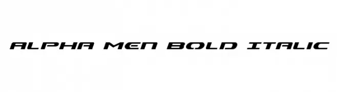
A bold, italicized font with a futuristic and dynamic style.
![Alpha Men Bold Italic font caratteri gratis]() Scaricare 483 Downloads@WebFont
Scaricare 483 Downloads@WebFont -
( Fonts by www.blambot.com )
Bold, outlined font with a strong, three-dimensional appearance.
![MutantAcademyDCBB font caratteri gratis]() Scaricare 483 Downloads@WebFont
Scaricare 483 Downloads@WebFont -
( Fonts by Muhammad Sirojuddin - lettersiro.com - Personal-use only. For commercial use please contact owner. )
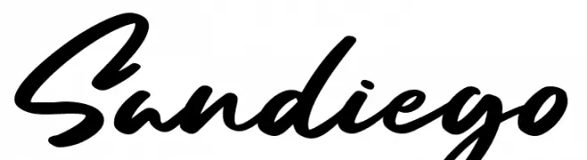
A dynamic, fluid script font with elegant cursive strokes and a bold, modern style.
![Sandiego font caratteri gratis]() Scaricare 483 Downloads@WebFont
Scaricare 483 Downloads@WebFont -
( Fonts by Dalton Maag Ltd - Personal-use only. For commercial use please contact owner. )
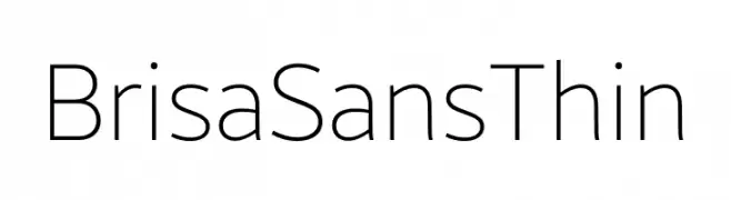
A clean, modern sans-serif font with a thin weight and minimalistic design.
![Brisa Sans Thin font caratteri gratis]() Scaricare 483 Downloads@WebFont
Scaricare 483 Downloads@WebFont -
-
( Fonts by antoniorodriguesjr.com )
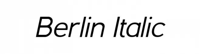
A modern italic font with smooth curves and a sleek, streamlined appearance.
![Berlin Italic font caratteri gratis]() Scaricare 483 Downloads@WebFont
Scaricare 483 Downloads@WebFont -
( Fonts by Fontfabric - Svetoslav Simov - Personal-use only. For commercial use please contact owner. )
A bold, modern sans-serif font with geometric lines and uniform strokes.
![Mont Blanc-Trial Bold font caratteri gratis]() Scaricare 483 Downloads@WebFont
Scaricare 483 Downloads@WebFont -
( Fonts by Pizzadude )
A bold, hand-painted style font with textured, brush-like strokes.
![ReliableDEMO font caratteri gratis]() Scaricare 483 Downloads@WebFont
Scaricare 483 Downloads@WebFont -
![Shining Pearl font caratteri gratis]() Scaricare 483 Downloads@WebFont
Scaricare 483 Downloads@WebFont -
( Fonts by fontsandfashion )
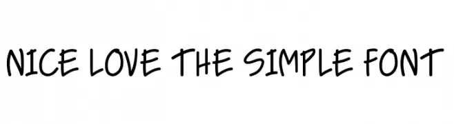
A playful, handwritten font with smooth, rounded edges and a casual style.
![NICE LOVE THE SIMPLE FONT font caratteri gratis]() Scaricare 483 Downloads@WebFont
Scaricare 483 Downloads@WebFont -
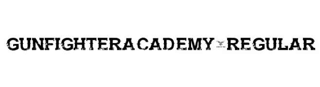
![GunfighterAcademy-Regular font caratteri gratis]() Scaricare 483 Downloads@WebFont
Scaricare 483 Downloads@WebFont -
( Fonts by Isaac K. Personal-use only. For commercial use please contact owner. )
An elegant serif font with refined strokes and balanced proportions.
![Meridian font caratteri gratis]() Scaricare 483 Downloads@WebFont
Scaricare 483 Downloads@WebFont -
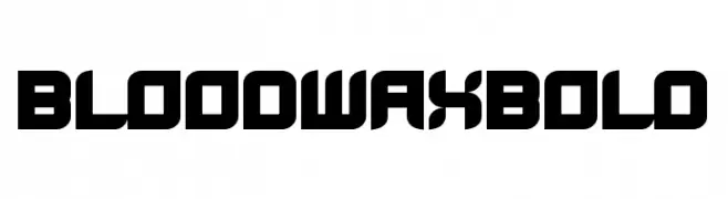
![BloodWaxBold font caratteri gratis]() Scaricare 483 Downloads@WebFont
Scaricare 483 Downloads@WebFont -
( Fonts by Woodcutter )
Monochrome sneaker and sports shoe silhouettes with brand logos.
![Sneakers font caratteri gratis]() Scaricare 483 Downloads@WebFont
Scaricare 483 Downloads@WebFont -
( Fonts by www.blambot.com )
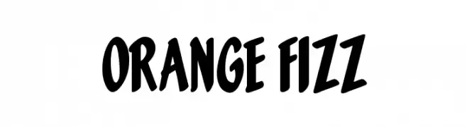
A bold, playful font with a hand-drawn, energetic style.
![Orange Fizz font caratteri gratis]() Scaricare 483 Downloads@WebFont
Scaricare 483 Downloads@WebFont -
![AEZ April Fool's Day dings font caratteri gratis]() Scaricare 483 Downloads@WebFont
Scaricare 483 Downloads@WebFont -
( Fonts by deFharo - Fernando Haro - Personal-use only. For commercial use please contact owner. )
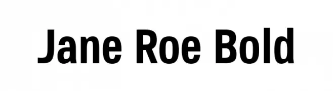
A bold, modern font with clean lines and strong visual impact.
![Jane Roe Bold font caratteri gratis]() Scaricare 483 Downloads@WebFont
Scaricare 483 Downloads@WebFont -
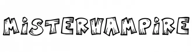
![MisterVampire font caratteri gratis]() Scaricare 483 Downloads@WebFont
Scaricare 483 Downloads@WebFont -
( Fonts by uatype.faithweb.com - UnAuthorized Type )
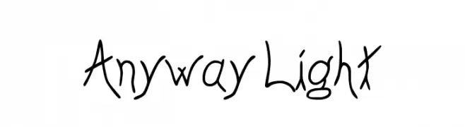
A whimsical, handwritten font with playful curves and expressive characters.
![Anyway Light font caratteri gratis]() Scaricare 483 Downloads@WebFont
Scaricare 483 Downloads@WebFont -
![Seperated font caratteri gratis]() Scaricare 483 Downloads@WebFont
Scaricare 483 Downloads@WebFont -
![SF Florencesans SC Shaded font caratteri gratis]() Scaricare 483 Downloads@WebFont
Scaricare 483 Downloads@WebFont -
![Doggie Doodie font caratteri gratis]() Scaricare 483 Downloads@WebFont
Scaricare 483 Downloads@WebFont -
( Free - comeunbound.tumblr.com/ )
A bold, geometric font with a digital, retro-tech appearance.
![LiquidCrystal-ExtraBold font caratteri gratis]() Scaricare 483 Downloads@WebFont
Scaricare 483 Downloads@WebFont -
( Fonts by Chris Vile )
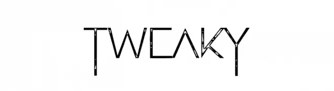
A tall, narrow font with a distressed, vintage texture.
![Tweaky font caratteri gratis]() Scaricare 483 Downloads@WebFont
Scaricare 483 Downloads@WebFont -
( Fonts by Siwox Core LineType )
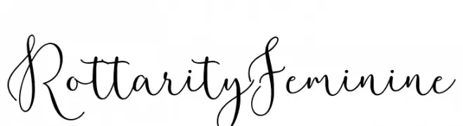
An elegant and flowing script font with graceful curves and loops.
![RottarityFeminine font caratteri gratis]() Scaricare 483 Downloads@WebFont
Scaricare 483 Downloads@WebFont -
( Fonts by Apostrophic Lab )
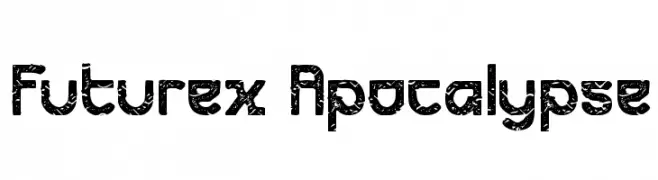
A bold, distressed font with a rugged, industrial feel.
![Futurex Apocalypse font caratteri gratis]() Scaricare 483 Downloads@WebFont
Scaricare 483 Downloads@WebFont -
( Fonts by Abdullah Arif - Personal-use only. For commercial use please contact owner. )
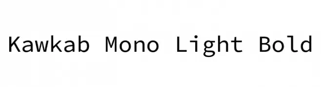
A clean, modern monospaced font with uniform character width and geometric structure.
![Kawkab Mono Light Bold font caratteri gratis]() Scaricare 483 Downloads@WebFont
Scaricare 483 Downloads@WebFont -
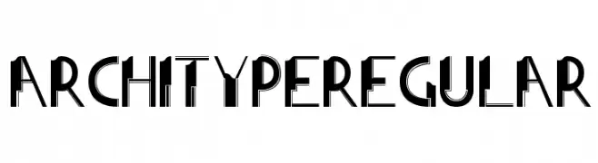
![ArchitypeRegular font caratteri gratis]() Scaricare 483 Downloads@WebFont
Scaricare 483 Downloads@WebFont -
( Fonts by Denne - Denise Bentulan - Personal-use only. For commercial use please contact owner. )
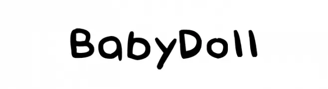
A playful, hand-drawn font with rounded, informal characters.
![Baby Doll font caratteri gratis]() Scaricare 482 Downloads@WebFont
Scaricare 482 Downloads@WebFont -
( Pollem Studio - Muhammad Nur - www.creativefabrica.com/designer/polem/ref/2050/ )
A sophisticated script font with flowing, cursive letters and elegant flourishes.
![Scallion font caratteri gratis]() Scaricare 482 Downloads@WebFont
Scaricare 482 Downloads@WebFont -
( Fonts by Mr Letters - https://www.creativefabrica.com/designer/mrletters/ - Personal-use only. For commercial use please contact owner. )
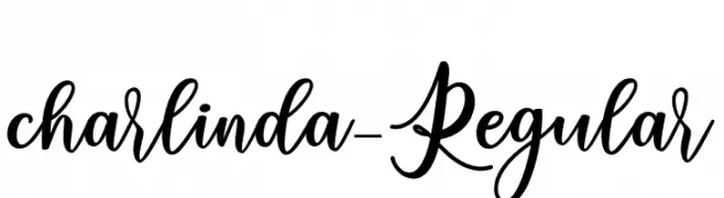
An elegant, flowing script font with graceful loops and swirls.
![charlinda-Regular font caratteri gratis]() Scaricare 482 Downloads@WebFont
Scaricare 482 Downloads@WebFont -
( Zetafonts - www.zetafonts.com )
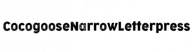
A bold, distressed font with a vintage letterpress effect and narrow, textured characters.
![Cocogoose Narrow Letterpress font caratteri gratis]() Scaricare 482 Downloads@WebFont
Scaricare 482 Downloads@WebFont -
( Fonts by Dieter Steffmann )
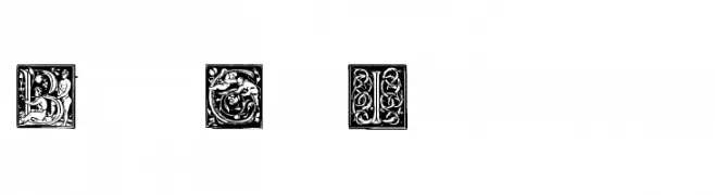
An ornate, Baroque-inspired decorative font with intricate floral designs.
![Barock Initialen font caratteri gratis]() Scaricare 482 Downloads@WebFont
Scaricare 482 Downloads@WebFont -
( Fonts by Khrys Bosland )
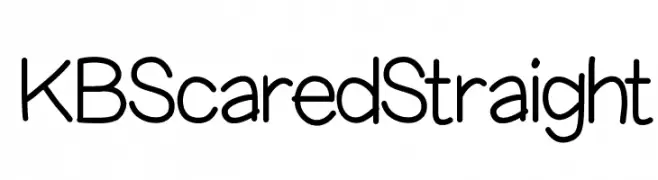
A modern, rounded sans-serif font with a friendly and approachable style.
![KBScaredStraight font caratteri gratis]() Scaricare 482 Downloads@WebFont
Scaricare 482 Downloads@WebFont -
![toybox font caratteri gratis]() Scaricare 482 Downloads@WebFont
Scaricare 482 Downloads@WebFont


Quali sono i font più popolari adesso?
Poppins, Roboto, Montserrat, Open Sans e Lato sono molto usati per le forme pulite e l'ampia applicabilità — dall'identità di marca alle landing page e ai poster.
Quali font si usano spesso nei loghi?
Le sans serif geometriche (es. Poppins, famiglie in stile Gotham) sono scelte comuni per un branding pulito e scalabile. Per un tocco personale restano valide script e stili manoscritti. Abbina un display deciso per i titoli a un corpo testo neutro per riconoscibilità ed equilibrio.
Ogni quanto si aggiorna la lista?
Con regolarità, in base ai download e all'attività reale. Torna spesso per scoprire in anticipo le nuove preferite.
💡 Consiglio: aggiungi ai preferiti — le tendenze cambiano in fretta e i font top di oggi possono ispirare il rebranding di domani.