Benvenuto nelle Font Più Popolari — dove popolarità e qualità si incontrano. Qui trovi i font più scaricati e usati dell'anno. Se cerchi scelte sicure per logo, web o social, inizia da qui.
Ogni font top si distingue per equilibrio, leggibilità e versatilità. Troverai sans serif moderne, script eleganti, serif vintage e display minimalisti.
-
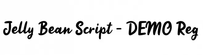
( Weape Design - creativemarket.com/weape?u=weape )
A playful, bold script font with smooth, rounded characters and seamless connections.
 Scaricare 487 Downloads@WebFont
 -
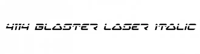
( Fonts by Daniel Zadorozny - www.iconian.com )
A futuristic, italicized font with sharp angles and a dynamic, geometric design.
![4114 Blaster Laser Italic font caratteri gratis]() Scaricare 487 Downloads@WebFont
Scaricare 487 Downloads@WebFont -
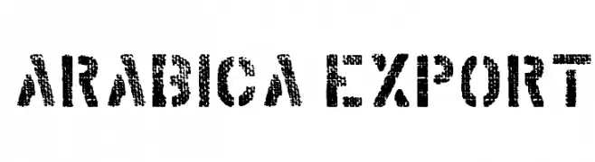
( imagex - www.imagex-fonts.com )
A bold, distressed font with a textured, vintage appearance.
![Arabica Export font caratteri gratis]() Scaricare 487 Downloads@WebFont
Scaricare 487 Downloads@WebFont -
( about.me/gaowsh )
A geometric and classic serif font with intricate patterns and bold lines.
![Amit font caratteri gratis]() Scaricare 487 Downloads@WebFont
Scaricare 487 Downloads@WebFont -
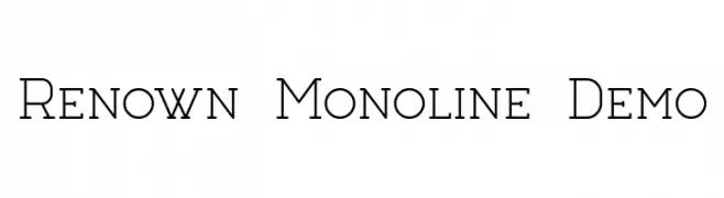
( Fonts by Dan Steinbok - Out Of Step Font Company - outofstepfontco.com - Personal-use only. For commercial use please contact owner. )
A clean, monoline font with consistent stroke widths and a classic, geometric influence.
![Renown Monoline Demo font caratteri gratis]() Scaricare 487 Downloads@WebFont
Scaricare 487 Downloads@WebFont -
-
![Transmetals Normal font caratteri gratis]() Scaricare 487 Downloads@WebFont
Scaricare 487 Downloads@WebFont -
![DjuiceWriting font caratteri gratis]() Scaricare 487 Downloads@WebFont
Scaricare 487 Downloads@WebFont -
( Fonts by Lionel Pailloncy )
A bold, playful font with textured and outlined styles, perfect for vintage and modern designs.
![Carnetdevoyage font caratteri gratis]() Scaricare 487 Downloads@WebFont
Scaricare 487 Downloads@WebFont -
![DK Office Squeeze Regular font caratteri gratis]() Scaricare 487 Downloads@WebFont
Scaricare 487 Downloads@WebFont -
( Vladimir Nikolic - www.coroflot.com/vladimirnikolic )
A bold, rounded font with thick strokes and smooth curves.
![Abandoned Ultra font caratteri gratis]() Scaricare 487 Downloads@WebFont
Scaricare 487 Downloads@WebFont -
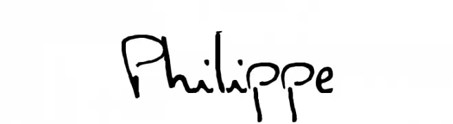
( Fonts by www.philing.net )
A casual, handwritten font with a playful and informal style.
![Philippe font caratteri gratis]() Scaricare 487 Downloads@WebFont
Scaricare 487 Downloads@WebFont -
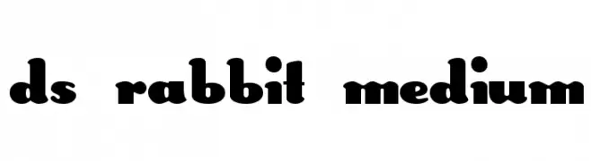
![DS Rabbit Medium font caratteri gratis]() Scaricare 487 Downloads@WebFont
Scaricare 487 Downloads@WebFont -
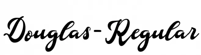
( Fonts by Aqeela Studio - Muhammad Nasir - Personal-use only. For commercial use please contact owner. )
A bold, elegant script font with flowing, interconnected letters.
![Douglas-Regular font caratteri gratis]() Scaricare 487 Downloads@WebFont
Scaricare 487 Downloads@WebFont -
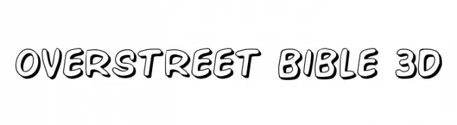
( Fonts by Daniel Zadorozny - www.iconian.com )
A bold, playful font with a 3D effect and cartoonish style.
![Overstreet Bible 3D font caratteri gratis]() Scaricare 487 Downloads@WebFont
Scaricare 487 Downloads@WebFont -
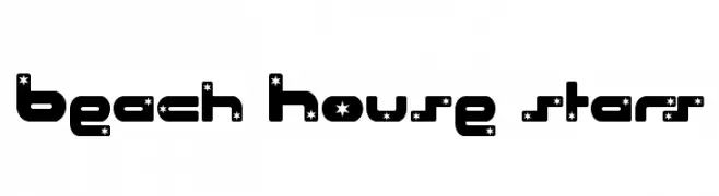
![Beach House stars font caratteri gratis]() Scaricare 487 Downloads@WebFont
Scaricare 487 Downloads@WebFont -
( Fonts by Spork Thug Typography - Josh Wilhelm - www.lifewithouttaffy.com/taffy/blog )
A playful, bold font with wavy, distorted characters for a whimsical look.
![Beer Goggles font caratteri gratis]() Scaricare 487 Downloads@WebFont
Scaricare 487 Downloads@WebFont -
( Magique Fonts - www.facebook.com/typesgal/ )
A bold, distressed stencil font with a rugged, industrial style.
![Take Cover font caratteri gratis]() Scaricare 487 Downloads@WebFont
Scaricare 487 Downloads@WebFont -
( Fonts by www.gliphmaker.com. Personal-use only. For commercial use please contact owner. )
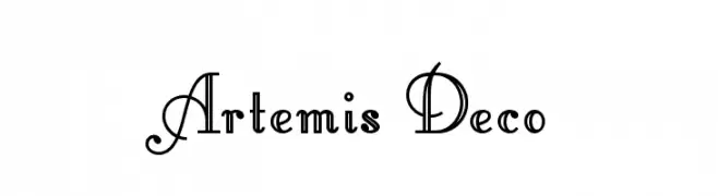
An elegant, Art Deco-inspired decorative font with ornate uppercase and streamlined lowercase letters.
![Artemis Deco font caratteri gratis]() Scaricare 487 Downloads@WebFont
Scaricare 487 Downloads@WebFont -
( Fonts by Galdino Otten - galdinootten.com )
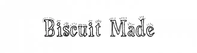
A playful, hand-drawn font with decorative, textured details.
![Biscuit Made font caratteri gratis]() Scaricare 487 Downloads@WebFont
Scaricare 487 Downloads@WebFont -
![Hacknslash font caratteri gratis]() Scaricare 487 Downloads@WebFont
Scaricare 487 Downloads@WebFont -
![RUNEnglish 2 font caratteri gratis]() Scaricare 487 Downloads
Scaricare 487 Downloads -
![Linux Biolinum O Italic font caratteri gratis]() Scaricare 487 Downloads@WebFont
Scaricare 487 Downloads@WebFont -
( Fonts by Zetafonts - Personal-use only. For commercial use please contact owner. )
A bold, modern sans-serif font with strong, clean lines.
![Eastman Grt Trial Bold font caratteri gratis]() Scaricare 487 Downloads@WebFont
Scaricare 487 Downloads@WebFont -
![NewDeli font caratteri gratis]() Scaricare 487 Downloads@WebFont
Scaricare 487 Downloads@WebFont -
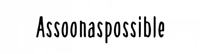
( Fonts by junkohanhero - Personal-use only. For commercial use please contact owner. )
A playful, hand-drawn style font with tall, narrow characters and a whimsical touch.
![As soon as possible font caratteri gratis]() Scaricare 487 Downloads@WebFont
Scaricare 487 Downloads@WebFont -
![Symbiopsy font caratteri gratis]() Scaricare 487 Downloads@WebFont
Scaricare 487 Downloads@WebFont -
![AME- font caratteri gratis]() Scaricare 487 Downloads@WebFont
Scaricare 487 Downloads@WebFont -
( Amar Lettering - creativemarket.com/Amarlettering )
An elegant script font with flowing, cursive strokes and refined details.
![Kimberly font caratteri gratis]() Scaricare 487 Downloads@WebFont
Scaricare 487 Downloads@WebFont -
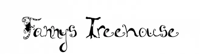
![Fannys Treehouse font caratteri gratis]() Scaricare 487 Downloads@WebFont
Scaricare 487 Downloads@WebFont -
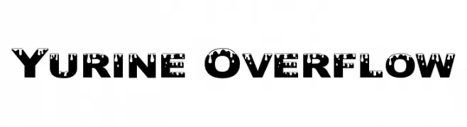
( Fonts by Graham Meade - GemFonts )
A bold, decorative font with a dripping effect for a playful and edgy look.
![Yurine Overflow font caratteri gratis]() Scaricare 487 Downloads@WebFont
Scaricare 487 Downloads@WebFont -
( Fonts by Pizzadude )
A bold, hand-painted style font with textured, brush-like strokes.
![ReliableDEMO font caratteri gratis]() Scaricare 487 Downloads@WebFont
Scaricare 487 Downloads@WebFont -
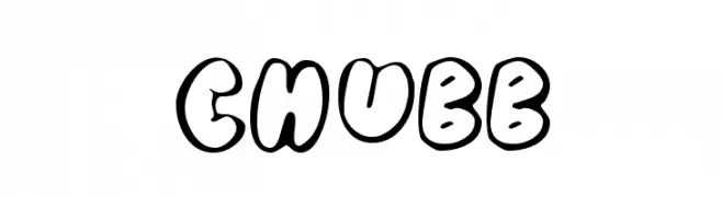
( Fonts by Typearound )
A playful, bold font with thick, rounded, outlined letters.
![Chubb font caratteri gratis]() Scaricare 487 Downloads@WebFont
Scaricare 487 Downloads@WebFont -
![Shining Pearl font caratteri gratis]() Scaricare 487 Downloads@WebFont
Scaricare 487 Downloads@WebFont -
( Fonts by Syaf Rizal - www.creativefabrica.com/ref/53/ - Personal-use only. For commercial use please contact owner. )
A bold, dynamic script font with fluid, energetic strokes and a handwritten feel.
![Insecure font caratteri gratis]() Scaricare 487 Downloads@WebFont
Scaricare 487 Downloads@WebFont -
( Fonts by Shara Weber )
A bold, rounded font with smooth curves and a friendly appearance.
![GelDoticaPlainLowerCaseThick font caratteri gratis]() Scaricare 487 Downloads@WebFont
Scaricare 487 Downloads@WebFont


Quali sono i font più popolari adesso?
Poppins, Roboto, Montserrat, Open Sans e Lato sono molto usati per le forme pulite e l'ampia applicabilità — dall'identità di marca alle landing page e ai poster.
Quali font si usano spesso nei loghi?
Le sans serif geometriche (es. Poppins, famiglie in stile Gotham) sono scelte comuni per un branding pulito e scalabile. Per un tocco personale restano valide script e stili manoscritti. Abbina un display deciso per i titoli a un corpo testo neutro per riconoscibilità ed equilibrio.
Ogni quanto si aggiorna la lista?
Con regolarità, in base ai download e all'attività reale. Torna spesso per scoprire in anticipo le nuove preferite.
💡 Consiglio: aggiungi ai preferiti — le tendenze cambiano in fretta e i font top di oggi possono ispirare il rebranding di domani.