Benvenuto nelle Font Più Popolari — dove popolarità e qualità si incontrano. Qui trovi i font più scaricati e usati dell'anno. Se cerchi scelte sicure per logo, web o social, inizia da qui.
Ogni font top si distingue per equilibrio, leggibilità e versatilità. Troverai sans serif moderne, script eleganti, serif vintage e display minimalisti.
-
( Fonts by benoitsjoholm.blogspot.com - Benoit Sjoholm - Personal-use only. For commercial use please contact owner. )
A modern, geometric sans-serif font with tall, narrow characters.
 Scaricare 91 Downloads@WebFont
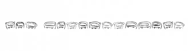
 -
![RvD_THUMBSUCKERS font caratteri gratis]() Scaricare 91 Downloads@WebFont
Scaricare 91 Downloads@WebFont -
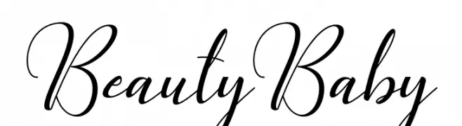
( Fonts by Delaga Studio - Personal-use only. For commercial use please contact owner. )
An elegant, flowing script font with high contrast and modern appeal.
![Beauty Baby font caratteri gratis]() Scaricare 91 Downloads@WebFont
Scaricare 91 Downloads@WebFont -
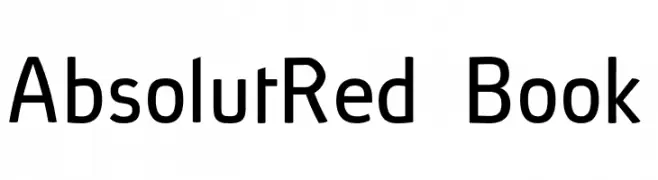
( Fonts by ingoFonts - Ingo Zimmermann - Personal-use only. For commercial use please contact owner. )
A modern, geometric sans-serif font with clean lines and uniform strokes.
![AbsolutRed-Book font caratteri gratis]() Scaricare 91 Downloads@WebFont
Scaricare 91 Downloads@WebFont -
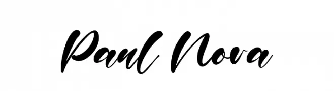
( Fonts by Kong Font - fontkong.com - Personal-use only. For commercial use please contact owner. )
A dynamic, cursive script font with elegant, sweeping strokes.
![Paul Nora font caratteri gratis]() Scaricare 91 Downloads@WebFont
Scaricare 91 Downloads@WebFont -
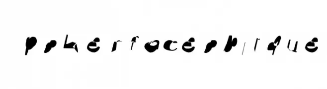
-
![pokerface oblique font caratteri gratis]() Scaricare 91 Downloads@WebFont
Scaricare 91 Downloads@WebFont -
( Fonts by Muhammad Romzul Khoir - Personal-use only. For commercial use please contact owner. )
A bold, geometric font with sharp edges and a condensed, industrial style.
![GRAM 01 font caratteri gratis]() Scaricare 91 Downloads@WebFont
Scaricare 91 Downloads@WebFont -
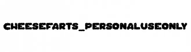
( Fonts by dcoxy )
A playful, cloud-like font with bold, rounded characters.
![Cheese Farts_PersonalUseOnly font caratteri gratis]() Scaricare 91 Downloads@WebFont
Scaricare 91 Downloads@WebFont -
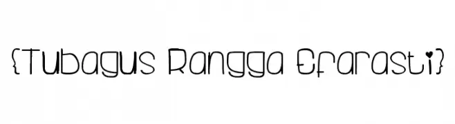
( tubagusranggaefarasti.blogspot.com )
A playful handwritten font with heart embellishments and rounded edges.
![{Tubagus Rangga Efarasti} font caratteri gratis]() Scaricare 91 Downloads@WebFont
Scaricare 91 Downloads@WebFont -
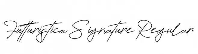
( Fonts by FinType Studio )
A modern, elegant handwritten script with fluid strokes.
![Futturistica Signature Regular font caratteri gratis]() Scaricare 91 Downloads@WebFont
Scaricare 91 Downloads@WebFont

Quali sono i font più popolari adesso?
Poppins, Roboto, Montserrat, Open Sans e Lato sono molto usati per le forme pulite e l'ampia applicabilità — dall'identità di marca alle landing page e ai poster.
Quali font si usano spesso nei loghi?
Le sans serif geometriche (es. Poppins, famiglie in stile Gotham) sono scelte comuni per un branding pulito e scalabile. Per un tocco personale restano valide script e stili manoscritti. Abbina un display deciso per i titoli a un corpo testo neutro per riconoscibilità ed equilibrio.
Ogni quanto si aggiorna la lista?
Con regolarità, in base ai download e all'attività reale. Torna spesso per scoprire in anticipo le nuove preferite.
💡 Consiglio: aggiungi ai preferiti — le tendenze cambiano in fretta e i font top di oggi possono ispirare il rebranding di domani.