Benvenuto nelle Font Più Popolari — dove popolarità e qualità si incontrano. Qui trovi i font più scaricati e usati dell'anno. Se cerchi scelte sicure per logo, web o social, inizia da qui.
Ogni font top si distingue per equilibrio, leggibilità e versatilità. Troverai sans serif moderne, script eleganti, serif vintage e display minimalisti.
-
 Scaricare 91 Downloads@WebFont
 -
![Nordica Classic Light Extended Opposite Oblique font caratteri gratis]() Scaricare 91 Downloads@WebFont
Scaricare 91 Downloads@WebFont -
( Fonts by David Espinosa [Type Sailor] - www.facebook.com/typesailor - Personal-use only. For commercial use please contact owner. )
An elegant script font with intricate swashes and high contrast strokes.
![Persifal font caratteri gratis]() Scaricare 91 Downloads@WebFont
Scaricare 91 Downloads@WebFont -
( Fonts by Jetsmax.com - Personal-use only. For commercial use please contact owner. )
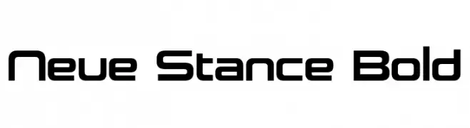
A modern, bold font with a geometric and futuristic style.
![Neue Stance Bold font caratteri gratis]() Scaricare 91 Downloads@WebFont
Scaricare 91 Downloads@WebFont -
![Hussar Przerywany Oblique font caratteri gratis]() Scaricare 91 Downloads@WebFont
Scaricare 91 Downloads@WebFont -
-
( Fonts by Khaiuns - Personal-use only. For commercial use please contact owner. )
A modern, geometric font with clean lines and rounded edges.
![GathaSans font caratteri gratis]() Scaricare 91 Downloads@WebFont
Scaricare 91 Downloads@WebFont -
( Fonts by twinletter - Rozikan - Personal-use only. For commercial use please contact owner. )
A playful, bold font with rounded strokes and whimsical character shapes.
![Barrets font caratteri gratis]() Scaricare 91 Downloads@WebFont
Scaricare 91 Downloads@WebFont -
( Fonts by Iconian Fonts )
A bold, italicized font with a futuristic halftone effect.
![Force Majeure Halftone Italic font caratteri gratis]() Scaricare 91 Downloads@WebFont
Scaricare 91 Downloads@WebFont -
( Fonts by wep - Wahyu Eka Prasetya - Personal-use only. For commercial use please contact owner. )
A playful, handwritten-style font with bold, energetic strokes.
![Average Donation $10 font caratteri gratis]() Scaricare 91 Downloads@WebFont
Scaricare 91 Downloads@WebFont -
( James Barnardo )
A bold, halftone-patterned font ideal for striking headlines and artistic designs.
![HalftoneNium font caratteri gratis]() Scaricare 91 Downloads@WebFont
Scaricare 91 Downloads@WebFont


Quali sono i font più popolari adesso?
Poppins, Roboto, Montserrat, Open Sans e Lato sono molto usati per le forme pulite e l'ampia applicabilità — dall'identità di marca alle landing page e ai poster.
Quali font si usano spesso nei loghi?
Le sans serif geometriche (es. Poppins, famiglie in stile Gotham) sono scelte comuni per un branding pulito e scalabile. Per un tocco personale restano valide script e stili manoscritti. Abbina un display deciso per i titoli a un corpo testo neutro per riconoscibilità ed equilibrio.
Ogni quanto si aggiorna la lista?
Con regolarità, in base ai download e all'attività reale. Torna spesso per scoprire in anticipo le nuove preferite.
💡 Consiglio: aggiungi ai preferiti — le tendenze cambiano in fretta e i font top di oggi possono ispirare il rebranding di domani.