Benvenuto nelle Font Più Popolari — dove popolarità e qualità si incontrano. Qui trovi i font più scaricati e usati dell'anno. Se cerchi scelte sicure per logo, web o social, inizia da qui.
Ogni font top si distingue per equilibrio, leggibilità e versatilità. Troverai sans serif moderne, script eleganti, serif vintage e display minimalisti.
-
( Fonts by Jadatype )
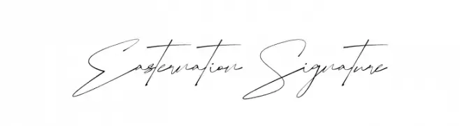
A sophisticated and elegant handwritten font with fluid, continuous strokes.
 Scaricare 91 Downloads@WebFont
 -
( Noto is a trademark of Google Inc. Noto fonts are open source. All Noto fonts are published under the SIL Open Font License, Version 1.1 )
A sleek, semi-condensed, light italic font with a modern and elegant style.
![Noto Sans Display SemiCondensed Light Italic font caratteri gratis]() Scaricare 91 Downloads@WebFont
Scaricare 91 Downloads@WebFont -
( Caveras - Cliff Modes - caveras.net )
A pixelated, retro-style font with a blocky, digital appearance.
![Altima font caratteri gratis]() Scaricare 91 Downloads@WebFont
Scaricare 91 Downloads@WebFont -
( Fonts by Vladimir Nikolic )
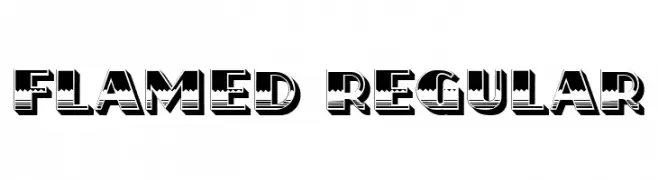
A bold, decorative font with a striped, three-dimensional effect.
![Flamed Regular font caratteri gratis]() Scaricare 91 Downloads@WebFont
Scaricare 91 Downloads@WebFont -
( Fonts by Scratchones )
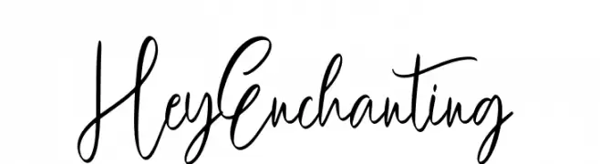
Playful handwritten script font.
![Hey Enchanting font caratteri gratis]() Scaricare 91 Downloads@WebFont
Scaricare 91 Downloads@WebFont -
-
( Fonts by Kong Font )
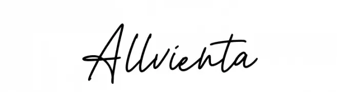
Handwritten cursive script font.
![Allvienta font caratteri gratis]() Scaricare 91 Downloads@WebFont
Scaricare 91 Downloads@WebFont -
( Fonts by Font Environment - fontenvironment.com )
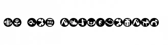
A set of bold, abstract symbols within circular shapes, perfect for creative designs.
![FE-Sam'sDingbatsNo.2 font caratteri gratis]() Scaricare 91 Downloads@WebFont
Scaricare 91 Downloads@WebFont -
( Iconian Fonts - Daniel Zadorozny - www.iconian.com )
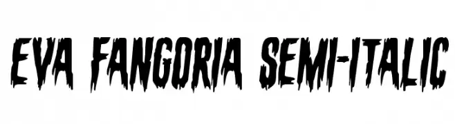
A bold, jagged font with a horror-themed, edgy design.
![Eva Fangoria Semi-Italic font caratteri gratis]() Scaricare 91 Downloads@WebFont
Scaricare 91 Downloads@WebFont -
( Fonts by Faldy Kudo - Personal-use only. For commercial use please contact owner. )
A classic serif font with high contrast and elegant serifs.
![Gloria Ramsey font caratteri gratis]() Scaricare 91 Downloads@WebFont
Scaricare 91 Downloads@WebFont -
( Fonts by Ditatype )
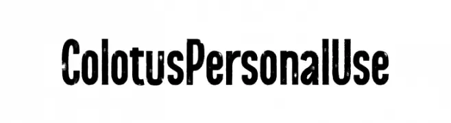
A bold, distressed font with a vintage, textured appearance.
![Colotus Personal Use font caratteri gratis]() Scaricare 91 Downloads@WebFont
Scaricare 91 Downloads@WebFont


Quali sono i font più popolari adesso?
Poppins, Roboto, Montserrat, Open Sans e Lato sono molto usati per le forme pulite e l'ampia applicabilità — dall'identità di marca alle landing page e ai poster.
Quali font si usano spesso nei loghi?
Le sans serif geometriche (es. Poppins, famiglie in stile Gotham) sono scelte comuni per un branding pulito e scalabile. Per un tocco personale restano valide script e stili manoscritti. Abbina un display deciso per i titoli a un corpo testo neutro per riconoscibilità ed equilibrio.
Ogni quanto si aggiorna la lista?
Con regolarità, in base ai download e all'attività reale. Torna spesso per scoprire in anticipo le nuove preferite.
💡 Consiglio: aggiungi ai preferiti — le tendenze cambiano in fretta e i font top di oggi possono ispirare il rebranding di domani.