Benvenuto nelle Font Più Popolari — dove popolarità e qualità si incontrano. Qui trovi i font più scaricati e usati dell'anno. Se cerchi scelte sicure per logo, web o social, inizia da qui.
Ogni font top si distingue per equilibrio, leggibilità e versatilità. Troverai sans serif moderne, script eleganti, serif vintage e display minimalisti.
-
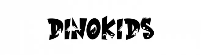
( Fonts by Mr.Soon Design )
A playful, dinosaur-themed font with bold, whimsical characters.
 Scaricare 94 Downloads@WebFont
 -
( Fonts by Daniel Zadorozny - www.iconian.com - Free for personal use )
A bold, jagged font with dripping edges, ideal for horror themes.
![Bloodlust Leftalic font caratteri gratis]() Scaricare 94 Downloads@WebFont
Scaricare 94 Downloads@WebFont -
( Fonts by Ahmad Khaidir - Personal-use only. For commercial use please contact owner. )
A bold, flowing script font with elegant, cursive letterforms and a slight slant.
![AtlanticTime font caratteri gratis]() Scaricare 94 Downloads@WebFont
Scaricare 94 Downloads@WebFont -
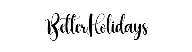
( Fonts by PiPi Creative )
Decorative script font with playful loops and high contrast.
![Better Holidays font caratteri gratis]() Scaricare 94 Downloads@WebFont
Scaricare 94 Downloads@WebFont -
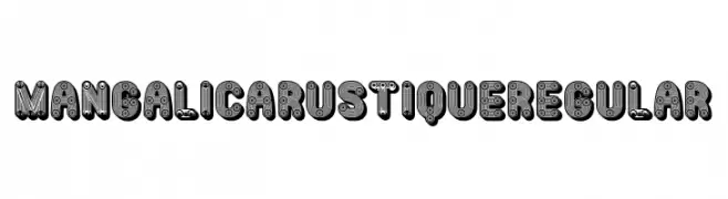
( Fonts by Vladimir Nikolic )
A bold, mechanical-themed decorative font with intricate, gear-like details.
![Mangalica Rustique Regular font caratteri gratis]() Scaricare 94 Downloads@WebFont
Scaricare 94 Downloads@WebFont -
-
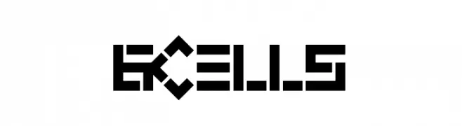
![6 Cells font caratteri gratis]() Scaricare 94 Downloads@WebFont
Scaricare 94 Downloads@WebFont -
( Fonts by www.houseoflime.com )
A bold, geometric font inspired by traditional Asian calligraphy, enclosed in rectangular frames.
![Asian Art II font caratteri gratis]() Scaricare 94 Downloads@WebFont
Scaricare 94 Downloads@WebFont -
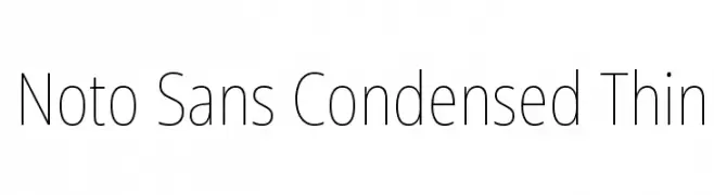
( Fonts by Google - Personal-use only. For commercial use please contact owner. )
A modern, thin, and condensed sans-serif typeface with excellent legibility.
![Noto Sans Condensed Thin font caratteri gratis]() Scaricare 94 Downloads@WebFont
Scaricare 94 Downloads@WebFont -
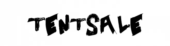
( Fonts by a Max Infeld - XEROGRAPHER FONTS - xerographer.blogspot.com . Personal-use only. For commercial use please contact owner. )
A bold, brush-style font with a textured, hand-painted look.
![TentSale font caratteri gratis]() Scaricare 94 Downloads@WebFont
Scaricare 94 Downloads@WebFont -
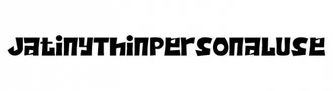
( Fonts by twinletter )
A bold, geometric font with sharp angles and playful shapes.
![Jatiny Thin Personal Use font caratteri gratis]() Scaricare 94 Downloads@WebFont
Scaricare 94 Downloads@WebFont


Quali sono i font più popolari adesso?
Poppins, Roboto, Montserrat, Open Sans e Lato sono molto usati per le forme pulite e l'ampia applicabilità — dall'identità di marca alle landing page e ai poster.
Quali font si usano spesso nei loghi?
Le sans serif geometriche (es. Poppins, famiglie in stile Gotham) sono scelte comuni per un branding pulito e scalabile. Per un tocco personale restano valide script e stili manoscritti. Abbina un display deciso per i titoli a un corpo testo neutro per riconoscibilità ed equilibrio.
Ogni quanto si aggiorna la lista?
Con regolarità, in base ai download e all'attività reale. Torna spesso per scoprire in anticipo le nuove preferite.
💡 Consiglio: aggiungi ai preferiti — le tendenze cambiano in fretta e i font top di oggi possono ispirare il rebranding di domani.