Benvenuto nelle Font Più Popolari — dove popolarità e qualità si incontrano. Qui trovi i font più scaricati e usati dell'anno. Se cerchi scelte sicure per logo, web o social, inizia da qui.
Ogni font top si distingue per equilibrio, leggibilità e versatilità. Troverai sans serif moderne, script eleganti, serif vintage e display minimalisti.
-
( Fonts by UI Creative )
An elegant, flowing script font with high contrast and graceful curves.
 Scaricare 89 Downloads@WebFont
 -
![PHOENIX GLYPH font caratteri gratis]() Scaricare 89 Downloads@WebFont
Scaricare 89 Downloads@WebFont -
( Fonts by Fani Kokolaki )
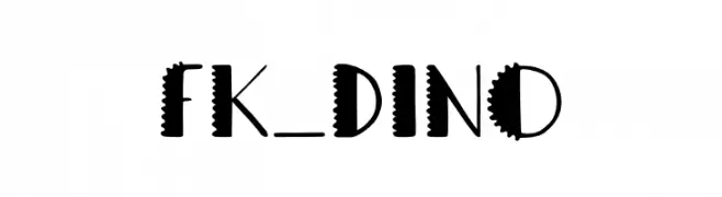
A playful, dinosaur-themed font with bold, spiky characters.
![FK_Dino font caratteri gratis]() Scaricare 89 Downloads@WebFont
Scaricare 89 Downloads@WebFont -
( Josep Patau Bellart )
A playful, handwritten font with rounded edges and smooth curves.
![VenturaEdding-Medium font caratteri gratis]() Scaricare 89 Downloads@WebFont
Scaricare 89 Downloads@WebFont -
![Mayday Italic font caratteri gratis]() Scaricare 89 Downloads@WebFont
Scaricare 89 Downloads@WebFont -
-
( Fonts by Pak DuaTiga - Personal-use only. For commercial use please contact owner. )
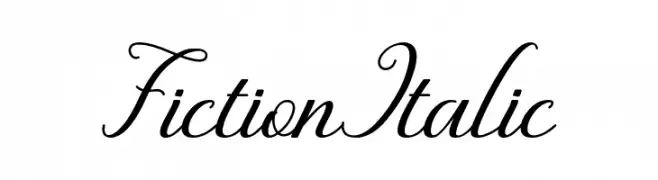
An elegant, italic script font with flowing, interconnected letters and ornate swashes.
![Fiction Italic font caratteri gratis]() Scaricare 89 Downloads@WebFont
Scaricare 89 Downloads@WebFont -
( Fonts by Eimantas Paškonis - Personal-use only. For commercial use please contact owner. )
A sleek, modern thin italic font with elegant strokes and excellent readability.
![Neris Thin Italic font caratteri gratis]() Scaricare 89 Downloads@WebFont
Scaricare 89 Downloads@WebFont -
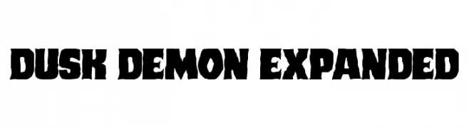
( Fonts by Daniel Zadorozny - www.iconian.com - Personal-use only. For commercial use please contact owner. )
A bold, rugged font with thick, uneven strokes and dynamic character shapes.
![Dusk Demon Expanded font caratteri gratis]() Scaricare 89 Downloads@WebFont
Scaricare 89 Downloads@WebFont -
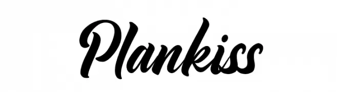
( Fonts by Fontherapy - Siti Anisa - Personal-use only. For commercial use please contact owner. )
A bold, expressive script font with elegant, flowing cursive letters.
![Plankiss font caratteri gratis]() Scaricare 89 Downloads@WebFont
Scaricare 89 Downloads@WebFont -
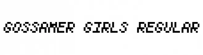
( Chequered Ink - chequered.ink/ )
A pixelated, blocky font inspired by retro digital displays.
![Gossamer Girls Regular font caratteri gratis]() Scaricare 89 Downloads@WebFont
Scaricare 89 Downloads@WebFont


Quali sono i font più popolari adesso?
Poppins, Roboto, Montserrat, Open Sans e Lato sono molto usati per le forme pulite e l'ampia applicabilità — dall'identità di marca alle landing page e ai poster.
Quali font si usano spesso nei loghi?
Le sans serif geometriche (es. Poppins, famiglie in stile Gotham) sono scelte comuni per un branding pulito e scalabile. Per un tocco personale restano valide script e stili manoscritti. Abbina un display deciso per i titoli a un corpo testo neutro per riconoscibilità ed equilibrio.
Ogni quanto si aggiorna la lista?
Con regolarità, in base ai download e all'attività reale. Torna spesso per scoprire in anticipo le nuove preferite.
💡 Consiglio: aggiungi ai preferiti — le tendenze cambiano in fretta e i font top di oggi possono ispirare il rebranding di domani.