Benvenuto nelle Font Più Popolari — dove popolarità e qualità si incontrano. Qui trovi i font più scaricati e usati dell'anno. Se cerchi scelte sicure per logo, web o social, inizia da qui.
Ogni font top si distingue per equilibrio, leggibilità e versatilità. Troverai sans serif moderne, script eleganti, serif vintage e display minimalisti.
-
( Fonts by Apostrophic Lab )
Uniform squares with thick outlines, no readable characters.
 Scaricare 89 Downloads@WebFont
 -
( Fonts by Fillo Graphic )
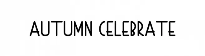
Playful, rounded sans-serif with a hand-drawn, whimsical feel.
![Autumn Celebrate font caratteri gratis]() Scaricare 89 Downloads@WebFont
Scaricare 89 Downloads@WebFont -
( Chequered Ink - chequered.ink/ )
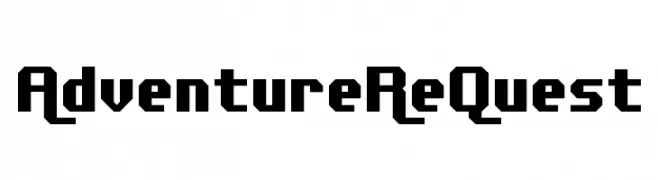
A bold, geometric font with a blocky, digital style.
![Adventure ReQuest font caratteri gratis]() Scaricare 89 Downloads@WebFont
Scaricare 89 Downloads@WebFont -
( Fonts by Achmad Yani )
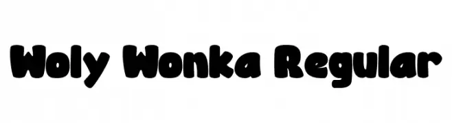
A playful, bold font with rounded, bubbly characters ideal for fun and whimsical designs.
![Woly Wonka Regular font caratteri gratis]() Scaricare 89 Downloads@WebFont
Scaricare 89 Downloads@WebFont -
( Fonts by Jonathan S. Harris - www.tattoowoo.com. Personal-use only. For commercial use please contact owner. )
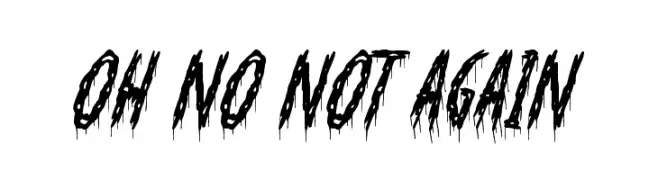
A dramatic, dripping font with a horror-themed aesthetic.
![Oh No Not Again font caratteri gratis]() Scaricare 89 Downloads@WebFont
Scaricare 89 Downloads@WebFont -
-
( Fonts by Iconian Fonts )
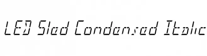
A futuristic, digital-inspired font with a condensed and italicized style.
![LED Sled Condensed Italic font caratteri gratis]() Scaricare 89 Downloads@WebFont
Scaricare 89 Downloads@WebFont -
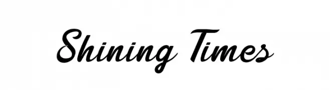
( Fonts by Seno Aji - Personal-use only. For commercial use please contact owner. )
A classic, elegant script font with flowing cursive letterforms.
![Shining Times font caratteri gratis]() Scaricare 89 Downloads@WebFont
Scaricare 89 Downloads@WebFont -
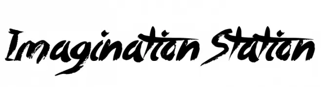
![Imagination Station font caratteri gratis]() Scaricare 89 Downloads@WebFont
Scaricare 89 Downloads@WebFont -
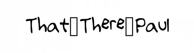
( Fonts by thattherepaul )
A playful, hand-drawn font with a casual and informal style.
![That_There_Paul font caratteri gratis]() Scaricare 89 Downloads@WebFont
Scaricare 89 Downloads@WebFont -
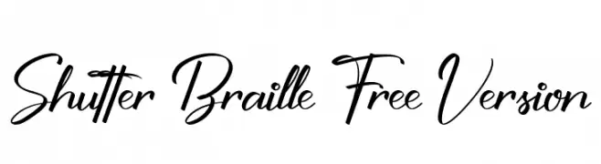
( Fonts by Ketikata Studio - Fuad Hasan - Personal-use only. For commercial use please contact owner. )
A dynamic and elegant script font with fluid, cursive letterforms and dramatic flourishes.
![Shutter Braille Free Version font caratteri gratis]() Scaricare 89 Downloads@WebFont
Scaricare 89 Downloads@WebFont
Quali sono i font più popolari adesso?
Poppins, Roboto, Montserrat, Open Sans e Lato sono molto usati per le forme pulite e l'ampia applicabilità — dall'identità di marca alle landing page e ai poster.
Quali font si usano spesso nei loghi?
Le sans serif geometriche (es. Poppins, famiglie in stile Gotham) sono scelte comuni per un branding pulito e scalabile. Per un tocco personale restano valide script e stili manoscritti. Abbina un display deciso per i titoli a un corpo testo neutro per riconoscibilità ed equilibrio.
Ogni quanto si aggiorna la lista?
Con regolarità, in base ai download e all'attività reale. Torna spesso per scoprire in anticipo le nuove preferite.
💡 Consiglio: aggiungi ai preferiti — le tendenze cambiano in fretta e i font top di oggi possono ispirare il rebranding di domani.