Benvenuto nelle Font Più Popolari — dove popolarità e qualità si incontrano. Qui trovi i font più scaricati e usati dell'anno. Se cerchi scelte sicure per logo, web o social, inizia da qui.
Ogni font top si distingue per equilibrio, leggibilità e versatilità. Troverai sans serif moderne, script eleganti, serif vintage e display minimalisti.
-
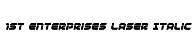
( Fonts by Iconian Fonts )
A bold, italic, futuristic font with rounded, geometric shapes.
 Scaricare 459 Downloads@WebFont
 -
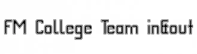
( Fonts by Dieter Schumacher )
A bold, outlined font with a geometric and modern style.
![FM College Team in&out font caratteri gratis]() Scaricare 459 Downloads@WebFont
Scaricare 459 Downloads@WebFont -
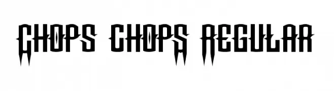
( Fonts by Chris Vile - fontmonger.com - Personal-use only. For commercial use please contact owner. )
A bold, angular font with sharp edges and a dramatic, condensed style.
![Chops chopS Regular font caratteri gratis]() Scaricare 459 Downloads@WebFont
Scaricare 459 Downloads@WebFont -
Caratteri di typotopia. For commercial use please contact the owner.
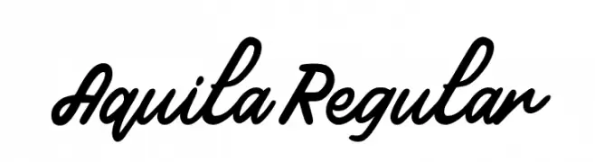
( Fonts by Typotopia - Typotopia.co - Personal Use Only, for Commercial Use, please contact us )
A bold, flowing script font with a natural handwriting style.
![Aquila Regular font caratteri gratis]() Scaricare 459 Downloads@WebFont
Scaricare 459 Downloads@WebFont -
( Fonts by Eifetstype )
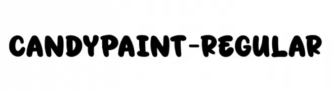
A playful, bold font with rounded, bubbly characters and a hand-drawn feel.
![CandyPaint-Regular font caratteri gratis]() Scaricare 459 Downloads@WebFont
Scaricare 459 Downloads@WebFont -
-
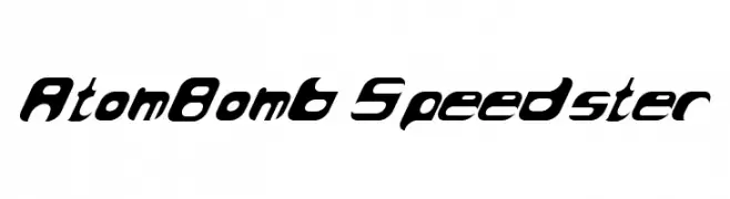
![AtomBomb Speedster font caratteri gratis]() Scaricare 459 Downloads@WebFont
Scaricare 459 Downloads@WebFont -
( Fonts by Blue Vinyl - Jess Latham - www.bvfonts.com )
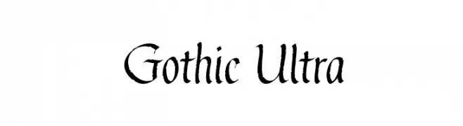
A bold, Gothic-inspired font with sharp, angular strokes and high contrast.
![Gothic Ultra font caratteri gratis]() Scaricare 459 Downloads@WebFont
Scaricare 459 Downloads@WebFont -
( be.net/vikaskumar )
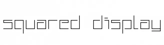
A geometric, squared font with a modern and minimalist design.
![Squared Display font caratteri gratis]() Scaricare 459 Downloads@WebFont
Scaricare 459 Downloads@WebFont -
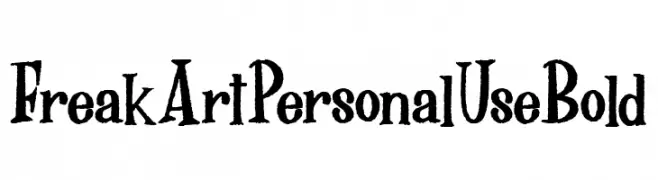
( Fonts by Billy Argel Fonts ® )
A bold, artistic font with a distressed, hand-drawn style.
![FreakArt Personal Use Bold font caratteri gratis]() Scaricare 459 Downloads@WebFont
Scaricare 459 Downloads@WebFont -
![Kremlin Premier font caratteri gratis]() Scaricare 459 Downloads@WebFont
Scaricare 459 Downloads@WebFont -
( Fonts by Yadhie Setiawan - typelinestudio.com - Personal-use only. For commercial use please contact owner. )
A dynamic and fluid script font with elegant, flowing strokes.
![Benthol font caratteri gratis]() Scaricare 459 Downloads@WebFont
Scaricare 459 Downloads@WebFont -
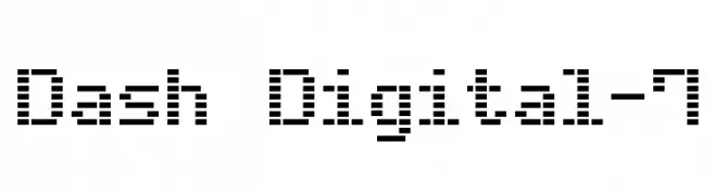
( www.styleseven.com/ )
A pixelated, digital-style font reminiscent of old digital displays.
![Dash Digital-7 font caratteri gratis]() Scaricare 459 Downloads@WebFont
Scaricare 459 Downloads@WebFont -
( Fonts by DM Studio )
A whimsical collection of autumn-themed dingbats with hand-drawn illustrations.
![Autumn Dingbats font caratteri gratis]() Scaricare 459 Downloads@WebFont
Scaricare 459 Downloads@WebFont -
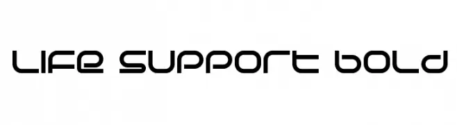
( Fonts by dustBUST - Andreas Nylin )
A bold, futuristic font with rounded, geometric letterforms.
![Life Support Bold font caratteri gratis]() Scaricare 459 Downloads@WebFont
Scaricare 459 Downloads@WebFont -
( Fonts by Graham Meade - GemFonts )
A bold, angular font with a distinctive, edgy style.
![Wewak font caratteri gratis]() Scaricare 459 Downloads@WebFont
Scaricare 459 Downloads@WebFont -
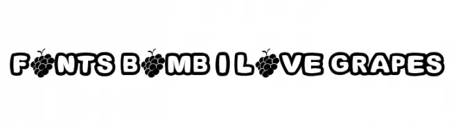
![Fonts Bomb I love grapes font caratteri gratis]() Scaricare 459 Downloads@WebFont
Scaricare 459 Downloads@WebFont -
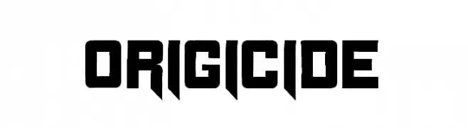
( Fonts by Cpr.Sparhelt )
A bold, angular font with geometric forms and a modern aesthetic.
![Origicide font caratteri gratis]() Scaricare 459 Downloads@WebFont
Scaricare 459 Downloads@WebFont -
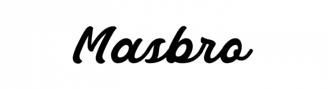
( 7NTypes - Situjuh Nazara - 7ntypes.com )
A bold, flowing script font with elegant, cursive letterforms.
![Masbro font caratteri gratis]() Scaricare 459 Downloads@WebFont
Scaricare 459 Downloads@WebFont -
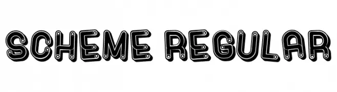
( Fonts by Vladimir Nikolic )
A bold, playful font with a unique outlined and filled design.
![Scheme Regular font caratteri gratis]() Scaricare 459 Downloads@WebFont
Scaricare 459 Downloads@WebFont -
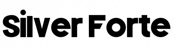
( LJ Design Studios - www.ljdesignstudios.com )
A bold, geometric sans-serif font with a modern and powerful aesthetic.
![Silver Forte font caratteri gratis]() Scaricare 459 Downloads@WebFont
Scaricare 459 Downloads@WebFont -
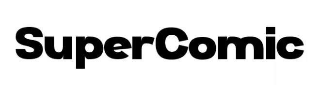
( Chequered Ink - chequered.ink/ )
A bold, rounded font with a strong, friendly presence.
![Super Comic font caratteri gratis]() Scaricare 459 Downloads@WebFont
Scaricare 459 Downloads@WebFont -
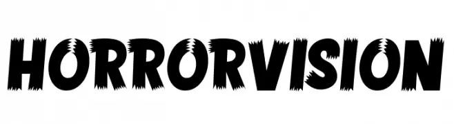
( Fonts by Memet Saputro )
A bold, jagged font ideal for horror-themed designs.
![HORROR VISION font caratteri gratis]() Scaricare 459 Downloads@WebFont
Scaricare 459 Downloads@WebFont -
( Fonts by PenCulture - Personal-use only. For commercial use please contact owner. )
A bold, energetic script font with flowing, connected strokes.
![hadfield strip font caratteri gratis]() Scaricare 459 Downloads@WebFont
Scaricare 459 Downloads@WebFont -
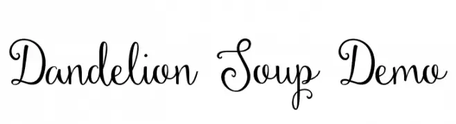
( Fonts by Emily Spadoni )
A whimsical and playful script font with a handwritten style.
![Dandelion Soup Demo font caratteri gratis]() Scaricare 459 Downloads@WebFont
Scaricare 459 Downloads@WebFont -
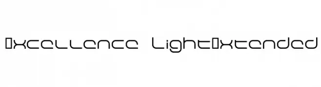
![Excellence LightExtended font caratteri gratis]() Scaricare 459 Downloads@WebFont
Scaricare 459 Downloads@WebFont -
( Copyright 2019 The Tomorrow Project Authors (github.com/MonicaRizzolli/Tomorrow) )
A modern, geometric sans-serif font with clean lines and balanced proportions.
![Tomorrow Medium font caratteri gratis]() Scaricare 459 Downloads@WebFont
Scaricare 459 Downloads@WebFont -
( Fonts by www.norfok.com - Norfok® Incredible Font Design - Thomas W. Otto )
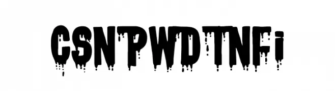
A bold, dripping font perfect for horror-themed designs.
![CSNPWDTNFI font caratteri gratis]() Scaricare 459 Downloads@WebFont
Scaricare 459 Downloads@WebFont -
![PRIMERA Semi-bold-italic font caratteri gratis]() Scaricare 459 Downloads@WebFont
Scaricare 459 Downloads@WebFont -
( Fonts by Jonathan Harris - www.tattoowoo.com )
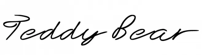
A flowing, cursive font with elegant, interconnected strokes.
![Teddy Bear font caratteri gratis]() Scaricare 459 Downloads@WebFont
Scaricare 459 Downloads@WebFont -
( Fonts by Daniel Zadorozny - www.iconian.com - Free for personal use )
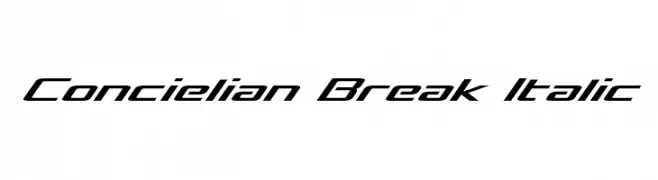
A sleek, italicized font with a futuristic and dynamic design.
![Concielian Break Italic font caratteri gratis]() Scaricare 459 Downloads@WebFont
Scaricare 459 Downloads@WebFont -
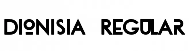
( Fonts by Tano Veron )
A bold, geometric font with clean lines and a modern aesthetic.
![dionisia Regular font caratteri gratis]() Scaricare 459 Downloads@WebFont
Scaricare 459 Downloads@WebFont -
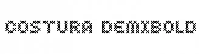
![Costura DemiBold font caratteri gratis]() Scaricare 459 Downloads@WebFont
Scaricare 459 Downloads@WebFont -
Caratteri di defharo. For commercial use please contact the owner.
![d puntillas [e] tiptoes squid font caratteri gratis]() Scaricare 459 Downloads@WebFont
Scaricare 459 Downloads@WebFont -
( Fonts by Grafito Design - dibujosenlinea.ideasintegrales.net )
A playful, curly font with bold, rounded characters full of whimsy and movement.
![CHANGO MARANGO font caratteri gratis]() Scaricare 459 Downloads@WebFont
Scaricare 459 Downloads@WebFont -
( Free for a personal use. For a commercial use please visit www.kevinandamanda.com )
A dynamic handwritten font with fluid strokes and a casual elegance.
![Snowshoe font caratteri gratis]() Scaricare 459 Downloads@WebFont
Scaricare 459 Downloads@WebFont


![d puntillas [e] tiptoes squid font caratteri gratis](https://d144mzi0q5mijx.cloudfront.net/img/D/0/d-puntillas-e-tiptoes-squid.webp)


Quali sono i font più popolari adesso?
Poppins, Roboto, Montserrat, Open Sans e Lato sono molto usati per le forme pulite e l'ampia applicabilità — dall'identità di marca alle landing page e ai poster.
Quali font si usano spesso nei loghi?
Le sans serif geometriche (es. Poppins, famiglie in stile Gotham) sono scelte comuni per un branding pulito e scalabile. Per un tocco personale restano valide script e stili manoscritti. Abbina un display deciso per i titoli a un corpo testo neutro per riconoscibilità ed equilibrio.
Ogni quanto si aggiorna la lista?
Con regolarità, in base ai download e all'attività reale. Torna spesso per scoprire in anticipo le nuove preferite.
💡 Consiglio: aggiungi ai preferiti — le tendenze cambiano in fretta e i font top di oggi possono ispirare il rebranding di domani.